
8 Unexpected Color Combinations That Actually Work Really Well Together
If your home is due for a redesign, and you’re looking to go bold with a color combination that will pop, you could choose a classic pairing that you see everywhere—or you could opt for a wow-worthy and unexpected duo. Here are some color combinations that are underrated, yet fashionable and elegant. Peace out, beige and white!
1. Coral pink and subdued teal
Sitting at opposite sides of the color wheel, pink and blue typically contrast in a dynamic way. Using lighter, more subdued shades of each adds maturity to the color scheme, ensuring that your room looks cool and adult while retaining a playful edge. Pair accents of each color against a neutral base, like light gray or eggshell white, to tie the room together.

2. Navy blue and burnt orange
This color combination is perfect for a fall upgrade. Burnt orange—a warm, striking color—offsets the cool feel of a darker blue, and when used in tandem, the two colors are regal. Both colors look beautiful against a rich hardwood floor, so if you’ve got a room in your apartment with dark wood, like mahogany or cherry, that’s likely your best bet for testing out this combo. Be warned, however, that using dark colors can quickly make a space feel smaller—to keep this from happening, it’s best to use these two colors in large spaces with expansive windows and a good amount of natural light.

3. Seafoam green and gold
Gold is a color that, in small doses, looks elegant and timeless in almost any room. That part we don’t need to convince you of, but this next part might be harder: Try pairing it with a seafoam green. While green and gold is a classic combination, seafoam is a brighter derivative that incorporates blue tones and keeps a space looking cool and bright. Maybe use seafoam as a base, painting it on one or two walls or incorporating large furniture pieces in the color, then accent the room with bits of gold, like picture frames, mirrors, coasters, or flowerpots.
4. White and fuchsia
A white, minimalist space is a tried-and-true classic, one that works well in an office or workspace designed to cultivate focus and zen. But an all-white room can feel too sterile if it lacks any color, so consider fuchsia. Red is associated with passion, strength, and power, and fuchsia’s a color in the same family. Including a powerful pop of a bright pink can go a long way in energizing you and boosting your productivity, while also breaking up white space and giving the room a joyfulness it would otherwise lack.

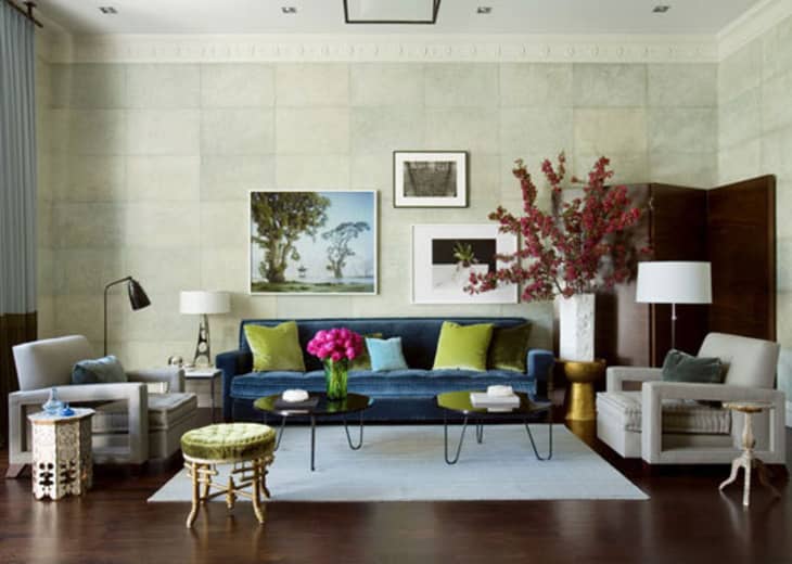
5. Gray, turquoise, and lime green
Gray is a safe color that works well as a base in most rooms, but a room that consists mostly of gray can easily look plain and boring. If you’re using a dense gray, like a sand or slate color, dark teal and lime green make for perfect partners. While teal and gray are both cool colors that complement one another naturally, the two alone can leave a room looking dark. Lime green is a rarely used option that creates warmth in a space. But use it sparingly, because it can otherwise quickly drown out the rest of a room!

6. Orange and dusty blue
You may already know that blue and orange are complementary colors, but a slight tweak in the shades (a little lighter, a little deeper) always creates interior spaces that buzz. There’s something about the strength of the orange met by the cool cast of the dusty blue that just makes a room sing, don’t you think?

Dave Coote Design conveyed the lovely color combo via orangey and burnt accents against dusty blue blanketed the walls.

Designer Eileen Kathryn Boyd opted for brightly colored artwork to meet the softer, dusty accents on the wall and in the console.

Here, from Martha Stewart via Enchanted Home, dusty French blue provides the perfect frame for those bold pops of vibrant orange.
7. Baby blue and olive
These two hues might reside on the same side of the color wheel, but when paired together, they bring something entirely different to the table. The light-hearted baby blue plays nicely with the deeply sophisticated olive green, revealing spaces that are fresh feeling and lively.

Design firm House of Jade punched up this bedroom with a chic baby blue wallcovering and olive green accents.

Sometimes, all you need to create a stellar color palette is the perfect wall color…and the perfect plant as made evident by Danish interiors firm Spatial Code.

Atlanta designer Liz Williams turned to the color couple when assembling this botanical gallery wall anchored by an olive sofa adorned with a baby blue bolster and pillow.
This kitchen found via Making It Lovely (by Parisian architect Phillippe Harden) embraces this color team well as the olive grounds the bottom cabinetry and the baby blue serves as a light and airy respite for the upper wall and shelves.
8. Teal and citron
Our last color couple is like the life of the party. With two powerful shades in one space, you might think a struggle for center stage would ensure, but to the contrary, these hues attract equal attention when paired together.

Teal might be the obvious star of this interior space by designer Katie Ridder, but it’s the citron accents that make the room sing on key.

A backdrop of teal patterned Graham & Brown wallpaper sets the scene for vintage circle chairs embellished with citrus fabric.