
This Gray Builder-Grade Kitchen Is Unrecognizable After a Mini Makeover (No Reno Needed!)
If a full-gut renovation isn’t in the cards, a mini makeover can sometimes deliver just as much of an impact. Instead of structural changes, thoughtful stylistic upgrades can completely change the feel of a space. That’s exactly what designer Lauren Brown-Wellington of Atlanta-based Flowing West Interiors did when faced with a dated white kitchen: Without any serious renovations, she gave the space a much-needed injection of style.
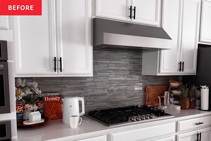
Before the update, the homeowner described the kitchen as “clean, but flat.” It featured all the standard selections. “Uniform cabinetry, minimal contrast, and finishes that felt functional but not intentional,” Wellington says. “The proportions were good, but there was no focal point and very little depth. It lacked personality, which is often what makes a space feel builder-grade rather than designed.”

The goal was to introduce warmth and dimension without changing the footprint or breaking the budget. Wellington wanted the kitchen to feel layered, modern, and inviting — elevated but still livable. The homeowner also shared that she wanted the space to feel more reflective of her style rather than identical to the kitchens in neighboring homes with the same layout.
The existing layout and cabinetry structure were intentionally preserved, which helped avoid major construction costs. Instead of gutting the kitchen, Wellington focused on high-impact surfaces and finishes. The cabinets were painted a softer, warmer white, which dramatically shifted the feel of the space without moving plumbing or walls.

Another impactful change (and the biggest splurge) was swapping out the countertops for gorgeous light quartz. Switching to a slab with more presence and subtle movement helped create contrast with the cabinetry; it adds visual weight and anchors the room.
Some of the smallest changes made a surprisingly big difference, too, though. Hardware swaps are often underestimated, but replacing the outdated matte black cabinet pulls with a more intentional brass-tone finish instantly elevated the cabinetry. Updating the light fixtures — without changing the placement — also helped refresh the space while keeping the project simple.
This overall shift in the color palette was also totally transformative. Introducing warmer tones and layered neutrals — from the glass light fixtures to the backsplash to the wooden counter stools — definitely helped soften the space. That subtle tonal adjustment added depth without requiring demolition.


The strategic splurge was the quartz surface — it’s the first place your eye lands when you walk into the room. The smart savings came from working with what was already functional and enhancing rather than replacing it.
After the project was complete, the homeowner said the kitchen now feels brighter, calmer, and more intentional — a space that supports their daily routines instead of simply housing them. While the function remained the same, the visual transformation made the kitchen feel elevated and welcoming.

In the end, Wellington’s client summed it up best: “It’s so good; it feels like me. It feels elevated and lived-in.” And for the designer, that emotional shift is always the biggest win.
Design Defined
Never miss the style inspo and recommendations you crave with Design Defined. Follow along each week as our Home Director Danielle shares the best style advice, latest trends, and popular decor finds you just can't miss.