
When In Decorating Doubt, Follow the 3/3 Vertical Rule
Sometimes the best way to decorate, particularly when you don’t know where to start, is by looking at nature itself. Plenty of decorators will tell you that they find color combos in nature, or that you can’t go wrong with a nature-inspired floral or foliage pattern.
And don’t even get me started on the crazy plant lady trend, which I’d wholeheartedly participate in if keeping plants alive were actually a strong suit of mine.
I read a super interesting take on bringing the outdoors in from designer Mark McCauley (mentioned here on HGTV and also author of Color Therapy at Home: Real-Life Solutions for Adding Color to Your Life), who suggests decorating your home similar to the way the outside looks — using darker colors/elements on or near the floors (“the ground”), medium tones in the middle (“buildings and trees”) and lighter shades at the top (“the sky”). Nature is beautiful, so McCauley may be onto something! Let’s take a look at some rooms that follow this 3/3 rule.
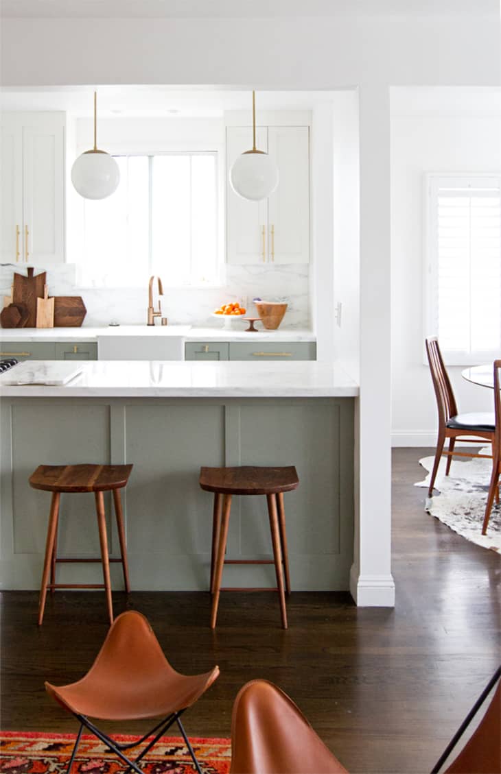
First, a two-toned by kitchen by Sarah Sherman Samuel, who’s kind of killing it right now. Imagine if that pretty mint green were on the upper cabinets as opposed to the lowers, and the room would be visually chaotic because your attention would go straight from the ground to the colored cabinetry, skipping over the entire white midsection of the room.
But as is, the eye harmoniously moves from the darkish wood floors, to the green island above, to the grayish marble counters and backsplash and finally to the white upper cabinets and ceiling. Sure, she ties in a pop of dark wood with the stools and cutting boards here and there, but it’s otherwise absolutely a progression from dark to light vertically, not unlike soil-trees-sky.
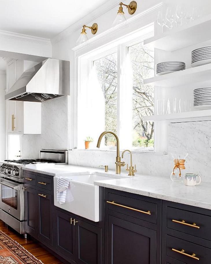
Here’s an even clearer cut illustration of this principle in a two-toned, tuxedo style kitchen from Elizabeth Lawson Design. Like the example above, if you inverted the colors, the room would become top-heavy and feel almost like it’s teetering. That’s because it makes more sense to ascend from dark to light than light to dark, at least in interiors. The deeper shades and materials found at the bottom of a space literally ground the brighter shades above.
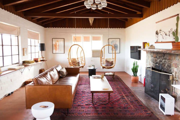
What have we here? Another living room (this one, from Inspiration for Decor) that’s a pretty good example of McCauley’s concept at work. Super dark floor and carpeting, darkish to almost white middle ground of furnishings and then white walls and ceiling. One thing to keep in mind is this rule isn’t saying you can’t have any colors at all. Just keep those more pigmented hues to the middle and edges of the room, as seen in the darker artwork and black shelfie accessories here.
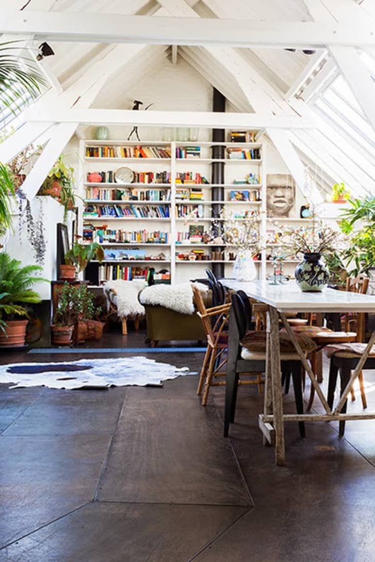
This insane open dining area meets living room meets library from Méchant Design is more of the same. Dark floor, pops of color on the perimeter, lofty white ceiling and beams for days. I’d move in.

Before you start thinking every example of this concept has to be black and white, here’s a dining room from A Beautiful Mess contributor Laura, who is making it work with blush pink walls and custom stained floors. She thinks the ebony colored flooring brings a modern edge to the space, and I’d have to agree.
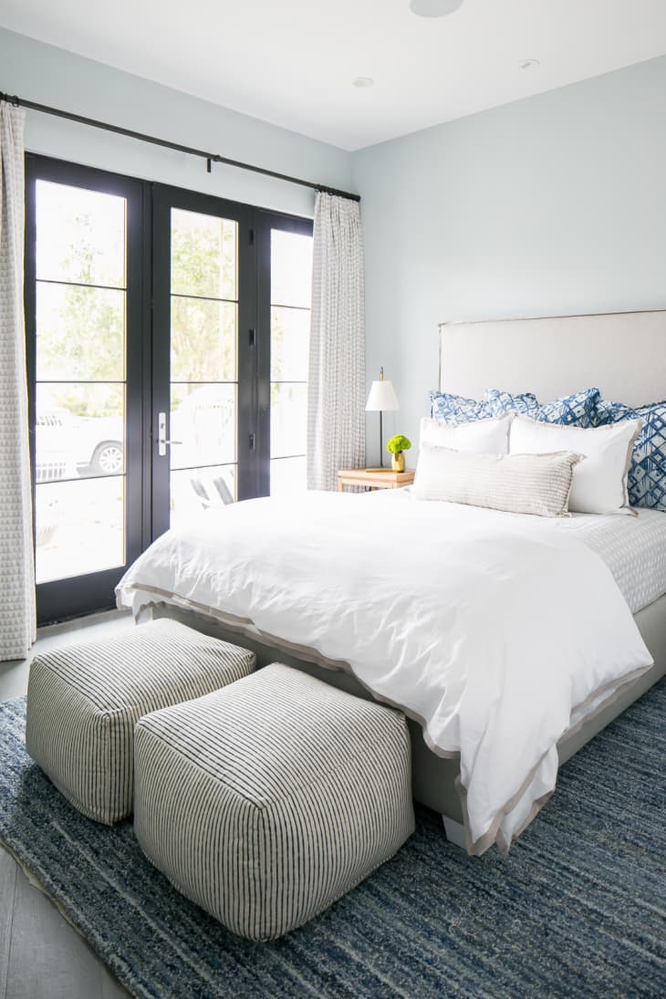
And this rule doesn’t always have to be high contrast either. if you like a more monochromatic scheme, it’s doable. Check out this blue bedroom by Brooke Wagner Design: denim chindi knit rug, followed by tan furnishings and whisper light sky blue walls up top.
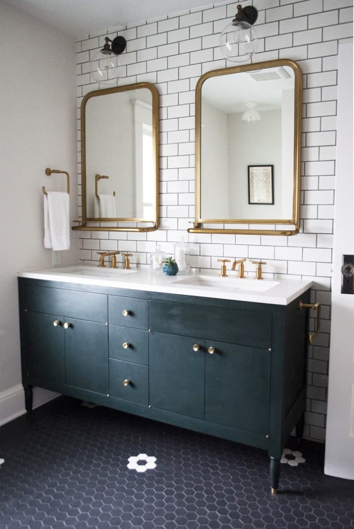
Bathrooms can get in on this design methodology, too. Though lots of bathing spaces tend to feature white, cream and light gray finishes simply because they look clean and bright, the black hex of this bath (via Aesthetic Oiseau) plays well with the medium tone green vanity set on top of it, which contrasts nicely with the white subway tile climbing up the sink wall. Dark to light strikes again!
So when you don’t know where to start, consider this ombre decorating tactic from McCauley. There’s not a lot of risk, since you’re kinda copying from nature, but there can be plenty of reward.
Design Defined
Never miss the style inspo and recommendations you crave with Design Defined. Follow along each week as our Home Director Danielle shares the best style advice, latest trends, and popular decor finds you just can't miss.