
Why Purple Is the Most Underrated Color for Interiors (& What Shades to Pair It With)

Not long ago, we proclaimed that blue was the most popular color in home decor. But if we had to take a guess as to what might be the most underrated? Well…that would be purple.
Purple seems to be a bit of a polarizing color: you either really love it, or you don’t. For the longest time, I fell in the “peeved by purple” camp, believing it had little place inside my home (in my closet, sure; in my living room, nah). But then, I fell in love with a piece of art that had swirling blue hues…and a hint of purple. And then, there was the lilac Moroccan rug I couldn’t walk away from at an antique market, and all of a sudden, I was a purple person. I’m certainly no cult-like purple follower now (I’m a hardcore blue lover), but I’ve grown to appreciate the unexpected appeal of a dash of grape here, a sprinkling of eggplant there.
It’s all about the shades you pair this blue-meets-red color with. To show you the power of purple, we’ve curated six great palettes where its the star.
Inspiration
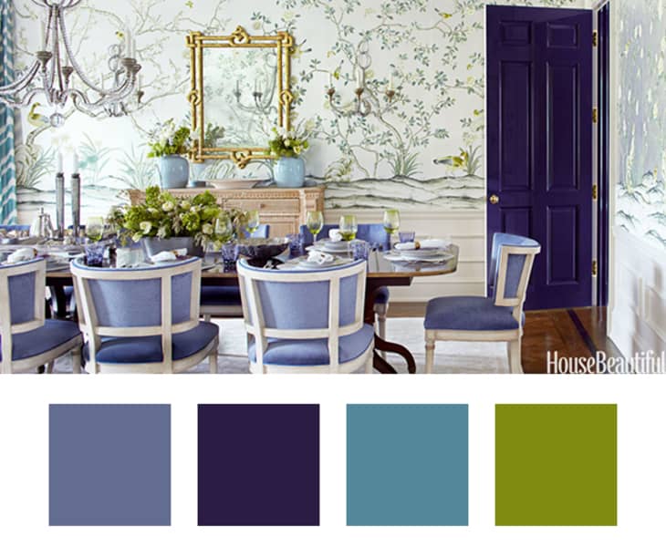
There are so many things to love about this dining room from House Beautiful. The stunning chinoiserie wallpaper, the crystal beaded chandelier, the barrel backed chairs…don’t make me pick. It’s the type of room that’s so beautiful, you don’t even really notice anything beyond how it makes you feel, like what colors make it up
Color Palette
This is a very straight-forward palette with little variation in color, which makes it quite easy to recreate in your own home. The periwinkle chairs (a color that can go a little blue or a little purple depending on the exact tone) do the heavy lifting here, but the deep-shaded door (a hue that makes me think “is it blue or is it purple”) adds a note of seriousness. The hint of aqua via the curtains and vases, along with the earthy green bring down the sweetness overall.
Inspiration
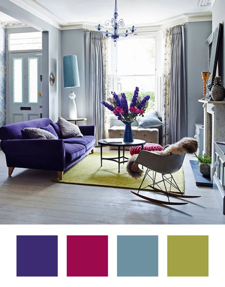
There’s something about this living room from Ideal Home that feels so European. It has that eclectic yet unexpectedly pulled together vibe that is hard to recreate but is oh-so-special when you get it right.
Color Palette
Keeping the base a dusty blue is key to pulling off a room with a statement-making violet sofa (echoed in the sprightly hyacinth on the coffee table). You really don’t need much of this punchy color, especially when you round it out with a little fuchsia and citron.
Inspiration
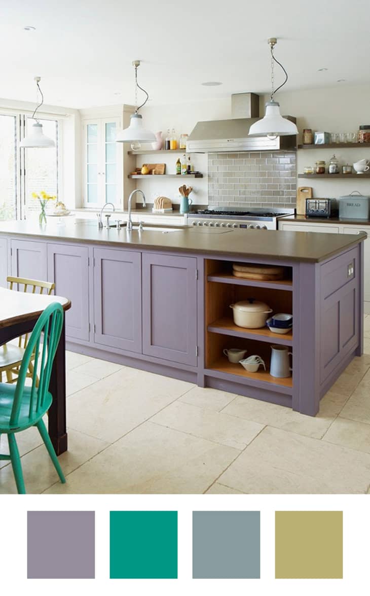
This might be my favorite palette out of the whole bunch. From Christopher Peters via Kitchn, it’s so happy and crisp and just feels like a spring day! Who wouldn’t want to whip up blueberry muffins and pastel-hued macarons in this space? The color combo would also be wonderful in just about any other room in the home.
Color Palette
Pastels are all the rage right now, but we’ve been seeing far more blushes and baby blues than lilacs. The addition of a saturated turquoise, a pop of Parisian blue and a touch of a yellow that’s just slightest bit green makes for a perky palette.
Inspiration
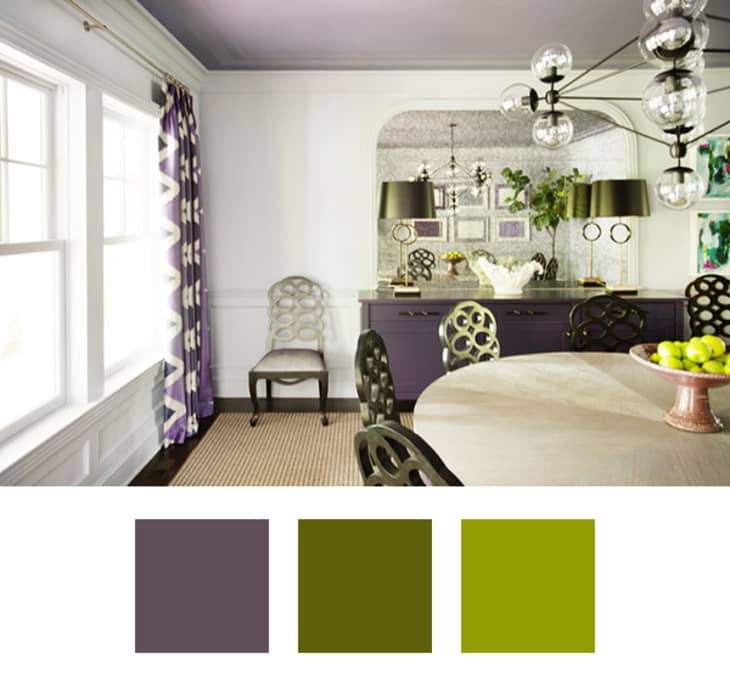
Purple can tend to come off feeling a little young, but designer Eileen Kathryn Boyd masterfully avoided the juvenile tendencies with a super sophisticated color pairing.
Color Palette
The key to this combination is the deep, stormy purple used. That keeps things super grown up. On top of plenty of white, throw in mossy and bright granny smith apple greens.
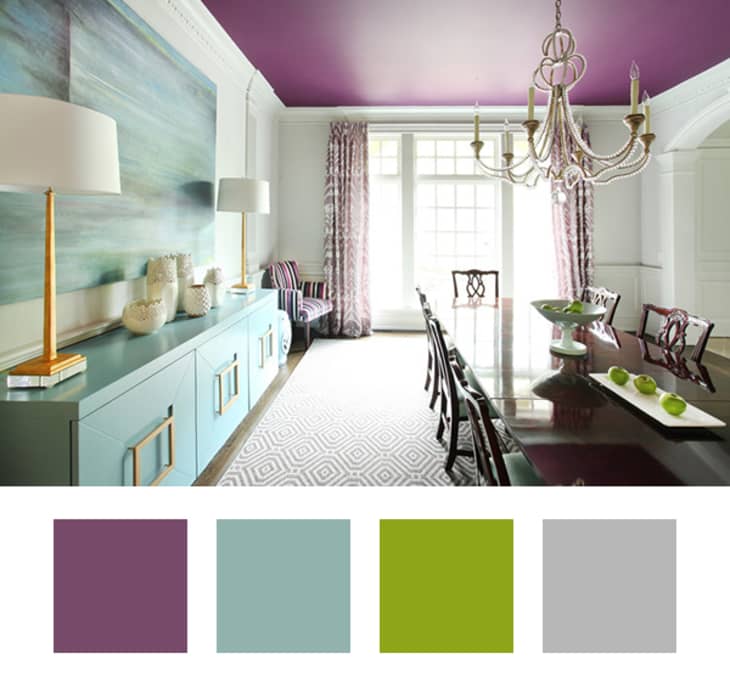
Inspiration
Another one by purple devotee Eileen Kathryn Boyd. The New York-based designer gave this formal dining room a total wow-factor with the unexpected brush of color on the ceiling, and echoed it in other textiles on furnishings and draperies.
Color Palette
Start with a base of plum-y purple (on the ceiling like Eileen if you’re bold!) and give it equal balance with a robin’s egg blue and white. Finish it off with just a touch of juicy apple green and some gray to keep things modern.
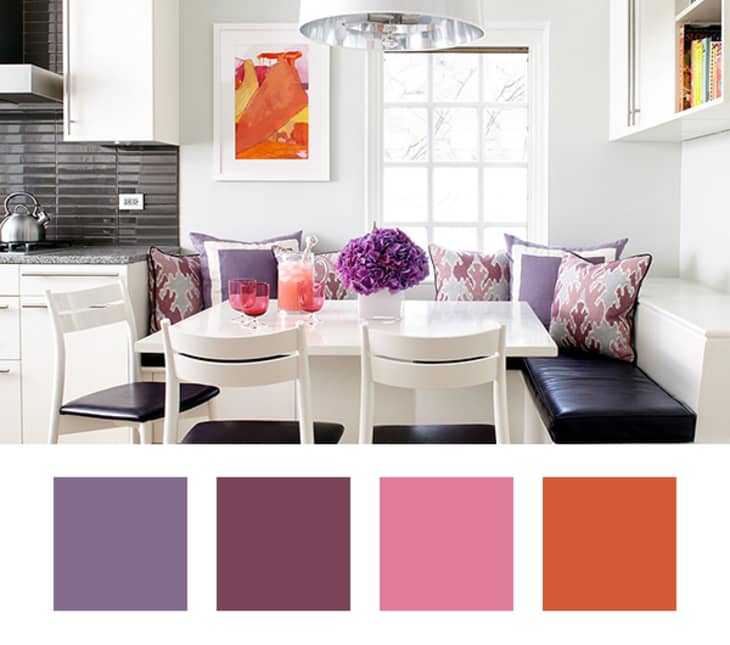
Inspiration
Now for a room that uses purple without green! From Midwest Living, a base of black and white is brought to life with varying shades of purple, pink and orange. The warm palette feels zippy and energetic, which is perfect for a breakfast nook to get your day started right!
Color Palette
Though there are a few different shades of purple at work here, the heather on the solid pillows stands out to me as the core color. That hue in particular is so great because it doesn’t feel too pastel-y, nor does it seem too grape-y; it’s just right! To that, add some plums and soft pinks for a nearly monochromatic look, then shake it up with a squeeze of orange.