
This $6 DIY Looks Like It Belongs in a Design Book, but It All Started with AI
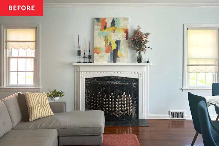
A fireplace is often the focal point of any room. And mine, well, was more of an afterthought. While the marble surround — a mix of rust and whites on a black background — is beautiful, the rest of the wood mantelpiece was a simple bright white that did nothing for the detailed moldings. I was ready to give this space the attention it deserved, and decided it needed a makeover.
To set things off, I upgraded the art above the mantel to InkPoster, a digital art frame, and wanted to ensure that whatever art I was displaying didn’t look as if it was floating above a cloud. As someone who works from a home office adorned in bright red peony wallpaper, my first thought was painting the whole fireplace in a bold color. But testing paint samples was not something I wanted to take on at the beginning of a school year. I had recently tried a few AI design programs to experiment with a dining room’s design. So once again, I experimented with Home Visualizer AI to settle on a new color.

I Tried to Let AI Pick My Fireplace Color
Because I love the glass candlestick holders my mom got me as a present, I knew these would stay. So it made sense to keep them in the photo I planned to upload to the AI design program (which you can see below). At the time, the InkPoster art on rotation was Vincent van Gogh’s “Head of a Skeleton with a Burning Cigarette,” and I went with the neural color palette so it wouldn’t distract too much from the paint colors.
Instead of using Home Visualizer AI’s “Custom” option, I went into “Paint Mode,” which lets you select actual colors from paint brands like Benjamin Moore, Behr, Farrow & Ball, and Sherwin-Williams, among others, and apply them to specific parts of the room, such as walls, ceiling, and trim. As the living room is adjacent to a dining room converted into a piano room with green William Morris wallpaper, I first opted for green to tie it together. I chose a soft shade, Benjamin Moore’s Let it Rain (639), for the mantel; a white with pink undertones, Gardenia (AF-10), for the walls; and a warm gray, Wind’s Breath (OC-24), for the trim (below left). The green didn’t feel quite right, but I thought something a bit moodier but still neutral could work. With a click of the “Visualize” button, the surround changed to Benjamin Moore’s Amethyst Sky (1447) (below right). To me, though, the mauve color looked a bit drab.


Then Things Got a Little Too Ambitious
I then decided to jump back to the “Custom” option to try to elevate the entire setup by adding more molding detail. The prompt read as follows: “Soft cream wall color and a coordinating natural beige or taupe trim, with an eye-catching fireplace color that is timeless but also impactful. The marble fireplace surround will stay exactly the same. I would like to add sconces on each side. Add interesting molding to the top of the fireplace mantel in a way that frames the art.”
The result looked like a macabre shrine (below left). No, thank you! I was disappointed by the fact that this beige was supposed to be so “eye-catching.” Similar to my last time running something through the system, I had to give the AI more direction as to what I liked personally, and specify, specify, specify.


I Asked for More Charm and Details
For the next version, I typed in: “Paint the wall Little Greene’s China Clay [a warm white] and the fireplace mantel in Little Greene’s Ashes of Roses [a soft brownish red]. The trim should be a coordinating color that goes with both China Clay and Ashes of Roses. Add molding above the fireplace, but it should be delicate and contemporary, with arches and almost Art Nouveau. Frame the fireplace with modern sconces.”
While the more pigmented, almost burgundy red of Ashes of Roses didn’t come through, I was immediately drawn to the dusty pink and the romantic archways of the molding (above right). I hadn’t even considered scroll-like details in the past, and this arrangement set me on to a whole new side project of creating beautiful molding details in the future. My husband, however, said that because the piano room already had the Little Greene’s Light Peach Blossom on the walls, he wanted something less delicate in this space.


I Then Asked AI to Go Back in Time
So I asked the program to design this fireplace mantel in the original style and period of my 1938 French Normandy home in Cleveland, Ohio. The romantic frills were stripped down to natural wood, and the new fireplace made me think that it could belong in Indiana Jones’ study (above left). At this point, I started to get a bit burned out with all the color variations. We completely nixed the blue family because my previous house had a blue fireplace mantel, and I already have too many elements in different sky hues, including a Smurf Blue bathroom.
In a final attempt, I went with terracotta for its earthy but still vibrant hue, which has been trending in interiors. I was hoping for something inspired by Georgia O’Keeffe’s New Mexico landscapes. The request read like this: “I want the fireplace mantel to be painted a terracotta color. The walls should be a buttery hue with a sandy trim. Above the fireplace mantel, create interesting molding detail with an arch and an Art Deco influence. It should be airy and not heavy or archaic-looking. Frame the fireplace with two sconces in a 1940s style.” The result? Interesting, but no (above right).

The $6 Solution Was Much Simpler
At that point, I called it a night. The next morning, I lamented to my husband how all those colors looked like they would be too much. I didn’t want something neutral, but I wasn’t ready for a jewel tone. But the state of the all-white fireplace made me sad every time I looked at it.
And then, my husband came up with a brilliant idea. Why not just paint the accent details and leave the rest as is? We can always change the color of the surround and the mantel when we repaint the living room down the road one day.
AI Was All Wrong in the End — But It Helped Me to This Two-Toned Look
Still wearing my pajamas, I darted to the basement and came back with a sample jar of Benjamin Moore’s Silhouette (AF-655), an espresso hue with notes of charcoal. Using art brushes, I outlined the dentil molding and the half-rounded trim. The entire project took me an hour max and just $6.
I love how it contrasts with the marble surround and plays up the details of the fireplace screen. It also doesn’t compete or clash with any artwork I change on my InkPoster. Sometimes you need to jump through the hoops of seeing all possibilities to feel confident that even a simple solution can make the greatest impact.