
Before & After: A Boring Bathroom Gets Some Dark Drama
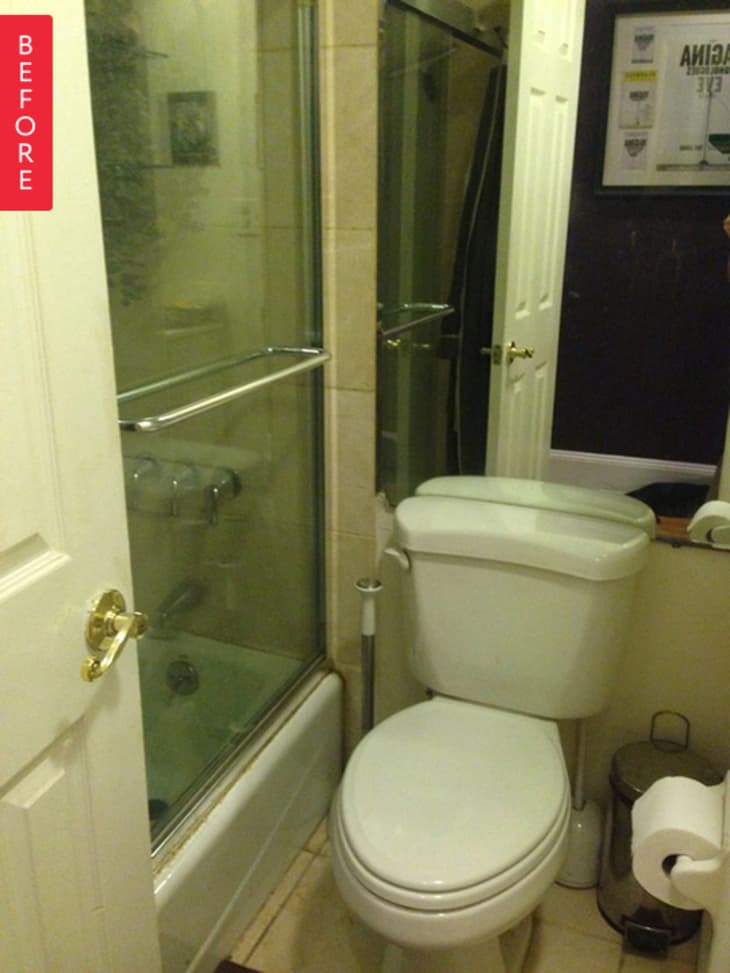
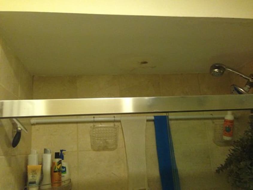
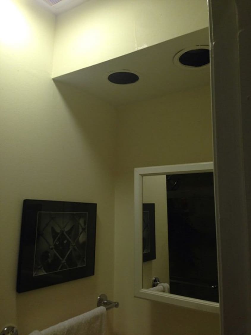
This is Marissa’s old bathroom. It’s certainly not the worst ‘before’ we’ve seen here on Apartment Therapy — but beneath its bland, dingy-80s exterior lurked a nasty surprise. The previous owner of Marissa’s co-op spent a lot of time away from home, and didn’t realize that leaks were causing extensive water damage. On top of that, the random dropped ceilings were making this tiny space even more claustrophobic. It was time for a change.

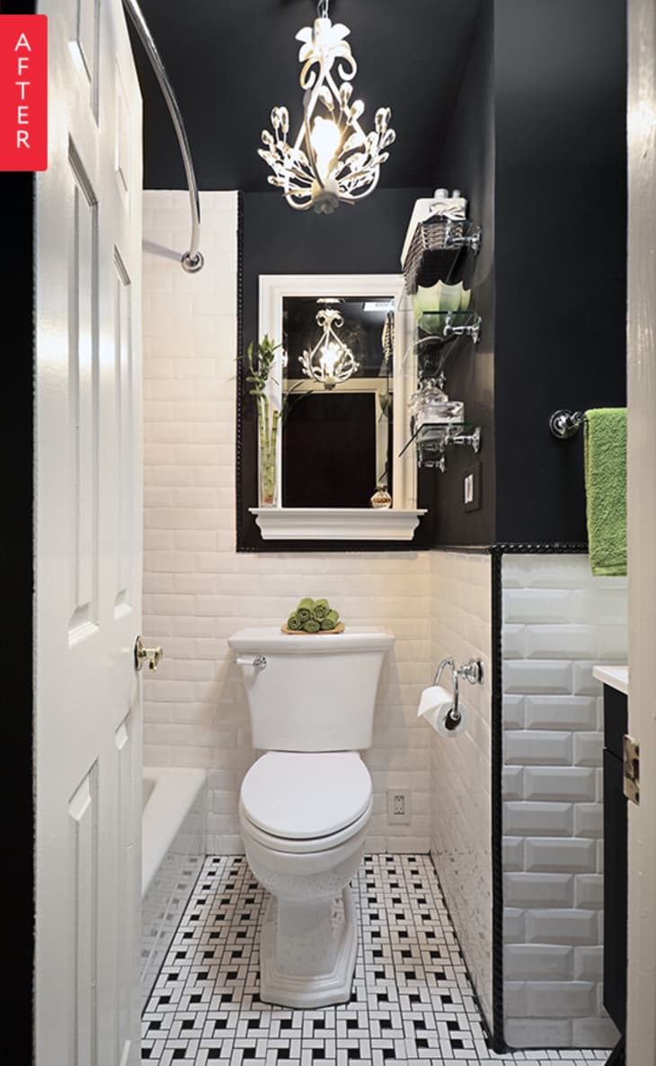
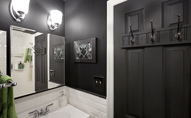
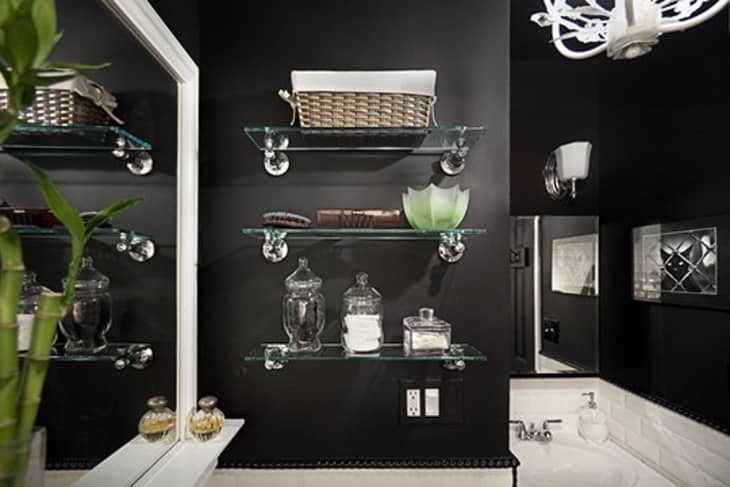
Can you believe this is the same bathroom? Marissa, who worked for years as a lighting designer for off Broadway productions, had an unconventional idea for making this small bathroom seem more spacious. From her theater days she knew that in small rooms without natural light, painting the walls a very dark color actually helps to visually enlarge the space (since the dark walls appear to recede from the viewer).
Pulling down the dropped ceilings was a bit of a gamble — Mark warned Marissa that if they pulled down the ceilings and they turned out to conceal plumbing or electrical work, money would have to be added to the budget to re-create them. But, fortunately, the dropped ceiling turned out to be a cost-cutting measure by a former renovator, and completely unnecessary. Having that extra ceiling height goes a long way towards opening up the space.
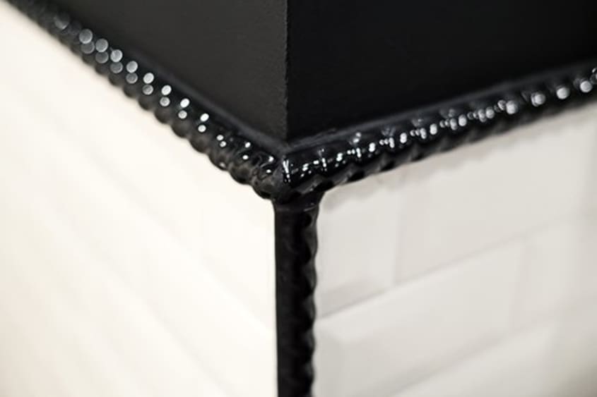
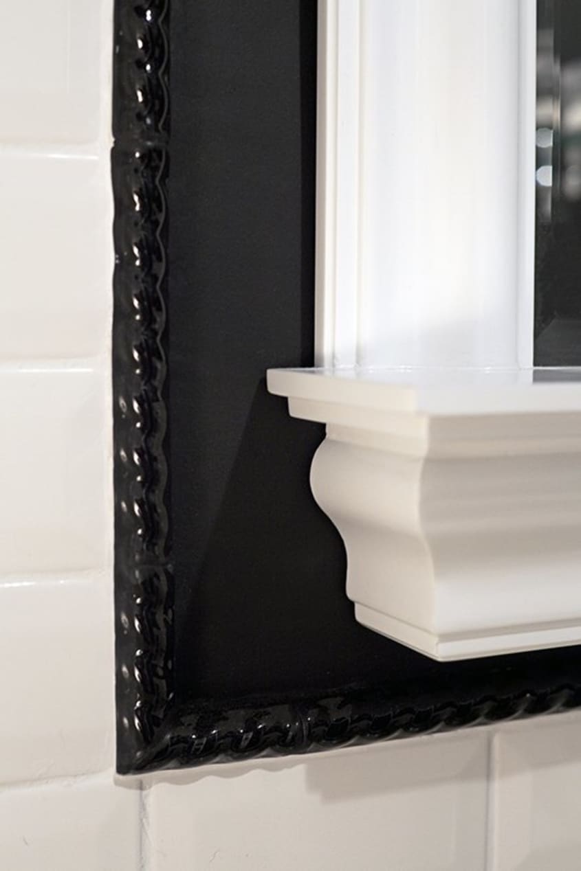
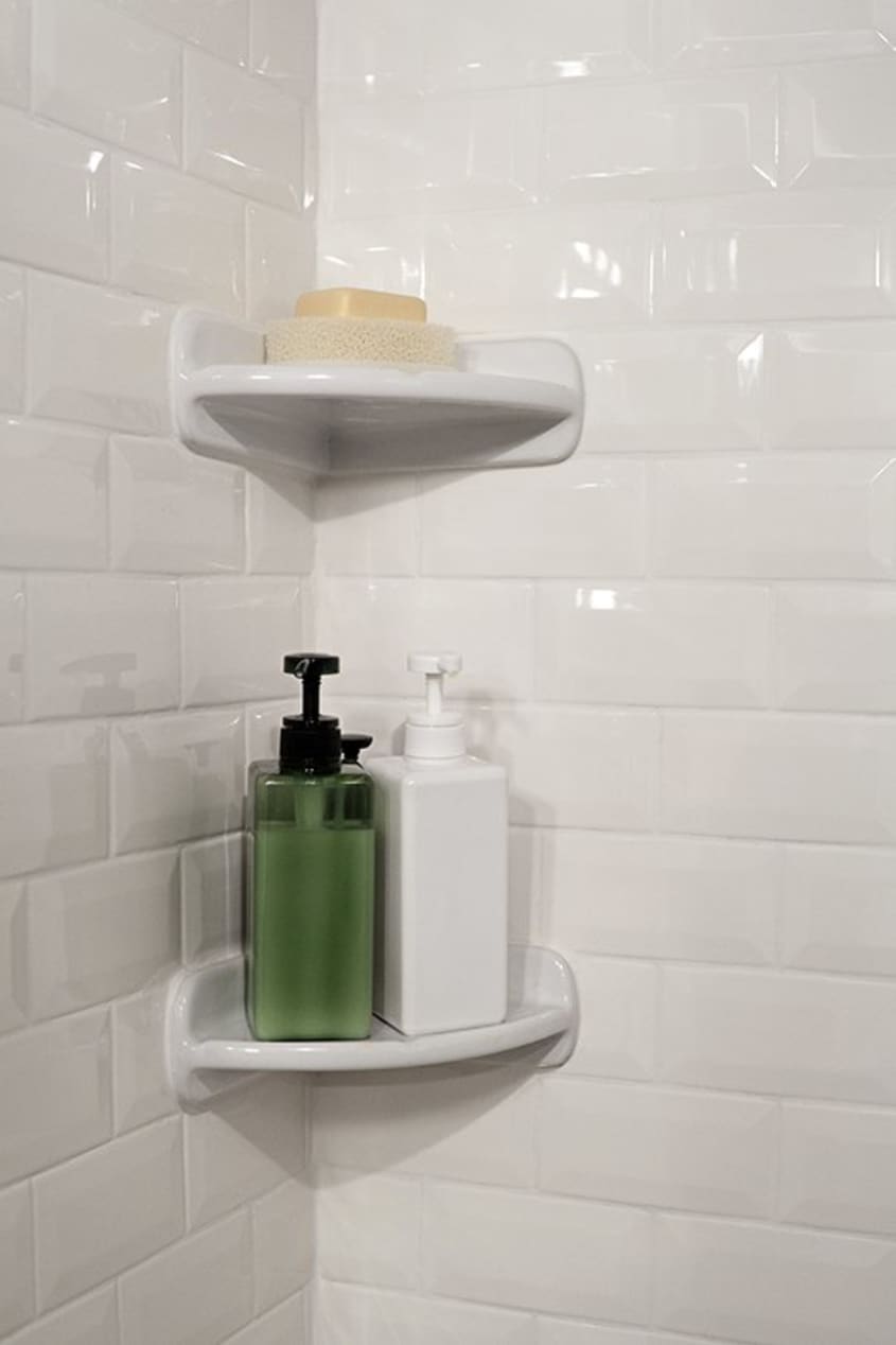
Elsewhere in the bathroom, little details make a big impact. To keep the budget down, Marissa kept the old tub and the old vanity, which was painted black to match the new bathroom, and to conceal dings. She liked the idea of subway tile, but, as a New Yorker, wanted something that was a little removed from the actual subway, hence the choice of the beveled tile. The basketweave pattern on the floor is very classic New York, and the black rope tile border adds a little touch of glamour.
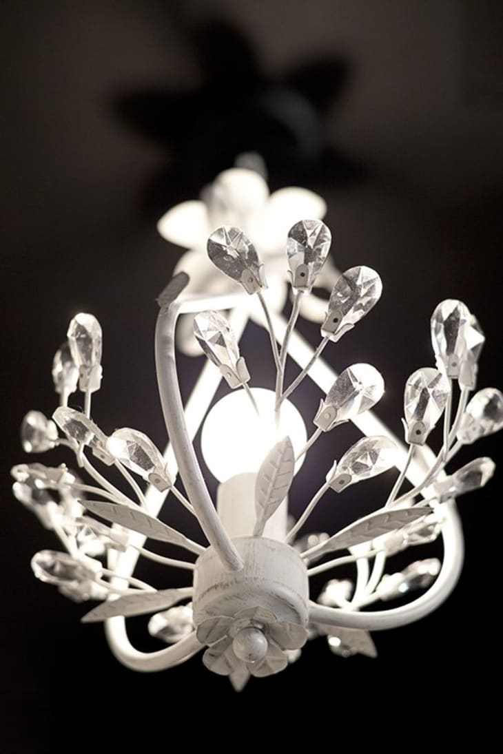
And of course it’s no surprise that Marissa, a lighting designer, has great taste in lighting. The sconces above the vanity, and especially the chandelier, are the perfect finishiing touch.
To see sources and read more about this project, visit the project page on Sweeten.