Before & After: Bold Bathroom Color Choices

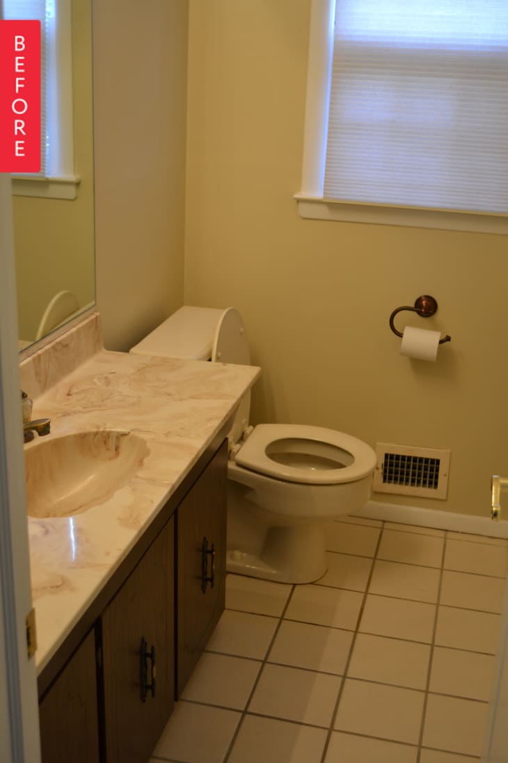
Our 1961 Colonial house on Long Island had orange shag carpeting and some delightful fixtures when we purchased it in 2013. We ended up renovating nearly every room in the house, but it’s taken all this time for me to finish decorating! The room I’m sharing is our powder room. It had a shell shaped sink in the shortest vanity I’ve ever seen when we started.
I decided to use the small space to get dramatic with color. The walls are painted Benjamin Moore AF 510- Dragonfly, a gorgeous deep blue green. The vanity is Kohler Devonshire, that I reused from a different bathroom in the house. The mirror was a splurge from Restoration Hardware. The flooring is natural slate from Walker Zanger that is in the kitchen, powder room and entry way of the house.
The walls were bare for a long time, until I decided to DIY some Pantone color chips (I’m a costume designer who works with Pantone all the time, I have a lot of affection for the books!) Because Michael’s inexplicably sold the canvases in a 7 pack, I used 6 in a grid on one wall, and then used the wall paint on the 7th. I had fun color matching my chosen colors to pantone numbers.
Soon after I completed the Pantone chips, I saw the Apartment Therapy post about the NASA classic travel posters and realized that one of them fit my existing color scheme perfectly! I printed the poster at Staples, grabbed a RIBBA frame from IKEA and I finally feel like I’ve finished my powder room.
Thank you, Colleen!
