
A “Boring” 2000s Kitchen Gets a Bold, Color-Drenched Makeover (No Reno Required!)
They say the kitchen is the heart of the home — but it’s also very often the most time-consuming and expensive space to update. So as long as it’s functional, the kitchen tends to end up at the very bottom of a renovation to-do list.
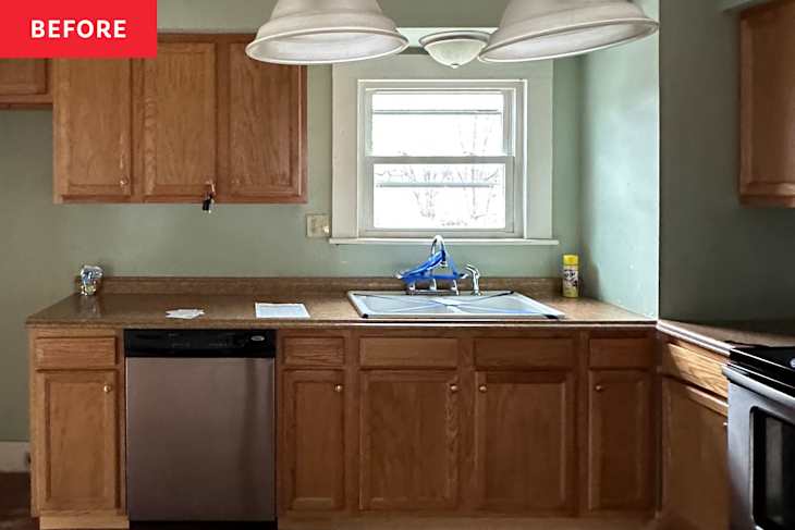
This was exactly the case for the 1920s fixer-upper designer Jordyn Garcia and her husband recently purchased as a summer home in Maine. “We’ll be updating it space by space, summer by summer,” Jordyn says. “Out of all the rooms in the house, the kitchen is actually in the best shape, so it’s last on our list to remodel.”
Still, the couple wanted a kitchen they actually liked looking at — even if only temporarily — before tackling a full renovation. According to Jordyn, the space hadn’t been updated since the early 2000s, complete with what she calls “a boring paint color and a hodgepodge of builder-grade selections.” So instead of remodeling, they opted for a refresh, with two main goals in mind: adding function and infusing personality.


With ’90s nostalgia and The Parent Trap’s summer-camp energy as inspiration, Jordyn set out to create a kitchen the couple could enjoy for the next few years — all within a $1,000 budget. (Spoiler alert: She actually came in under budget!)
Color Drenching for Bold Impact
The transformation began with a challenge. “When my husband was heading out of town for four days, I told him I’d have the kitchen painted by the time he was back,” Jordyn recalls. “He said, ‘Yeah, right,’ and I accepted the challenge.”
With just 14 minutes to spare, Jordyn finished painting the walls, ceiling, and trim — fully committing to color-drenching the space. As a designer who’s building her business around helping people ditch millennial gray, going bold felt like a natural choice. “I think people are tired of our spaces all looking the same,” she says. “We’re ready to return to more colorful and unique homes.”


To land on the right shade, Jordyn let the existing materials guide her. “The laminate countertops have warm mauve and plum undertones,” she explains. Knowing she had to work with the existing floors, cabinetry, appliances, and counters, she leaned into those hues. Farrow & Ball’s Preference Red was the perfect rich reddish shade with a traditional feel that matched the rest of the house.
Color drenching also helped disguise the kitchen’s bulky soffit. By painting it with the same color, Jordyn visually minimized the feature — it practically blends into the background. This paint job is the perfect example of a high-impact change at a relatively low cost.
Adding Surface Area Without Changing the Layout
Because a full remodel is still years away, improving function without altering the floor plan was key. The original L-shaped layout lacked a center point. So Jordyn turned to Facebook Marketplace and struck gold: a solid oak island and stool set that happened to closely match the existing cabinetry, for just $50. “Before, we treated the kitchen like a grab-and-go fridge,” she says. “Having a central island completely changed how we use the space.” Now there’s a hub for everything from morning coffee to casual dinners.

Small Swaps That Make a Big Difference
While the paint and island do much of the heavy lifting, the details are what complete the look. Jordyn focused on small, renter- and budget-friendly updates with big visual impact. “Replacing cabinet knobs is the easiest removable DIY in a kitchen,” she says. Swapping out the old nickel hardware for white ceramic knobs added visual contrast and a charming vibe (and they tie in perfectly with the existing faucet handles!).
She also replaced the builder-grade flush-mount light fixture over the sink with a more sculptural, playful fixture from Urban Outfitters — a small change that brought in an extra layer of personality and intention.
Final Touches Layer in Warmth and Character
To finish the refresh, Jordyn added warmth through textiles and vintage finds. Cafe curtains, an extra-long runner, and locally sourced antiques softened the space and made it feel lived-in. “The café curtains were just $20 and made such a difference,” she says. An eight-foot runner with a modern grid pattern helps ground the space and lessens the contrast between the tones of the wooden cabinets and the floors — something Jordyn plans to address later during a remodel.


To put the final touches on the space, she thrifted decorative objects and cookbooks, borrowed a vase from her mom, and splurged on one standout detail: custom-framed artwork. “My local frame shop had mauve and magenta lacquered glossy frames that I fell in love with,” she admits.
Once a kitchen used only long enough to grab a snack, the space has become somewhere worth lingering in. “I’m obsessed with my plum kitchen,” Jordyn says. “I can see myself enjoying it for years to come.”
Design Defined
Never miss the style inspo and recommendations you crave with Design Defined. Follow along each week as our Home Director Danielle shares the best style advice, latest trends, and popular decor finds you just can't miss.