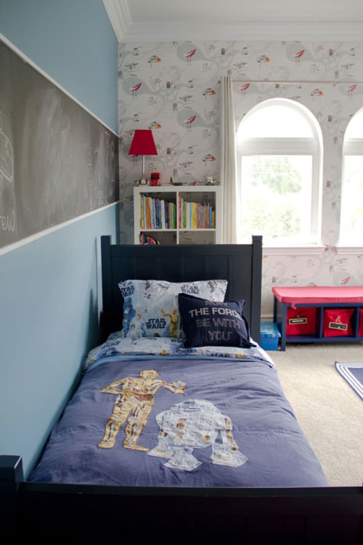
Cameron’s Contemporary Room with Graphic Wallpaper
Name: Cameron (5)
Location: Sherman Oaks, CA
Room Size: 16′ x 16′
Now that Cameron is five years old, he wanted a cool, big boy room. The room is definitely all boy and the graphic wallpaper and bold colors give it a more modern aesthetic. The space is pretty large for child’s room, so his parents were faced with the challenge of dividing up the room into different play areas. Designer Shirry Dolgin helped bring the design together to create a special room for Cameron.
How would you define the style of the room?
Parents: We’d describe it as contemporary with a fun twist.
Shirry: Youthful and contemporary. The rest of the home has a clean California transitional feel, but this room has a punch of youthfulness!!
What was the inspiration for the space?
Parents: Since Cameron had recently started kindergarten, he wanted more of a “big boy” room. He has a very cool work desk that he uses daily for his art projects and a great reading nook with shelves for all his books. The chalkboard is a great space to practice all the things he learned in school in a fun way.
Shirry: Honestly when I saw the space for the first time, it was a pale, beige, and dull room. Wallpaper was the jumping off point, and I happened to find this cool and contemporary spaceship wallpaper. Sort of “Jetsons” like.
How did you decide on the color scheme?
Parents: Blue is his favorite color, so he chose that for his walls along with wallpaper for one wall.
Shirry: Once I got the clients on board with the wallpaper, which had a bright white background, I decided to select a bold hue of blue to offset the wall covering. It was a VERY specific blue because we didn’t want it to feel like a typical boy’s room. I then picked up on the little bit of bright red from the wallpaper and decided that would be the perfect accent color. Luckily Cameron’s room gets a huge amount of natural light and the ceilings are over 10 feet high, so going this bold seemed to ground the room properly.
I love the wallpaper choice! What are some tips for using wallpaper in a kid’s room when the design changes so often?
Parents: The wallpaper choice was all Shirry! It’s absolutely perfect. He loves robots, space and aliens so it’s a great choice that should last even when he’s older.
Shirry: The best tip I can give would be to select one or two clean walls to use the wallpaper as an accent. What I mean by clean is a wall that’s either symmetrically divided by windows or a wall that doesn’t have a bunch of doors in it. It’s hard to get the full impact of a wallpaper that has a bold pattern if it keeps getting interrupted by doors.
The room seems to be very organized for a kid’s room. What are a few tips for maximizing storage in a children’s room?
Parents: Storage was a big hurdle for us. We found a combination of storage bins built into benches along with toy bins to be an effective solution to store toys out of the way and yet be easily accessible.
Shirry: It can be very tricky, but organizing a kid’s room really has to do with making sure similar things are bundled together and that there is a fair amount of closed storage. For instance, keep all the books in one designated area and get small jars to organize little figurines and toy parts.
What was the biggest challenge when designing the space?
Parents: Where to place his bed in the room. Being on the second floor and having four large windows, we couldn’t put the bed next to any of the windows. In the end, Shirry put the bed on the longest wall and created a little reading nook in the corner for him. It’s sort of his little hide out!
Shirry: I would say the biggest challenge was figuring out the space plan. I wanted to leave the center of the room open for Cameron to be able to play, but at the same time create little zones in the room. I did this by bringing focus to the desk area by placing it on the wallpaper wall in a bright red which contrasts the rest of the blue furniture. I also decided to create an element of play above the bed with the chalk stripe and the zig zag shelves in bright red above the dresser.
How do you see the design transitioning as Cameron gets older?
Parents: Some elements such as the painted walls could remain the same while the chalkboard and wallpaper could be removed and changed for something else. Furniture will likely change as he grows and his needs change.
Shirry: I think it’s just a matter of what Cameron is interested in. Simple things like bedding, wallpaper, and paint are inexpensive ways to change the look of the room as time goes on. Then larger pieces like the bed and dresser and get replaced over a longer period of time.
Sources:
- Furniture: Pottery Barn
- Wallpaper: Graham & Brown
- Paint: Benjamin Moore
- Red Desk and Red Shelves: Ikea
- Drapery: Ikea
Thanks Cameron!
(Images: Erika Bierman)
• MORE KIDS’ ROOMS ON APARTMENT THERAPY
• SUBMIT A BABY OR KID’S SPACE
