
10 Gray Paint Colors That Are Anything but Boring, According to Designers
Gray paint has earned a bad reputation over the past few years, but designers aren’t ready to discount it altogether. While the all-gray-everything era may be officially in the past, design pros still love using this classic neutral paint in both their and clients’ homes. Light and airy grays offer a fresh alternative to classic off-white, adding subtle depth and dimension. Medium grays can ground a space, while darker shades bring drama and work beautifully as accents.
The trick to using gray paint in the home, according to interior designers, is to use it sparingly and with intention. Overusing gray may leave a space feeling cold, sterile and impersonal — a common criticism of the “millennial gray” aesthetic. Today, gray paint is used thoughtfully, with balance and personality guiding every design decision.
Like many other modern color trends, designers are currently favoring warm grays over cooler shades, explains Caroline Kopp, founder and principal designer of Caroline Kopp Interior Design. “They give a soothing feel that a cold gray never will.”
If you’re looking to add sophisticated gray hues into your home, designers say these 10 paint colors are the best place to start. From barely there light grays to moody and dramatic shades, here are the top gray paints that interior designers return to again and again.

Best Light Gray Paint Colors
You can’t go wrong with light gray. Like classic white, light gray paint is versatile, adaptable, and enduringly timeless. It can help make any room feel bright, open, and airy while also feeling fresh and modern. For designers, soft grays and warm greiges make up the majority of their light gray paint favorites list.

1. Benjamin Moore’s Classic Gray
If you’re looking for an airy, barely there shade of gray, Classic Gray (1548) is the paint for you. It sits on the edge of light gray and off-white, with warm undertones and a natural, earthy feel. For Kopp, this light gray paint strikes the perfect balance between beige and gray, making it one of her design go-tos.
“It changes tones depending on the light, but never goes depressing or dirty — it always stays light and soft … I love it for a guest room or a boys’ room, it can also suit a dining room and work with colorful art,” she says.

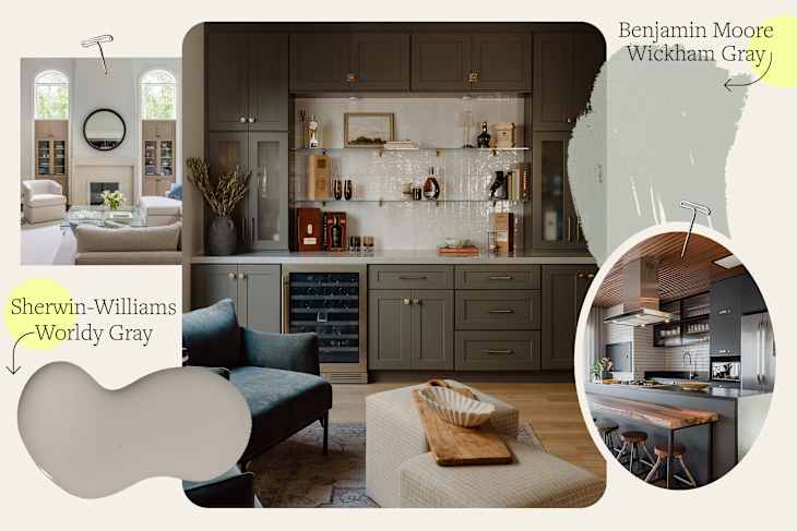
2. Benjamin Moore’s Wickham Gray
Another light and breezy pick, Wickham Gray (HC-171) is actually cool-toned, with subtle blue undertones. Sydney Levy, designer at Anthony Wilder Design/Build in Maryland, loves it for its bright, light-reflective qualities.
“Wickham Gray is a soft, light gray that brings subtle depth to large living spaces, such as in a recent living room renovation project [shown above],” she says. “It’s airy, elegant, and versatile, ideal for creating an inviting atmosphere.”
Use it instead of your usual go-to white paint for some added dimension and sophistication in your space.

3. Sherwin-Williams’ Repose Gray
Similarly warm in tone, but a touch darker than the nearly white Classic Gray above, is Sherwin-Williams’ Repose Gray (SW 7015). “Repose Gray is such a great neutral. It has a little depth while still keeping any space feeling light and refreshed. There’s just enough warmth in it to play nicely with both warm and cool tones, which makes it so versatile,” says Sallie Lord, founder and principal designer of Virginia-based GreyHunt Interiors.
Its warmth and brightness make this gray an excellent pick for any room, but it’s especially popular as an alternative to classic white in living rooms, bedrooms, and hallways.
Best Medium Gray Paint Colors
Looking for something a little more saturated? Medium-toned gray paint can be a great way to ground a space and add some depth without overwhelming a room in bold color. Designers love these medium gray paint colors for their versatility, richness, and timeless appeal.

4. Benjamin Moore’s Galveston Gray
Galveston Gray (AC-27), also known as Graystone (1475), is a gorgeous mid-tone gray inspired by the pale gray shales embedded in America’s coastlines. It features slight green undertones and a subtle warmth that leaves this gray paint feeling earthy, organic, and cozy, explains Tracy Morris, founder and principal designer of Virginia-based Tracy Morris Design.
“It is versatile in many locations and tends to take on the color of the surrounding areas. This shade has a lot of depth, so I prefer to use this color in smaller spaces or kitchen cabinets,” she adds.

5. Sherwin-Williams’ Worldly Gray
Is it beige? Is it gray? Sherwin-Williams’ Worldly Gray (SW 7043) will keep you guessing as a fabulous greige, similar to a pewter tone. Slightly lighter than Galveston Gray but just as warm and inviting, Morris points to the shade as another one of her top gray paint picks.
“I used to refer to this paint color as the ‘blue jeans’ of gray paints. If you are looking for a perfect, deeper tone for your walls, look no further than Worldly Gray,” she says.
Thanks to its warm undertones, it pairs seamlessly with numerous other colors, from earthy palettes to coastal-inspired hues. It works well on walls, trim, cabinetry, and more.

6. Sherwin-Williams’ Dovetail
Dovetail (SW 7018) is a warm, rich, and soothing gray that is just as versatile as it is cozy. It possesses an organic quality that lends it well to a variety of decorating styles. Lord loves using Dovetail in bedrooms to create a quiet and relaxing atmosphere.
“There’s a warmth and richness in this gray that makes the perfect contrast for this bedroom,” Lord explains. “It creates a peaceful background that feels like the best kind of retreat.”

7. Sherwin-Williams’ Modern Gray
If a midtone greige is what you’re after, look no further than Sherwin-Williams’ Modern Gray (SW 7632). This warm and earthy medium gray paint feels balanced and cozy at the same time, making it a great option for bedrooms and living spaces alike.
“Modern Gray is my absolute favorite gray color to use. It is timeless and fresh, but soft all the same,” says Katalin Farnady, principal designer of Farnady Interiors in Annapolis, Maryland.
Try it on the walls or use it to accentuate trim and molding in your space. It can also make a great choice for cabinetry, whether you’re redoing your bathroom or repainting your kitchen cabinets.
Best Dark Gray Paint Colors
Get ready to bring the drama! These dark gray paint colors are rich, moody, and effortlessly timeless. Designers love them as stylish alternatives to black — perfect for creating striking accents in any space. Pros also love these dark gray paint colors on vanities and kitchen cabinets for a pop of unexpected contrast.

8. Benjamin Moore’s Iron Mountain
Iron Mountain (2134-30) is one of Benjamin Moore’s best-selling paint colors, and it’s not hard to see why. This shade of dark gray offers warmth and drama without overpowering an entire space.
“Iron Mountain is the perfect dark gray, bold without being as stark as black,” says Levy. “We recently used it in a high-gloss finish for a powder room vanity, and it added just the right amount of drama and sophistication.”

9. Benjamin Moore’s Ashwood Moss
If you love grays that lean fully into earth-rooted tones, you have to try Ashwood Moss (1484) by Benjamin Moore. According to Joyce Huston, cofounder and lead interior designer at Decorilla, this moody shade is the perfect ensemble of green-meets-gray — a graphite gray with prominent green undertones that’s reminiscent of dark, deeply veiled forests.
“It’s got the maturity and drama of gray with the underlying warmth and richness of green,” Huston explains. “What I love about Ashwood Moss is how beautifully it can be layered alongside natural tones like lighter shades of green and soft, sandy creams.”

10. Sherwin-Williams’ Iron Ore
The darkest shade on this list, Iron Ore (SW 7069) is a true charcoal gray that’s ideal for those who want moody contrast without leaning all the way into black.
“Iron Ore is not for the faint of heart: Its opulent boldness makes it an excellent choice for people who want to make a strong statement in their palettes,” Huston declares. “I particularly like Iron Ore on kitchen cabinets to give a kitchen a dramatic edge.”
Design Defined
Never miss the style inspo and recommendations you crave with Design Defined. Follow along each week as our Home Director Danielle shares the best style advice, latest trends, and popular decor finds you just can't miss.