
What Are Earth Tones, and How Can They Work in Your Home?

Choosing the right color palette for your home can make all the difference. If you’re feeling lost or completely overwhelmed by the endless options, don’t stress — instead, try sticking to earth tones. These calming and versatile hues give off a timeless appeal and complement any style.
Earth tones are a step up from more minimalist shades: Instead of playing it safe with simple whites or neutrals, you can pull off even more of a soothing space with rich browns or greens inspired by the natural world. “Earth tones are warm, inviting, and resemble colors found in the earth such as brown soil, multi-colored leaves, and luxurious skies,” says Erika Woelfel, Behr’s vice president of color and creative services.
For a better understanding of what works best for your home, I consulted a range of experts on the best earthy color palettes and how to style them. Check out their ideas below, plus inspiration for pairing various shades.
What’s Considered an Earth Tone?
Earth tones are all derived from nature; they help anchor a room and make things extra comfortable. “Leaning more rustic and organic, these softer hues tend to have a toasted, warming quality,” explains Arianna Barone, color marketing manager at Benjamin Moore. “Think easygoing sages, deep browns, creamy off-whites, sunbaked clays, cozy ochres, earthy neutrals, and blues that fall warmer with touches of green or gray.”
Another popular route is drawing inspiration from golden hour, aka using sunset-like tints that are bold and eye-catching, yet simultaneously peaceful. “Warm reds like terracotta and rust capture the essence of the earth and contribute to a serene, grounded atmosphere,” adds interior designer Mikel Welch.
Which Paint Colors Pair Well with Earth Tones?
The key to layering with earth tones is subtlety. You want to make sure you’re not going overboard with loud, bright hues that’ll detract from any tranquil, nature-inspired colors. “They pair beautifully with whites, off-whites, and grays, creating a soft, harmonious look that feels gentle and sophisticated,” says Welch.
“To add a touch of contrast, use blues, navy, and charcoal,” he continues. “Metallics like brass, bronze, and copper bring a touch of elegance to the palette. For a hint of subtle color, introduce soft pastels like blush pink, muted blues, and gentle lavenders, as they complement earth tones without overpowering them.”
How to Create a Color Palette with Earth Tones
When it comes to pairing earth tones, brown, cream, and sage are a classic combination. “You can’t go wrong with these colors,” says Erin Banta, co-founder of Pepper Home. Plus, if the goal is to bring the outside in, this palette does exactly that.
On the flip side, don’t be afraid to go for the unexpected. “We’ve noticed a shift of people looking to incorporate more personality and depth, whether painting the whole wall or adding an accent,” Woelfel mentions. “To create a one-of-a-kind palette of earth tones, I recommend leveraging a bold pop of color such as Rumors (Behr’s 2025 Color of the Year), Jackfruit, or Aerial View with warm neutrals like Blank Canvas, Even Better Beige, and Nutmeg Frost.”
How to Style Earth Tones in Your Home
Beyond earth-hued paint colors, consider decorating with daring fabrics and striking details. “After starting with a neutral base like our cream grasscloth wallpaper or an ivory sofa, add brown furniture,” Banta says. “Then, top off the look with sage pillows and printed curtains for a touch of pattern and color. Moreover, earth tones shine when paired with texture, so mix in velvet pillows, jute rugs, and wooden accents.”
Eftihia Stefanidi, creative director of the earth-tone-forward, highly rated boutique hotel Mona Athens in Greece, also advises keeping natural materials in mind, like marble, iron, concrete, and wood. “And remember, light plays an important role in setting the tone and accentuating the palette,” she adds. “Combine natural light with warm interior light and liven up a space with plants or go with ceramics to harmonize the interior and enhance the earthy colors.”
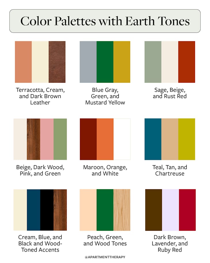
For more earth tone palette inspiration, check out the ideas below for pairing specific colors and finishes.
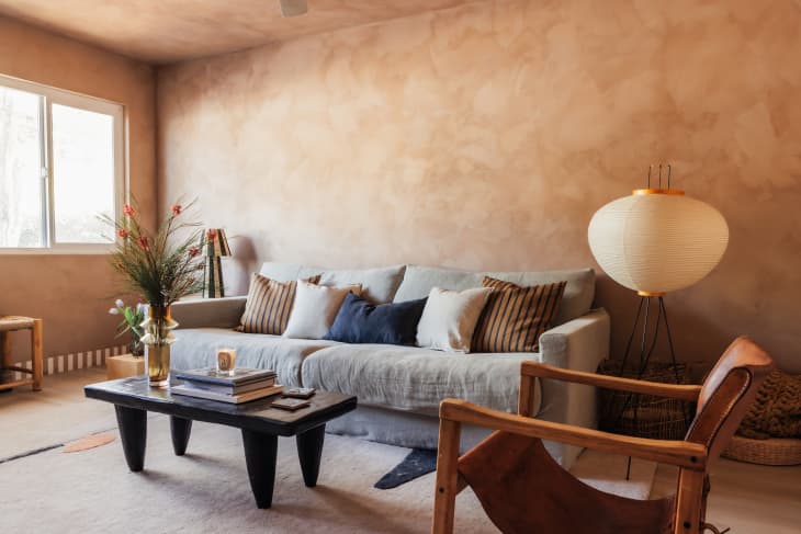
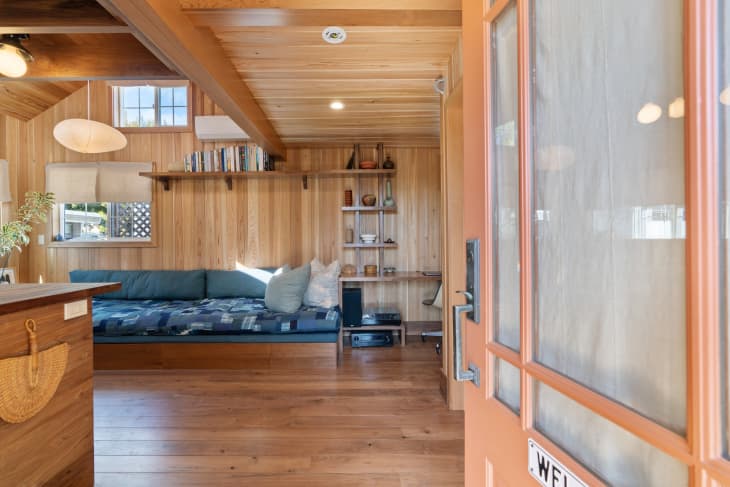
Terracotta, Cream, and Dark Brown Leather
A lime-washed wall that you want to touch and feel embodies an earthy palette at its finest. To add even more visual interest, throw in a leather accent chair, a paper lantern, and linen pillows, like in this Ojai, California, home. There’s no doubt that the different textures automatically level up the fairly monochromatic color palette.
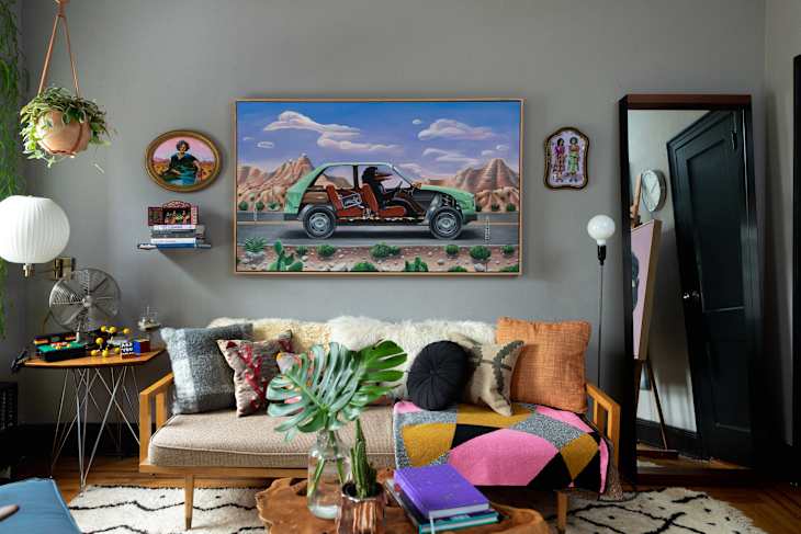
Blue Gray, Green, and Mustard Yellow
Don’t sleep on blues with gray undertones, like the color used here in artist Shyama Golden’s Brooklyn home. They can be considered upscale neutrals — especially because they’re able to bridge together all kinds of opposing colors like orange, mustard yellow, bright pink, and more.
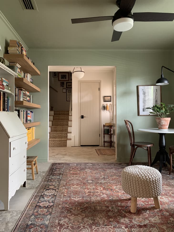
Sage, Beige, and Rust Red
Green paired with shades of brown and hints of red doesn’t have to scream Christmas. This DIYer’s Dallas home boasts a softer range of more subtle shades, balanced out by beige accents. When picking earth tones, don’t be afraid to apply this same idea and lean into laid-back, seemingly contrasting hues.
Beige, Dark Wood, Pink, and Green
When it comes to earth tones, pink might not be what you immediately think of, but it has the sunset-inspired quality your space is likely missing. Pair it with brown tones, greens, and white accents.
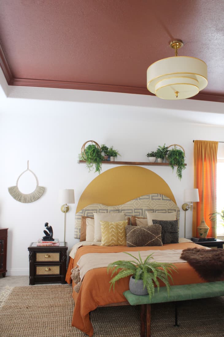
Maroon, Orange, and White
Why not paint only the ceiling, or a faux “headboard” design on your walls, as seen in this boho Virginia home? Both ideas can help save time and money, but still make a big impact. You’ll likely still have plenty of surrounding white space to play around with, too — perfect for offsetting with more vivid earth tones like orange and yellow.
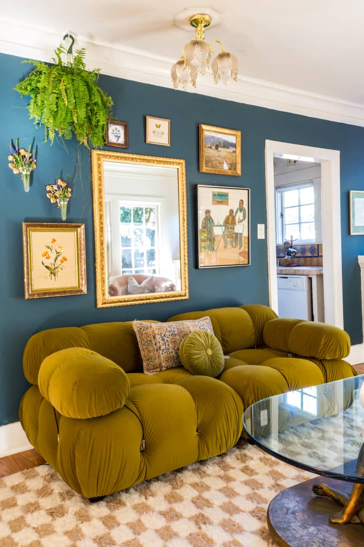
Teal, Tan, and Chartreuse
Beyond walls and decor, draw in earth shades through uniquely colored furniture. This home stager styled her Los Angeles living room with a statement chartreuse sofa, tan rug, and Benjamin Moore’s Yorktowne Green on the walls. The velvet seating especially adds some much-needed texture that’s sure to turn heads.
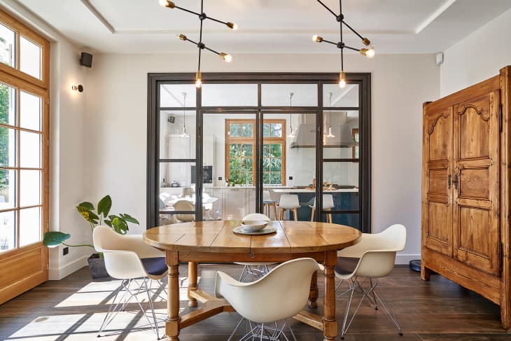
Cream, Blue, and Black and Wood-Toned Accents
For a space with plenty of natural light, like this nature-inspired French home, keep things simple — especially if you prefer a more minimalist aesthetic. Here, the brightness from the windows couples nicely with chill blue and black tones, plus plenty of wooden furniture and architectural details.
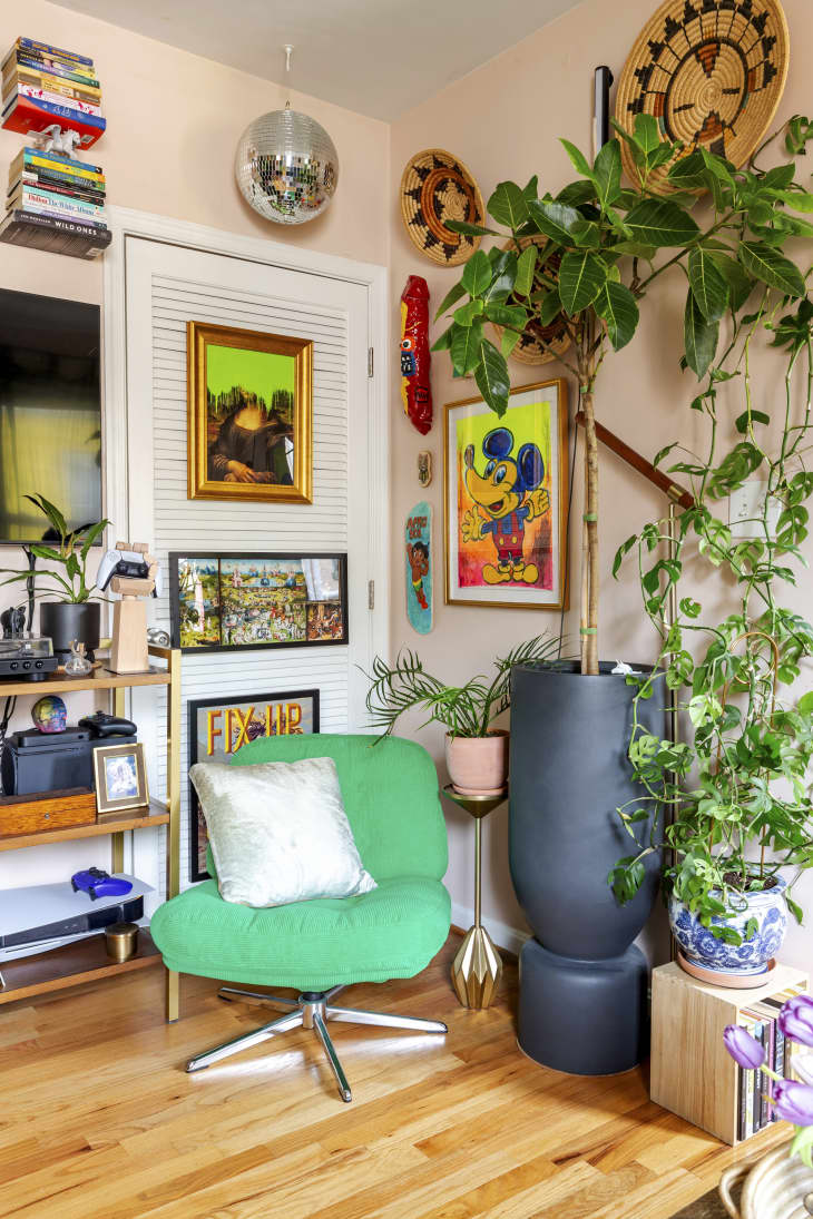
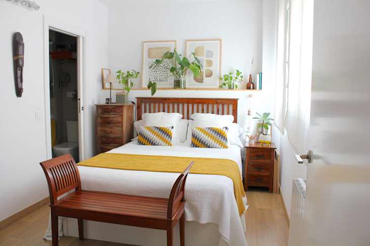
Peach, Green, and Wood Tones
Not a huge fan of pink or orange? Take a cue from this 535-square-foot apartment and go for the more relaxing and natural-looking color of peach, which makes the perfect backdrop for anyone with a large plant collection.
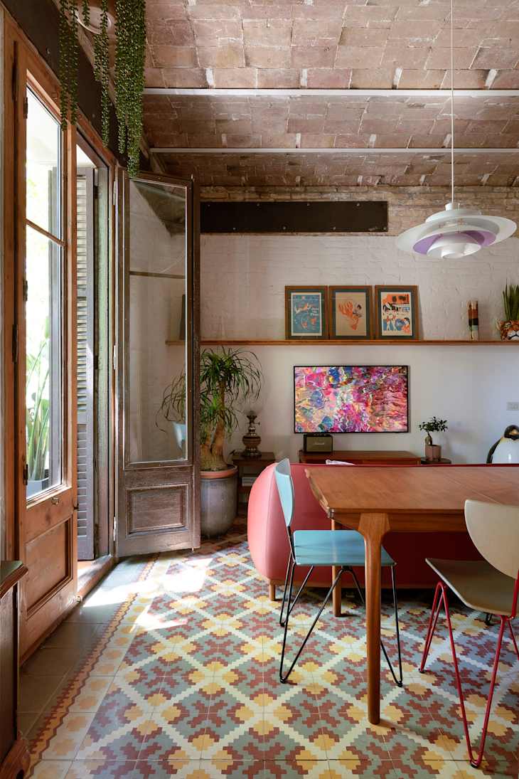
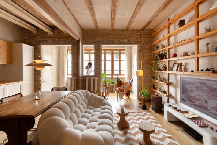
Dark Brown, Lavender, and Ruby Red
Celebrate the versatility of earth tones by pairing them with pops of lavender, red, orange, and more, exhibited in the tile and furniture from this Barcelona apartment. This can be done through colorful rugs, art, and lighting, so feel free to mix and match and let your color imagination run wild.