
Designers Weighed In on the 22 Best Blue Paint Colors (I Can’t Pick a Favorite!)
Blue paint colors are some of the most sought-after shades — experts even agree that blue is hands down the perfect bedroom color. “The color blue can evoke a sense of calm and serenity,” says interior designer Meghan Jay of Meghan Jay Design. “It has the power to slow down the mind, making it an ideal choice for a bedroom where relaxation and rest are the primary goals. I painted my bedroom light blue and find it reduces my stress and anxiety and gives me a sense of mental clarity.”

But blue isn’t just popular in bedrooms — it works in any room. “Blue is one of the most timeless colors to use in interiors as it can vary from calm and serene to vibrant and playful,” explains designer Natalie Papier of Home Ec. “It’s such a versatile paint color to use in any home. I love using moodier blues for spaces you want to feel cozy and relaxing. Vibrant blues are fun for higher-energy spaces like a playroom or den.” Papier used Sherwin-Williams’ Hyper Blue (SW 6965) on her built-in bookshelves below.

Because of its popularity, it’s no surprise that narrowing down the best blue paint colors isn’t the easiest task. Not to mention, if you’re standing in front of a few blue color swatches, what’s on the paper might look totally different on your wall IRL (especially during certain times of the day, depending on sunlight).

“It’s always best to try out swatches before diving all in. Some paint companies offer sticker samples for a no-mess trial,” Michelle Gage of Michelle Gage Interiors recommends. “When in doubt, break out the paintbrush and throw a few strokes on your walls to test it out. Monitor how the color changes throughout the day, based on the light outside.” (You can see how Gage used a dramatic blue in a bedroom project below and a lighter shade in a different bedroom above.)

Choosing the right shade of blue isn’t a decision that’s taken lightly. That’s why I tapped interior designers to get their expert feedback on 22 of the very best blue paint colors. Another bonus? For many of the options below, you’ll see an online color swatch, an actual paint chip from the hardware store, and a swatch of the color that we painted in person. Consider this your ultimate cheat sheet for selecting the best blue paint color in any room of your home.

22 Best Blue Paint Colors
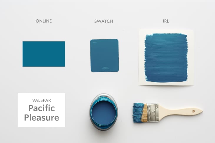
1. Valspar’s Pacific Pleasure (5009-10)
Looking for a cool teal on the bluer side? Valspar’s Pacific Pleasure (5009-10) is bold yet serious, perfect for a bedroom, hallway, or even interior doors. “Pacific Pleasure is a rich, vibrant blue with a refreshing depth,” Jay explains. “It brings a sense of calm and tranquility while still adding energy to a space. It would look stunning color-drenched in a library and paired with more sophisticated fabrics, like glazed linens or velvets. I see it coordinating beautifully with a deep aubergine or forest green.”

2. PPG Paints’ Blueberry Muffin (PPG1164-5)
Besides having the most delicious name (who’s hungry?), PPG Paints’ Blueberry Muffin (PPG1164-5) is a gorgeous blend of two colors — blue and purple. As for color pairings, Papier recommends incorporating “pinks, oranges, and peach tones” into a space with this shade.

3. Benjamin Moore’s Blue Grotto (CC-964)
Consider Benjamin Moore’s Blue Grotto (CC-964) your go-to if you’re looking for a powerful blue. Beware: It looks slightly more dramatic on an entire wall than just the swatch — but it’s worth it. “If you are a little bit more daring with your designs, I would funk it up by pairing this color with shocking chartreuse and magenta tones,” Gage suggests. “This color would work well in a lively dining room or even if you were redesigning your basement.”

4. Valspar’s Memorybook Blue (4007-5C)
Jay loves Valspar’s Memorybook Blue (4007-5C) for its happiness-inducing aesthetic. “I can already picture it on kitchen cabinets, complemented by a rustic baker’s table island and painted floors — it would create such a warm, inviting space with a perfect balance of timeless style and cozy, lived-in character,” she says.

5. Glidden’s Rich Navy (50BB 08/171)
If you’re looking for a classic blue, Glidden’s Rich Navy (50BB 08/171) might be the perfect pick. “[I] love using navy for boy’s rooms and coastal spaces,” Papier explains. “[I] would pair this with black-and-white art or bedding to make this classic color pop in a more modern design.”

6. Behr’s Oslo Blue (PPU13-13)
Behr’s Oslo Blue (PPU13-13) is a cozy blue hue with notes of green. “I would pair it with equally soft tones — like white, sage, and maybe a little blush pink,” Gage shares. “It could be beautiful in a living room or primary bedroom, as the hue is very soothing and calm.”

7. Valspar’s Blue Mist (4006-9A)
Valspar knocked it out of the park with their aptly named Blue Mist (4006-9A) paint — I feel so refreshed when looking at this nature-inspired color, and so does Jay. “I can picture it on the walls of a New England seaside cottage,” she shares. “It would pair beautifully with whitewashed or light oak floors. Linen, cotton, and sheer fabrics would enhance the light and airy quality of this blue, giving the space a relaxed, breezy vibe.”

8. Farrow & Ball’s Stiffkey Blue (No. 281)
No one knows how to do saturated, deep colors quite like Farrow & Ball, and its range of blues is second to none. Stiffkey Blue (No. 281) in particular is one of those shades that will forever have people asking you, “What paint color is that?” Papier describes it as “rich and smoky,” and says it would look fabulous in a dining room paired with “warm wood tones and deep, mossy greens.”

9. Behr’s Aspiring Blue (S440-3)
Behr’s Aspiring Blue (S440-3) is slightly deeper and greener than the brand’s Oslo Blue (PPU13-13), but similarly, Gage says that she would pair this color with “equally soft tones” to create a truly tranquil blue room.

10. Sherwin-Williams’ Sky High (SW 6504)
For a crisp-yet-slightly-more-subtle paint, Sherwin-Williams’ Sky High (SW 6504) is perfect for someone who wants to branch out from neutrals but still may be color-shy. Jay thinks that, due to the color’s “soft and serene” qualities, it would work well in a nursery to help encourage relaxation. “Its gentle hue also makes it a versatile neutral that pairs beautifully with a wide range of colors,” she continues. “I could see it placed on the ceiling, with four walls covered in a vibrant wallpaper.”

11. Farrow & Ball’s Lulworth Blue (No. 89)
Inspired by a cove in Southern England, Farrow & Ball’s Lulworth Blue (No. 89) looks much greener in the online swatch, but it’s the perfect light, powdery blue in real life. “Lulworth Blue is the perfect shade to use in a bedroom to create a sense of calm and serenity,” Papier says. “Crisp white bedding would pair nicely with this tone. Because it’s so soft, it’s easy to pair with patterns or a color pop in pillows.”

12. Benjamin Moore’s Gentleman Gray (2062-20)
There’s no way this list would be complete without Benjamin Moore’s Gentleman Gray (2062-20). It’s a classic, dramatic navy shade that’s so striking, it’ll undoubtedly be a conversation starter in your home — Gage has even used the color in several projects. “It’s the perfect heritage navy hue,” she explains. “I like how classic the color is. I think it’s great for a more traditional dining room or a masculine office.”

13. Sherwin-Williams’ Languid Blue (SW 6226)
Sherwin-Williams’ Languid Blue (SW 6226) reminds me of those beautiful, ethereal Scandinavian-inspired blue hues I’ve been seeing everywhere — perfect for bringing a little wanderlust into your home. “It would look stunning in a bedroom, especially paired with a rich wood-tone four-poster bed and luxurious linens,” Jay says of this shade, which she describes as ”a beautiful, grayed medium blue that exudes sophistication.”

14. Farrow & Ball’s Hague Blue (No. 30)
Farrow & Ball’s Hague Blue (No. 30) is a beloved color among designers and Apartment Therapy editors. “Hague Blue is my absolute favorite,” Jay explains. “I’ve used it on both vintage furniture and new kitchen cabinetry. Its stunning green undertone adds a layer of richness and depth. It feels complex and sophisticated, yet also a tad vintage.”
Papier says she loves using the color on ceilings, or color-drenching an office or lounge. She also recommends pairing it with ornate statement pieces like a brass chandelier.

15. Sherwin-Williams’ Loyal Blue (SW 6510)
“I picture this in a butler’s pantry, color-drenched and lacquered,” Jay says of Sherwin-Williams’ Loyal Blue (SW 6510). “[It] would look stunning paired with a dramatic marble countertop and unlacquered brass hardware.” Papier even has personal experience with this color and says it’s her favorite on the list! “I used this in my son’s bedroom, and it provides an instant sense of timelessness, yet feels a little more energetic,” she explains.

16. Dunn-Edwards Paints’ Slate Wall (DE5797)
Dunn-Edwards’ Slate Wall (DE5797) is similar to Farrow & Ball’s Hague Blue (No. 30), but appears a little lighter. Regardless, it’s still eye-catching. “This dark gray blue is instantly striking in its depth of color,” Papier says. “Slate Wall would look amazing on cabinetry with white walls and a dramatic countertop. It’s instantly a grounding color that demands your attention as a softer alternative to a starker black.”

17. Benjamin Moore’s Santa Monica Blue (776)
“I am a big fan of Benjamin Moore’s Santa Monica Blue (776),” Gage explains. “It’s bold, but not too in your face. It’s a little moody, but more so optimistic. It’s the perfect shade!” The brand’s website notes that it would pair well with neutral paints like Distant Gray (OC-68) or Summer Harvest (206).

18. Benjamin Moore’s Kensington Blue (840)
Benjamin Moore’s Kensington Blue (840) just looks luxurious, so it’s fitting that the name also has an air of royalty. “It feels mature for any space and easy to pair with just about any other color family, as it feels almost like a neutral,” Papier says. “This would be stunning with a large-scale, more colorful piece of art.”

19. Farrow & Ball’s Skylight (No. 205)
One of Jay’s favorite blue colors is Farrow & Ball’s Skylight (No. 205), which she recently used in a primary bedroom project seen below. “It’s the perfect soft, grayed-out baby blue and is such a versatile color,” she adds. “It pairs beautifully with warmer tones, and in the featured bedroom, I added accents of ochre and marigold. The combination of warm and cool hues feels both refreshing and cozy.”


20. Sherwin-Williams’ Hyper Blue (SW 6965)
If you want a color that instantly attracts attention, look no further than one of Papier’s favorite blue paints: Sherwin-Williams’ Hyper Blue (SW 6965). “I used [this paint color] on my built-in bookshelves to make a huge statement,” Papier shares. “It’s a look-at-me color that brings a ton of liveliness into a room.”

21. Benjamin Moore’s Polar Sky (1674)
Experts deemed blue the best bedroom color, so it’s no surprise that Gage is drawn to Benjamin Moore’s Polar Sky (1674) for that very reason. “I love a soft blue in a bedroom — the calming hue just lulls you to sleep,” she explains. “Don’t play it safe by pairing it with only neutral hues; a blush pink makes the perfect complement to his blue hue!”

22. Farrow & Ball’s Cook’s Blue (No. 237)
When Jay was designing a dress-up room, she used Farrow & Ball’s Cook’s Blue (No. 237) — one of her most beloved blue shades — and paired it with a panoramic wallpaper from Isidore Leroy in the image below. “It’s a punchy, saturated blue that pairs beautifully with other vibrant colors,” she says. “It adds just the right amount of playful energy to this little girl’s dress-up room.”
