
The 4 Biggest Food-Inspired Colors Dominating 2024, According to Designers
Since writing my love letter to butter yellow, I can’t stop wondering what the next food-inspired color trend of 2024 will be. Because one thing’s for sure: It’s arguably more fun to describe the different colors you’re decorating with as they relate to food or beverages. Martini olive green, “tomato girl” red, the list goes on and on. Associating a color with food simply makes it sound more delicious. There’s also a nostalgic element to it. Case in point? The fact that a vibrant shade of orange can suddenly bring me mentally to Italy, with a cold Aperol spritz in hand.
When thinking about food-inspired colors, my mind tends to default to brighter hues. But to my surprise, interior designers believe we’ll begin seeing a few more darker shades in homes this year. Check out their four food-centric color predictions below — all of which are versatile enough to last way beyond 2024.

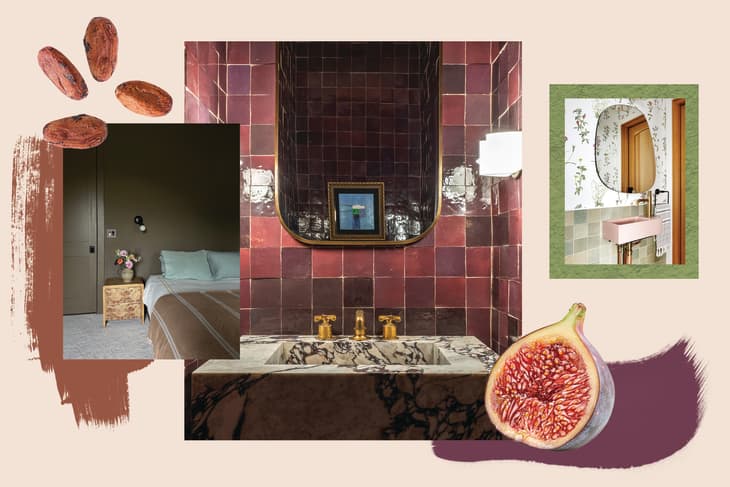
Fig
If you’re a fan of moody meets romantic interiors, then you’ll love this color recommendation from designer Ashley Ferguson. “Fig is a deeply beautiful, rich yet unexpected color that can be celebrated in many applications,” she explains. “Symbolically, they signify knowledge, enlightenment, and passion. Who doesn’t want a bit of that?”
In this bathroom, Ferguson created a bold statement by placing fig-colored zellige tiles from Cle Tile behind a dramatic marble sink. The hue adds an extra layer of intrigue to this small space because it’s unexpected and daring. Want to try using this color in smaller ways throughout your home, though? Ferguson recommends finding a deep fig-colored duvet to throw on a bed for the ultimate luxurious look.

Plum
For those who love interiors that balance moodiness with elegance, plum might be just the color you’re looking for. “Plum is a moody color that adds depth and warmth, elevating a space with its sophistication,” says interior designer Rae Rockwell. This color is a true deep purple, but it can range from having reddish undertones to lighter tones of indigo. Use the variations to your advantage when pulling other colors into your palette.
Rockwell recommends pairing plum with softer neutral colors, like cream or beige, then blending in some brass accent pieces and wood-toned furniture throughout the room. If you’re a fan of going bold, she also says to go all out with a monochromatic design by color drenching the walls, tile, and decor in similar shades. She’s currently crushing on Backdrop’s Self-Portrait and Fireclay Tile’s Vintage Leather.
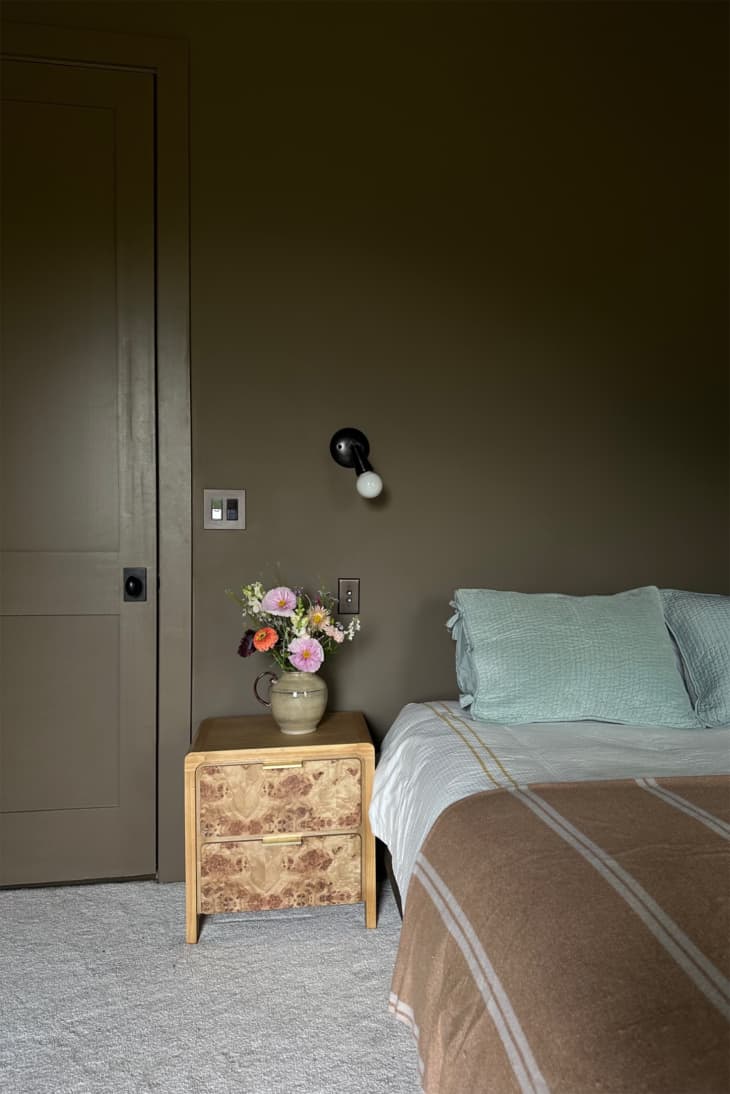
Cocoa
To channel something a bit more cozy, Diana Farberov of Artemuse Design invites you to “think of a delicious hot chocolate, and then imagine that perfect rich tone painted on your walls to really fill the room.” She explains that because brown is a naturally warm color — like Farrow and Ball’s Salon Drab paint, pictured here — it surprisingly evokes a feeling of comfort, which is perfect for catching up on some R&R in your bedroom.
If you’re new to decorating with a darker color like this, take a page from her book, and pair it with blue accessories and golden accents for the ideal palette. “Because cocoa is a darker tone, you want to make sure you use it in a well-lit area so the natural light helps highlight the shade’s depth and richness,” she adds.

Matcha
If you’re craving a color that feels a bit more energizing, could I interest you in a shot of matcha? Designer Hillary Rutherford recommends matcha green (an almost complementary color to the reddish purples listed above!) for your next project. “We’ve seen many neutral sage green tones come into homes based on our need to bring nature inside, and I don’t think that is going anywhere,” Rutherford says. “Where we will see a shift is in playing with different shades of green, such as matcha.”
Before trying the color out in your home, Rutherford recommends thinking about the overall feeling you’re trying to achieve to choose the tone — a tried-and-true trick from interior designers. “If you want a more subtle, calming, and earthy feel, stick to the more muted side of this color,” she adds. “On the other hand, a vibrant and bright green is a great way to go if you want a lively and fresh feeling.”
I don’t know about you, but I can practically taste these colors from here!
Design Defined
Never miss the style inspo and recommendations you crave with Design Defined. Follow along each week as our Home Director Danielle shares the best style advice, latest trends, and popular decor finds you just can't miss.