
10 Stylish Color Schemes to Inspire Your New Space
One of the trickiest things about decorating a new space is picking out colors. So I’ve selected ten rooms that get color right, in hopes that one of them will catch your eye. Get ready for some serious inspiration.
Above: the soft blues and greys of this space, from Woman Magazine, get just the right dose of warmth from a Beni Ourain rug and a pair of wooden side tables.

This joyful combination of colors reads as less than riotous because it’s set against a white background. Black accents help keep things sophisticated and not nursery-school. When in doubt, add a bit of black. Spotted on SF Girl by Bay.
Here we have blue and grey again, but this time the colors are a bit deeper, with a dash of black for style. I love this combination because it hints at the moody, dark colors that are so big in interior design right now, but without being at all somber or dreary. From Dimore Studio, via My Favorite and My Best.

Here’s another approach to rich, moody colors: layer them over a light background. This interior plays deep purple, teal, and black off of light walls, to brilliant effect. One thing that helps tie it all together? Little dashes of pink, acting as a sort of color mediator. From Share Design.
I love how this living room from Bolaget feels so airy and sophisticated all at the same time. The palette is white, black, and gold, with just a touch of the botanical (from the hanging in the bedroom in the background, and the real plant on the table).
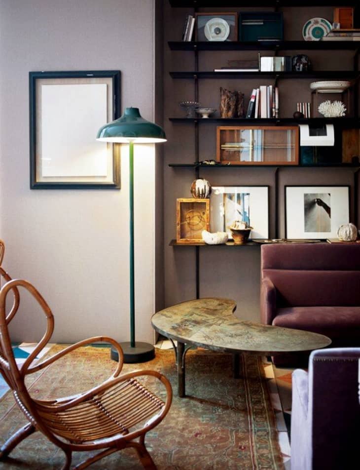
Here’s another interior from Dimore Studio, which starts with a light purple base, adds the same color in a darker hue, and then layers in black and teal. A worn table and rug and a rattan chair add warmth and mellow out the mix just a little.
Emily Henderson’s living room, from Domino, has a palette of blue, beige, and white, with subtle accents of light pink and gold.
There’s not a lot of clor, persay, in this interior from Design Sponge, but it works the contrast between white and natural materials (the rug, the pillows, the rattan chair) masterfully.

In her Scotland home, Sooz Gordon layered rich jewel tones against a grey background. (This is essentially the same as photo #2 above, but with a darker background.)
I have a soft spot for pastels, so this interior from vtwonen makes for a nice close. The palette is mostly pastel, but a few choice accents, in bright pink and copper and black, keep things lively and sophisticated.