
A Case for Why You Should Try Contrasting Wallpapers and Carpets
For those who don’t like busy-looking rooms, matching printed wallpaper with a patterned rug might make your eyes bug out. Surely, you would get a headache each time you walked into the room? But even if you’re not a fan of clashing prints and patterns, some rooms really do look great with a friendly amount of juxtaposition. And the great part about the new trend of contrasting wallpaper and rug is that there are all sorts of different ways to do it. You can tweak the colors, the amount of negative space, and busyness of the print to suit your own eye. Scroll down to see some examples, and see if it makes you want to start mixing and matching.
Play Up Busy Wallpaper
A busy wallpaper with small, tightly compacted illustrations doesn’t have to be surrounded with blank neutrals. This fruit-themed wallpaper complements a light pink rug that has a big pattern for balance.
Try Opposing Colors
If you like the busy feeling of a print-on-print look but want the clash to feel cohesive, try balancing the room with opposing colors. If your wallpaper is a light print, pair it with a dark rug.
Experiment with the Same Color Family
Another great trick to make a room feel less hectic with layered prints is to keep it in the same color family. In Marcella’s Bushwick apartment, she has blue-and-teal wallpaper that is matched with a navy printed rug.
Mimic The Prints
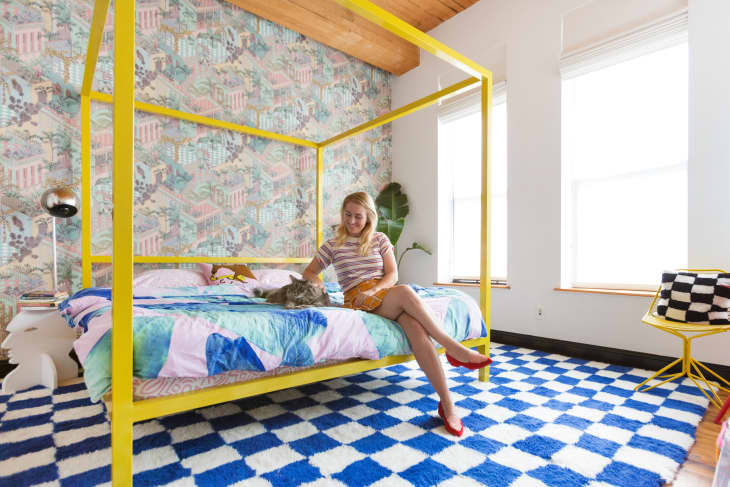
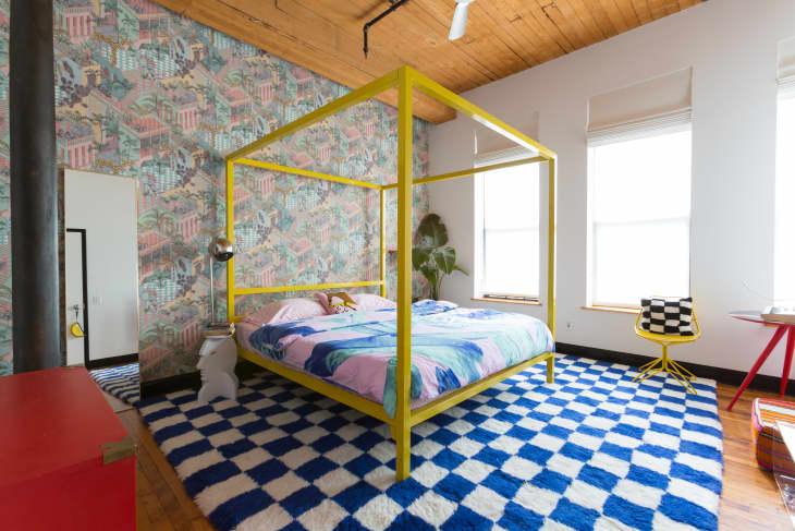
There is charm in mismatched colors in a room, as Aelfie proves in her vibrant bedroom. But part of the reason the clashing colors work is that there is a consistency to the prints she chose: her rug has checkers, and the wallpaper has a boxy feel to it, thanks to the pattern of rooftops printed on it. The bright pop of yellow on the statement bed frame also helps tie the room together.
Complement Your Room’s Hues
Even a room that’s filled to the brim with color can still feel pleasant to the eye if the colors complement each other. Here the small playroom has a light green wallpaper, which complements that bright blue rug.
Break Up The Prints
Sometimes it helps to break a pattern up with the help of furniture or decor. For example, this study has a bold black and white, checkered rug. It goes well with the delicate town-themed wallpaper, but the black bookshelf helps the wallpaper motif feel subtler.
Keep It Airy
If you gravitate toward white spaces and prefer a minimalist aesthetic, you can still play with contrasting patterns. The trick is to keep it in a white color wheel so the room still stays airy. Here, a grey and white carpet is paired with a white and mint wallpaper, adding interest to the room but not overwhelming it.
Just Have Fun
Sometimes there is no rhyme or reason to why contrasting prints work together, because sometimes it’s just plain fun. If the look makes you happy, that’s all that matters. Here the blue wallpaper matches the blue zig zags in the rug, which creates a nice backdrop for the wooden furniture pieces in the bedroom. This could be too busy for some, or too modest for others—but as long as your eye likes it, it will look amazing in your household.