
I Tried a Mural in My Dining Room — Here’s What I Did Wrong (and How I Finally Got It Right!)
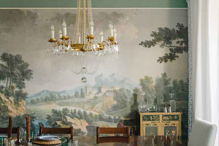
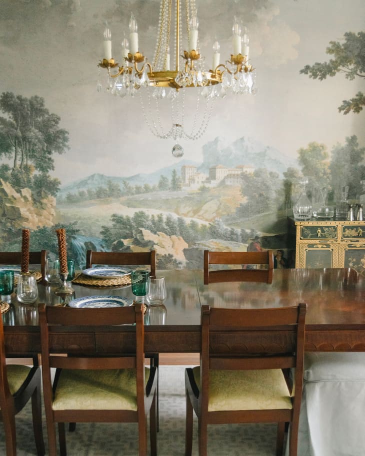
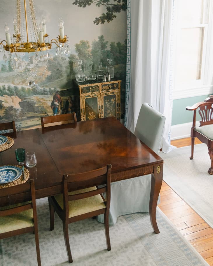
I love the look of a dining room wall mural. These typically pastoral scenes are classic. They’re whimsical. They’re impactful. So when I began renovating and designing my row house, I absolutely wanted this look in my own home. I went for it in my dining room — and I got it wrong.
While I haven’t taken the plunge and redecorated that space just yet, I did get a shot at a mural in another room in my home. There, I redeemed myself.
What exactly went wrong in my dining room? And how did I get it right in the parlor? I’m sharing my mistakes — and how I avoided them the second time around — with you here so you can nail your mural wallpaper project on your first take.
I Chose the Paint Before the Wallpaper
My first mistake in the dining room was choosing the paint color before the wallpaper. I had a specific color in mind based on a portrait of my grandmother from the 1950s. I matched the color to her dress. Sentimental? Yes. A lovely idea in theory? Yes. The best practice when I knew I’d be choosing a wallpaper to go with it? Absolutely not.
I should have made the decision on the wallpaper before I ever considered paint colors. I could have picked a general direction for the palette, yes, but getting the paint on the walls and then requesting wallpaper samples afterward was a terrible idea.

I went through countless wallpaper samples trying to get the color of the wall to complement the wallpaper perfectly. In the end, I did end up with a wallpaper print that would have risen to the top of the stack regardless of being boxed in by paint, but I’m lucky it turned out that way. And it was a long road to getting there.
I Didn’t Go All-In
My second and biggest mistake when it came to the wallpaper mural in my dining room was not going all in. I dipped my toe in, but I didn’t jump. What I mean by that is that I only papered one wall — and didn’t let the scene unfold throughout the entire room.
The worst part? I know better. I typically would never do a statement wall. I work with design clients, and I always shut down the idea of one accent wall before they even get the full sentence out. I know you should either go all in or out, yet I didn’t fully commit in my own home.

Now, in my defense, a few contributing factors led to that decision. The first was the layout of the room itself, which features many odd walls, nooks, angles, and weird juts in and out. The idea of papering a mural around each of those seemed to detract from the impact of the image itself. Plus, with four large windows in the room, I hated the idea of spending money on panels that would only be used for a few inches at the top and a few inches at the bottom of the wall.
Looking back, the layout difficulties should have pushed me in the direction of choosing a wallpaper with a repeat rather than a mural with panels. Now I know better than to fight against the architecture of a room.
Second, the cost made going all-in seem insurmountable. I was in the middle of a renovation that included items like making sure I had at least one functional bathroom (this was not the case when I moved in). Spending an exorbitant amount of money on a mural didn’t seem like a good use of my funds. Which, again, takes me back to the same conclusion as mentioned just a few moments ago: I should have abandoned the mural idea.
Luckily, I took these lessons and applied them to one last room in my home: the parlor.

How I Finally Got a Mural Wallpaper Right
In the parlor, which is what I call the spare room on my first floor, I decided to try a mural again. But this time, I took a totally different approach.
I first chose a general color palette — neutral taupe (thrilling, I know, but the rest of my house has color — I promise!). Then I picked the mural. I chose a calming, tone-on-tone landscape scene that could wrap around the entire room. While I knew I would still run into the wasted panel effect — given that the room has large pocket doors, a bathroom, an exterior door, and a window — I just had to suck it up and let it go.


Lastly, I picked a paint color for the trim, doors, and ceiling after the mural was chosen. I was able to get a perfect match. Trust me, choosing a few paint swatches is a heck of a lot easier (and cheaper!) than ordering countless wallpaper samples.
After all was said and done, the parlor is decidedly more impactful. When you walk in that room, it feels intentional. It feels finished.


I don’t feel like I held back. I went for it, and you can tell. And you can, too, if you like this look.
Design Defined
Never miss the style inspo and recommendations you crave with Design Defined. Follow along each week as our Home Director Danielle shares the best style advice, latest trends, and popular decor finds you just can't miss.