
Glorious Rooms in Pantone’s Color of the Year We’re Totally Crushing On
Purple is not an easy color to design with. On a shirt or boldly patterned dress it’s wonderful and bold, but in a room, it can be incredibly tricky and go from bad to worse with one false move. Where blue is basic and the everyman of the color world (I mean, it goes with everything and near impossible to mess up), lilacs and plums and, well, ultraviolet, are as easy to work with as a prickly cactus.
Plucky shades of purple are the hardest. Soft muted hues can act as whispers in a room, as backup dancers so to speak to the space’s other color protagonists. But something like ultraviolet? Oh no, that’s the prima ballerina of an interior, pulling the spotlight no matter what. But say you heard Pantone’s 2018 Color of the Year announcement this morning and were overjoyed purely for the colors aesthetic profile (the “subtle” political and zeitgeist-y undertones aside) and are itching to slather your home in the royal tone but aren’t sure how to do it or where to begin…that’s where the pros come in.
Following are glorious rooms that use the electric color with skill, from a delicate peppering to an all-out baste (and our takeaways of what you can learn from each).
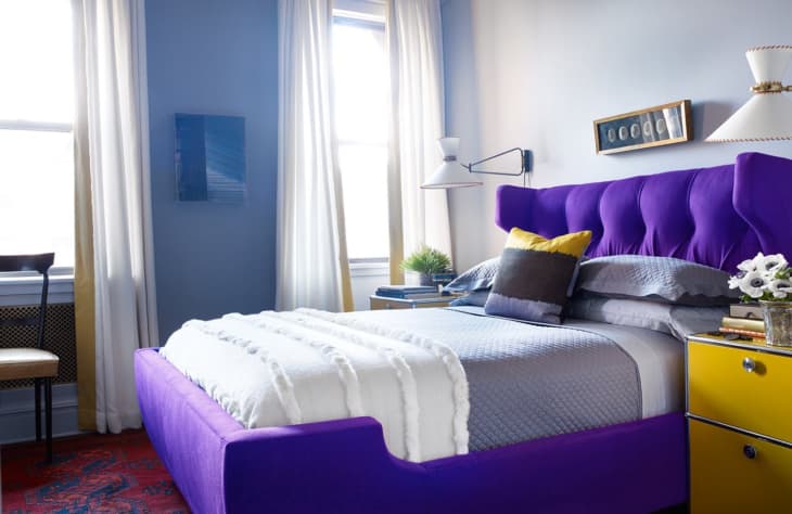
Wesley Moon‘s bedroom seen at the lead of this post is a lesson in balance. With a daring bed color like the one chosen, the designer was smart to go mostly neutral (with the exception of the complementary yellow nightstand) with the rest of the room. This approach is a great one to emulate if you want to try out the color for a zip of excitement in your home without going overboard.
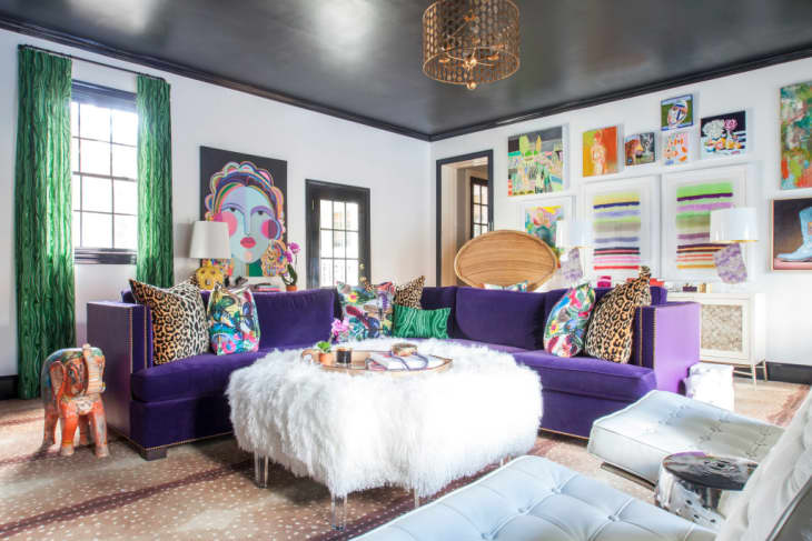
From The English Room‘s One Room Challenge, what we are taking away from this masterful space is that you don’t have to be reserved with a color like ultra violet to avoid a chaotic interior. Keeping the walls and trim a neutral charcoal and white leaves visual room to take in the sofa, green curtains, fearless leopard print and explosive art. Dare to live bold, people!
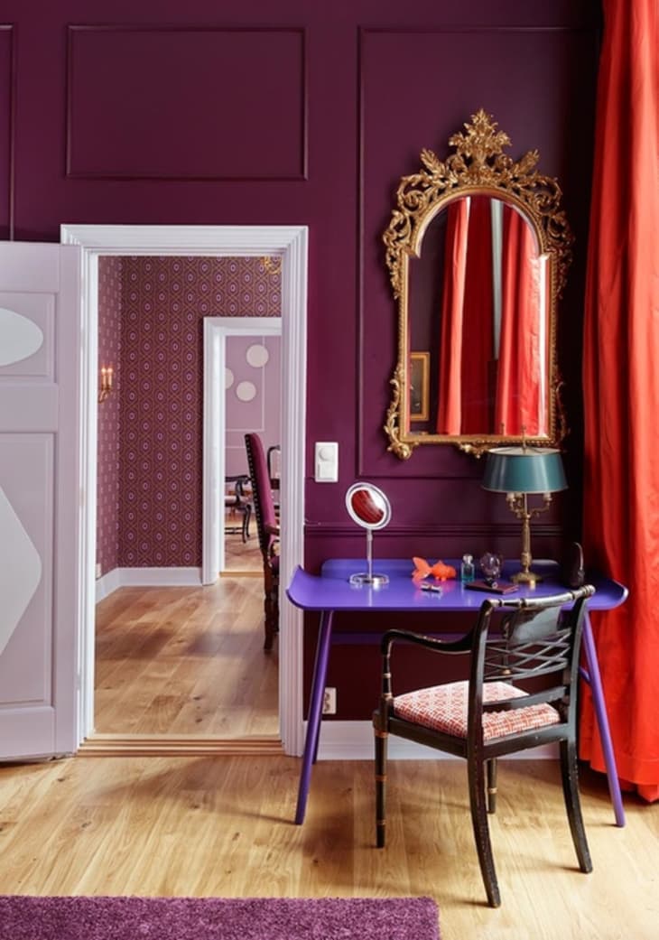
While you may think of Nordic design as soothing and neutral, the Mikado suite at the Grand Hotel in Oslo, featured on Bright Bazaar, says otherwise. Awash in saturated plums and rubies, this one little nook that features an ultra violet desk is our favorite. The unexpected jolt of color gives a super refined and regal room a bit of a modern touch.
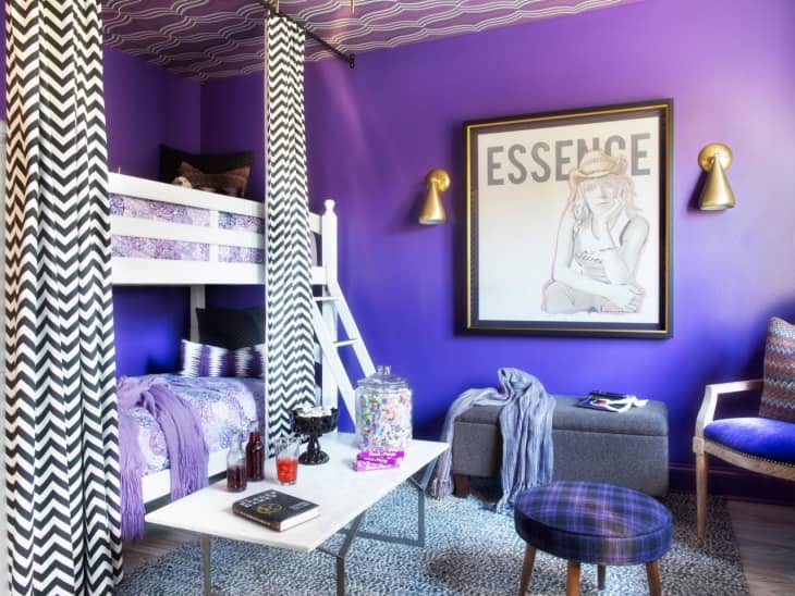
And finally, a room that goes all out from HGTV. This is technically the room of a teenager, but we applaud its intrepidness. One way to temper the main color here? When in doubt, add black and white.