
Bobby Berk, Emily Henderson, Jonathan Adler, and More of Our Faves Weigh In on Pantone’s Color of the Year
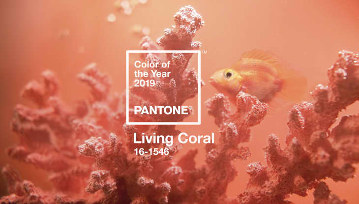
On Thursday, Pantone announced their 2019 Color of the Year is Living Coral. We’ve already rounded up paint matches and affordable items for your home, but if you’re on the fence about how to feel about next year’s hue, we asked some of our favorite design pros for their hot takes (and cool tips) on using this bright shade at home.
Jonathan Adler—Potter, designer, and author
“I just learned that the collective noun for a group of flamingos is a flamboyance. As a dude, I’ve always steered clear of this color but I’m happy to see that the color of the year is a flamboyant flamingo. I’ve never said no to a little eccentric flamboyance.”
Bobby Berk—Designer and “Queer Eye” expert
“Coral! What a vibrant and happy color! It’s been one of my favorites for years. In fact in my stores we had a coral sofa from Gus Modern that was our best selling ‘color’ sofa. I have one in my office to this day. Excited to see what companies and designers are able to do with it this year.”
Erin Gates—Designer and author of ‘Elements of Style’
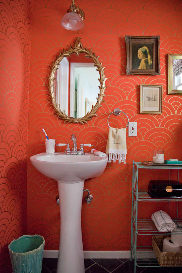
“This iteration of coral is a bit bright for my taste, especially for interiors. I would use a bright coral more in outdoor settings, perhaps throw pillows for a chaise or a seat cushion for an outdoor dining set. Otherwise, to me, this feels too vibrant and bordering on neon. I prefer a more toned down version of coral for interiors—either pale corals or rich deeper corals—especially pretty paired with blues or chartreuse.”
Emily Henderson—Designer, author, and stylist
“2017’s Millennial Pink had a love child with 2018’s Terra Cotta and it is the new Pantone color of the year – Living Coral. It’s bright, it’s saturated and it’s dramatic, and although I am a little bit scared of anything that reads too orange I am leaning into this color with an open mind. It might not be something that I am ready to paint on my walls but I could get very into using a few small hits of the color peppered around a room to give it a little bit of a punch.”
Breegan Jane—Interior designer
“As a beach girl, I just love coral. It is a strong accent color that can also work as a muted solid in the right case. I love it because it is a mix of red and yellow with the power of pink. In a tumultuous time, I love that our design world is leaning into pink and women rising. I see it as the comeback of a classic and think it pairs well with teal! Teal is a color you see in most of my projects.”
Dayna Isom Johnson—Etsy’s resident trend expert
“I’m loving Pantone’s 2019 color of the year, Living Coral. Much like burnt orange, which I predicted for Etsy’s color of the year, this refreshing tone embodies authenticity and draws inspiration from nature. I’m excited for these grounding colors to take hold in the new year. In the months leading up to 2019 (September-November), Etsy has already seen interest for ‘coral’ items, with over 470K searches.”
Nina Magon—Creative director & principal, Contour Interior Design
“Love the shade. It’s fresh and inviting, lively and energetic. It also looks good with black.”
Emilie Munroe—Interior designer, Studio Munroe
“Love the beachy warmth of a bright coral, but must say that coral feels like one of those in-betweener colors… I say choose a side and either go bold orange or bright pink. No middle ground here!”
Taniya Nayak—Designer, judge on ABC’s ‘The Great Christmas Light Fight’
“This year’s Pantone Color of the Year is fresh and vibrant. I love to use bold, bright colors like this in smaller doses so that it pops without taking over the space. It’s perfect as a welt detail in a pillow or a chair, fresh cut flowers, or you can make it a bolder statement by painting an accent piece of furniture like a credenza or side table in a high gloss finish.”
Kristen Pena—K Interiors
“I don’t see this color as a big trend for interiors in our area, but I do feel that a hint of it here and there layered into an otherwise neutral palette might feel fresh in a California home.”
Alison Pickart—Interior designer
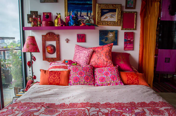
“Living Coral is an accelerated version of ‘Millennial Pink’… which is awesome for those who love to work with BIG color!! Living Coral would be FABULOUS on walls as the back-drop to a crisp living room. Paired with turquoise, greens and even yellow would be a stunning WOW factor! Living Coral is fun and vibrant… I imagine doing a room in this color would result is a supremely happy space… bright in the morning sun, yet cozy and warm in the evenings!”
Amy Sklar—Interior designer
“I’m not gonna lie, I don’t always love Pantone’s color of the year choice (I’m so sorry Ultra Violet!). But I must say I am really loving Living Coral! This is a soft, almost golden orange, that definitely plays well with others. You could pair this with camel, green, navy blue, grey, off-white – really, it’s a total team player. My dream pairing for this would be a super lofty mohair or cashmere throw in this color casually draped on the arm of a navy blue velvet sofa.”
Tom Stringer—Interior designer
“We LOVE Living Coral and it shows up in a lot of our work. We generally use it as an accent, and find it works beautifully to create a spark of interest in monochromatic interiors as well as serving as an important complimentary color to both blues and greens in multi-hued environments.”