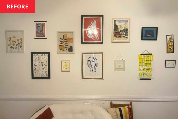
I Sent a Designer Photos of My Gallery Wall — Here’s What She Said to Change

Gallery walls — in their many forms, from pristine grids to thrifted galleries that grow over time — are a reliable design hit. I’m a big fan, and one of the first things I did when I moved into my apartment (with the help of my roommate, whose art collection and artwork hanging skills were absolutely crucial) was hang a gallery wall in the living room. It’s come to be sort of the defining design feature of our apartment.
In fact, our landlord is actually the one who suggested that the long white wall in our living room would be a great canvas for a gallery wall, and that’s what helped convince us this apartment was the place for us!
However, after about two years of looking at the same layout everyday (and after more than two years of looking at gorgeous gallery wall inspiration everyday on AT), I was ready to give my gallery wall a spruce-up. I was curious what a professional designer might recommend for my gallery wall, so I reached out to interior designer Carissa Henderson of A Bold New Hue.
I love Henderson’s colorful home and style, so I wanted to know what she’d do to my wall. There were, of course, a couple limitations: While my landlord is cool with nails, I can’t paint, and I also wanted to save money by using as much of what I already owned as possible.
The design pro suggested three changes, in addition to maintaining a balance of color throughout the wall, and I took her up on all three suggestions — with a few of my own twists.
Go big.
Except for a couple of my favorite pieces I’d noted from the gallery wall, like the pigeon sketch and the Chrysler Building artwork (made by my sister!), Henderson suggested replacing some of the smaller with “larger scale pieces to create more depth” and drama.
Get sculptural.
She also said to add 3D elements to the gallery wall “to create texture and interest.” She specifically suggested these melted disco balls, Wayfair wall planters, and a Mitzi swing arm wall sconce, as seen in her mockup above.
Add a mirror.
Lastly, she suggested adding a vintage-style mirror to add more drama but keep the look from being too busy — plus to brighten things up.
Here’s how I followed her advice while using mostly things I already owned.
I used my largest artwork.
I sent Henderson a bunch of photos of my artwork, and she pulled out some of the bigger pieces that would add more drama and stretch up further to the ceiling, making the room feel taller.
In the end, I made a couple of swaps from the mockup because I couldn’t find a frame for cityscape artwork (and the similarly colored floral piece, also part of my art collection, came pre-framed) and because the striped piece from West Elm, although I love it, is just too heavy to hang. A silver lining? You can see it in the mirror’s reflection, so it still — sort of — has a spot on the wall.
I incorporated 3D details (including a disco ball DIY!).
I loved Henderson’s suggestions for ways to add a bit of unexpected shape and texture to the gallery wall. I decided to try my hand at creating something similar to the dripping Etsy disco balls. For my DIY version, I used styrofoam half-spheres for floral arrangements, mirror stickers, and silver spray paint.
I also like the way the pink plant holders looked in the mockup, so I spray painted this $10 duo from Target pink and put some plants I already owned inside them. Lastly, I loved Henderson’s suggestion of adding a sconce to the wall, so I bought one from Amazon. (I thought the squiggly design in Henderson’s suggestion was particularly striking so I tried to mimic something similar with my lamp’s cord.)
I used a mirror I already had.
Although I love the vintage-style mirror in Henderson’s mockup and think it would probably look better in the end, I wanted to use materials I already had. In place of the vintage-style mirror, I used an arch-shaped mirror from Target that was already in my apartment. It’s one of my favorite additions; I love that it reflects the color and pattern in the rest of the room and makes the space feel brighter and larger.
In the end, my two favorite elements in the gallery wall are the DIY disco balls — you can catch me disco-fying everything I own with my extra stickers — and the lamp. I love that the latter creates a new cozy zone for curling up and reading in my living room. Thanks for the suggestions, Carissa!