
How Design Pros Use the 60-30-10 Rule to Create Balance
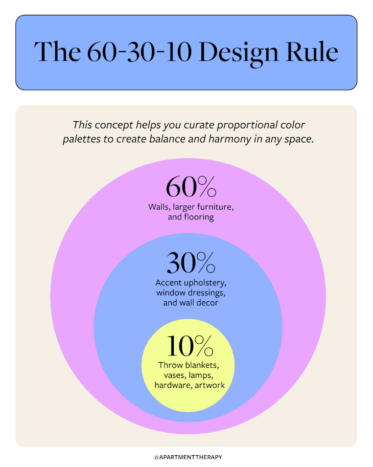
If you’ve ever struggled to put together the perfect color palette for a room, you’re not alone. Choosing the colors is only half the battle; the real challenge starts as you begin integrating them into your space. Interior designers understand this dilemma all too well — and believe it or not, they have a secret formula they use to create perfectly balanced and cohesive spaces every time they redecorate. It’s known as the 60-30-10 color rule, and it’ll completely change the way you look at any room you’ve ever put together.
What is the 60-30-10 color rule, exactly? It all revolves around the magic of custom color analysis, leaning into proportions to instantly create a space that feels balanced. I spoke with three interior designers who routinely use this approach to understand how color theory influences this easy-to-adapt design rule.
Here’s everything you need to know about this ratio-based concept, plus some examples to help inspire your next decorating project.
How Designers Use the 60-30-10 Color Rule
According to Alexis Readinger, founder of Preen Inc., a Los Angeles-based hospitality design and architecture firm, the 60-30-10 color rule is a simple guiding principle in interior design that helps create balanced, harmonious, and visually cohesive spaces.
“The 60-30-10 color theory rule is an idea based on the Golden Section, which is a mathematical, geometric approach to understanding balance and harmony in proportions of thirds,” Readinger explains.
It can often be observed in nature; for example, consider the expanding spiral of a seashell. “In terms of color, the idea is that roughly two-thirds of a space is comprised of one color, roughly one-third is a complementary color, and the last 10% is an offset,” she adds.
When executed correctly, this simple formula should create a calming, aesthetically pleasing space where the brain feels at ease and relaxed. “It can create the sensation of things feeling right, or in place,” Readinger says.

She references a recent project her team completed in Oaxaca for Mezcal expert Bricia Lopez. In the bathroom seen above, the 60-30-10 color rule is perfectly exemplified in color, texture, and pattern: 60% is grey concrete, 30% is warm wood and terracotta, and the remaining 10% splays out in the black and white tiling.
“It all ties together as a visual field that feels right. We don’t consciously know why … [but] the 60-30-10 rule can explain it,” she summarizes.
How to Use the 60-30-10 Color Rule in Monochrome Spaces
Now you understand the 60-30-10 color rule for integrating three to four colors in a single space — but what if you’re a fan of tonal, monochromatic spaces? Should you still follow this color theory? Can you still follow it?
Design experts are clear — you absolutely can (and should) still reference the 60-30-10 color rule, even for monochromatic spaces. The trick is to work along the saturation scale of tone, utilizing various shades of the same color to follow the theory.
“If you’re creating a monochromatic green living room, a soft, light green makes a great base for the walls. You could then opt for a rich green couch for a touch of drama, and save the darkest green for decorative touches, like pattern detailing in textiles,” says Joyce Huston, co-founder and lead designer at Decorilla. “There are so many options to go with, but the great thing about [this] color theory rule is that it’s a northern star to make choosing colors a lot easier!”
Pitfalls to Avoid When Using the 60-30-10 Color Rule
While this theory is pretty straightforward, there are a few elements you should avoid when applying it in newly designed rooms to ensure a truly harmonious and cohesive result.
- Limit your choices to three or four colors at maximum when creating your color palette — otherwise, you may risk a space that feels visually overwhelming, says Huston. These hues don’t need to be completely different; various tones in the same color family are also a great option.
- Distribute each color with intention throughout the entire space, advises Monique Holland, founder and principal designer of Holland Custom Designs in Washington, D.C. For example, filling a room with too much white and then trying to make up for the other colors in furniture, decor, and art often reads as unbalanced and poorly planned out. Instead, think carefully about the colors you plan to include and ensure they are evenly distributed in your final design.
- Don’t take the 60-30-10 rule too literally, Readinger cautions. If you choose three colors at random and apply them in a room according to the theory’s ratio, this doesn’t guarantee the same result. “For example, if creating a living space with three primary neutrals, tan, white, and calf … you aren’t going to find a problem. However, introduce lime green and, even though you are following the rule, things might not culminate,” Readinger says. “There is still a color wheel and an entire history of the eras of color significance at play.”
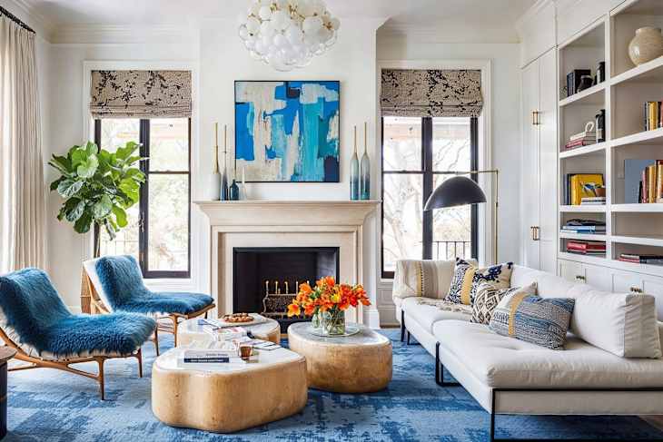
Real Examples of the 60-30-10 Rule
Looking to adopt the 60-30-10 color theory rule in your own home? The best part about this color theory is that it’s versatile, adaptable, and can be used with any style and color palette. Here are a few interiors that demonstrate this simple color theory to help inspire your next project.

Nuanced Neutrals
Take this as proof you don’t need bright, bold colors to make the 60-30-10 color rule work. This sophisticated yet inviting dining room by Decorilla utilizes the theory to create balance and harmony using neutrals and natural textures. Steal the look with a color palette that’s bathed in 60% sleek white paint on the walls (or cream!), 30% black, and 10% finished in warm wood and beige tones.

Earthy and Balanced
Ready to inject a touch of earthy color into your space? Holland shows us how it’s done right with this warm sitting room design. Creamy whites make up the base of the space, led by warm olive green tones. Black also acts as the accent in this space, with ochre yellow stools and stacks of natural wood logs adding a final pop of color and contrast.

Bold and Bright
This design-forward Barcelona apartment demonstrates the harmony of the 60-30-10 color rule perfectly. In the kitchen, there are actually four primary colors that compose the room’s palette: white, light wood, green, and yellow.
Yet it’s the wood, green, and yellow that establish the foundation of the space, with white being used as a backdrop on some of the walls and ceiling. The color palette can be broken down as 60% light wood, 30% green, and 10% accents.

Drenched in Color
Ready to dial it up on the color? This Tampa home left no wall untouched by a paintbrush, and the result is vibrant, cheery, and harmonious.
The trick to using so much color? Nailing your proportions, of course. The entire house utilizes the exact same color palette, with each room having a different primary color.
For example, green is the dominant color in this living room, while orange and teal serve as accent colors. In contrast, the nursery features orange as the primary color, with green and yellow as the accent colors. Then, the dining room features yellow as the primary color, with teal and green as the accent colors … and so on. Color theory perfectly exemplified!