
4 Tips for Using Bold Color in a Bedroom if You’re Not into Color, According to a Designer
I’m not exactly color shy, but one area that’s always leaned a little more neutral for me in my adult life has been the bedroom. I’ve talked to at least a hundred different designers at this point (probably more), and for the most part, they’re all proponents of soft, calming shades like cream, gray, light blue, mint, and maybe blush in a sleep space. Of course, there are exceptions to this rule: namely deeper, dark hues like black or midnight blue that can create an enveloping, cocoon-like effect in a room. But what do you do when you like punchy shades in theory but are worried they might be jarring where you sleep—or you’re not really a color person but find the all-white everything look a little, well, bland?
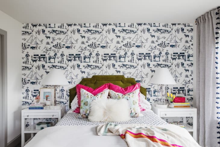
That’s where designer Abbe Fenimore of Studio Ten 25, who you might remember from AT’s Small/Cool Experience at Home back in May, comes in. Her guest bedroom, seen above, was the last space she tackled in her recently remodeled home, and it’s pretty much an exercise in decorating with bold color—without going over the top.
“I wanted the room to feel like our guests were visiting a fun bed and breakfast where they had all of the comforts of home,” says Fenimore. “Since most guest rooms are neglected, I wanted this room to feel well thought out while also being cohesive with the rest of our home.” Pops of color! That’s how she accomplished this goal (including incorporating hot pink!), and she’s sharing her best four decorating ideas here.
Let a bold piece be your palette’s jumping off point, but balance it out with more subdued staples
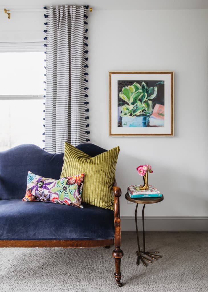
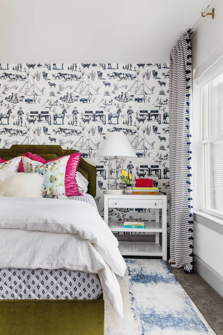
“I love the navy velvet settee I inherited from my grandparents and purposefully selected the color palette to work with the piece,” says Fenimore of her guest room’s little sitting area, seen above. Because that hue and fabric are visually rich, she decided to stick with mainly plain white bedding and walls. To bridge the gap between navy and white (two colors of opposite intensities), she strategically selected a navy and white wallpaper, Katie Kime’s Marfa Toile, to accent the bed wall and a pay a little homage to her home state of Texas.
“The Marfa wallpaper in navy not only created the wow factor in the room, but it visually balances out the navy settee and grounds the remaining white walls,” she says. She also selected an area rug, bed coverlet, and curtains that reinforce the white and dark blue color color scheme. White lacquer nightstands from Worlds Away are the perfect scale, receding visually so all eyes are on the bed and statement wallpaper.
Add punchy accents with more temporary textiles and accessories
Fenimore likes to go big with color and pattern for throw pillows, blankets, and other textiles since they’re the easiest elements to switch out. “If I want to warm the room up during the winter, I can layer pillows and accessories in a more neutral color palette with texture for a cozier feel,” she says. To pull off these kind of seasonal switches, it’s best to keep your sheets and duvet cover plain to make layering in color simple. Her secret source for luxe looking velvet pillows in practically every shade of the rainbow? Amazon, where you can get two covers for less than $17. Placing them behind lighter colored toss pillows subdues their saturation, so you can go hot pink or canary yellow without worrying about it being too much.
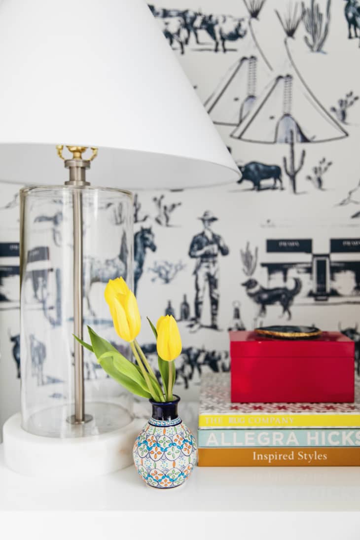
You can always add color using fresh flowers and decorative knickknacks, too. “Smaller accessories like framed art leaning on a nightstand or even hanging on the wall above will help to personalize the room and infuse your color scheme,” says Fenimore. “Coffee table books, small decorative boxes (to help hide clutter), and a small vase are a few of my go-to accessories that bring in function while injecting personal style.”
For a sleep space, trade black and white for something a little softer
“I adore a classic black and white combo, but sometimes it can feel a bit harsh and formal in the wrong setting,” says Fenimore. “Navy and white are versatile and allow you to create multiple looks ranging from sophisticated and chic to traditional with a twist.” This slight tweak also feels a little fresher and allows you to introduce a little bit more color if you riff on the different shades of navy that you can find furnishings in, as Fenimore did with her curtains, wallpaper, and more.

Take a chance on a trendy (but also timeless) hue
Right now, moss green is Pinterest’s hottest color—it’s popping up on walls, furniture, and even tile. That said, moss green is also a color plucked right from the natural world, and as such, it’ll never really go out of style the way a neon lime or bright purple might. So Fenimore felt safe taking a calculated risk on The Inside’s Art Deco Bed in this serene shade. “The bed has a strong presence in the room, and the shape of the headboard helps to break up the repeat of the wallpaper pattern,” says Fenimore. “I love how versatile the color is.”
This color choice wasn’t completely arbitrary though—since Fenimore has green elsewhere in her home, the bed actually adds a bit of cohesiveness to her entire decorating scheme. The lesson here is if you do want to try something trendy for an anchor piece, make sure it’s livable and not too far outside the realm of what you already have going on in the rest of your home color-wise.