
Trending: Dark & Stormy Jewel Tone Paint Colors
In a recent Apartment Therapy ‘Favorite Rooms’ post, someone described their bedroom as “Dark and Stormy.” Perusing through the photos, I agreed with the adjectives; the wall paint color was reminiscent of the greenish blue color of a stormy sea. I realized I had seen several wall paint colors recently that also fit the dark and stormy style. I spot a trend – one that could lead to dramatic and bold spaces.
The big difference between these dark and stormy jewel tones and other jewel tone color trends we’ve seen in recent years is the amazing dichotomy behind the particular colors below: they’re rich, bold and dramatic, but they also have a subtly to them. These colors are bold, not loud. Attention-grabbing but not obnoxious. They don’t necessarily force a mood—these hues can complement the mood of the weather outside, architecture of the home or the people inside.
These colors exude both energy and peacefulness. They coordinate with other paint colors when used on a single accent wall, and they flourish when used to cocoon a small space. If you’re looking to create your own dark and stormy vibes, try one of these wall paint colors from real-life rooms:
BEHR’s Tropical Skies creates a bold dining room.
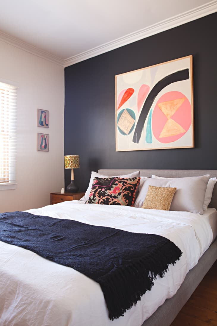
A bedroom accent wall is coated in DULUX Domino.
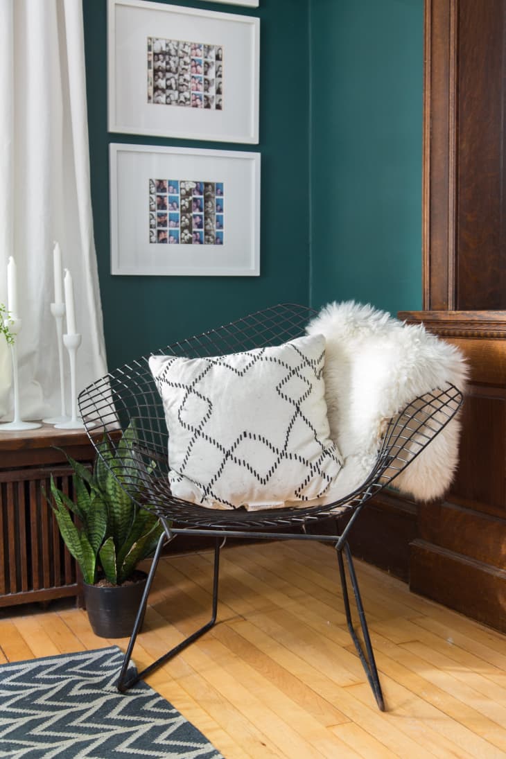
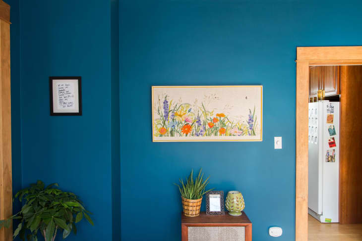
Benjamin Moore’s Dragonfly cocoons this living room.
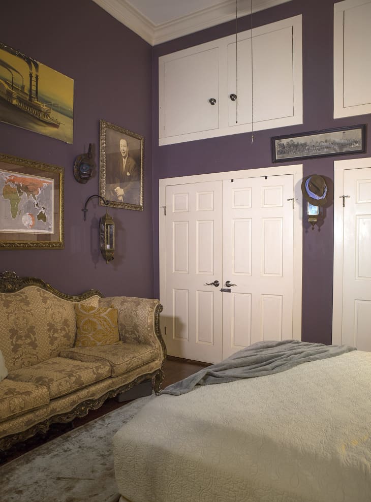
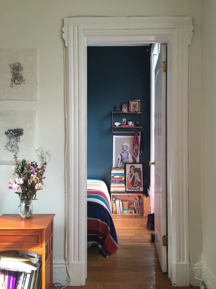
This bedroom (and the home’s living room) are a wall paint color matched from a paint chip: Ace Royal, Flat 183 (170A340)
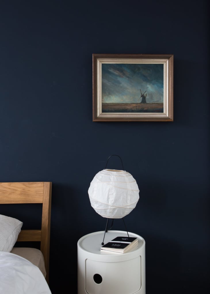
This master bedroom features a gorgeous color from Sanderson: Indigo Blue.