
This Super-Bold Color Instantly Elevates a Room (Even if It Has a Neutral Palette)
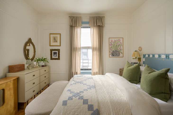
A room’s color palette communicates the space’s intention and energy. For example, you might want to use a warm color palette in high-traffic areas meant for gathering and socializing. Or you might opt for a specific blue shade in bedrooms to heighten relaxation. Once you’ve thoroughly considered and settled on the color palette for a given space, it might be daunting to throw a curveball by introducing a bold color into a room.
But remember the unexpected red theory that was trending two years ago? (The theory suggests that adding even a small touch of red makes a room feel more intentional and visually complete.) Well, it’s still around and thriving today. Take Madeline Scalzi’s bedroom in her cottage-inspired Queens apartment. Initially it looks like a neutral space, with calming pastels and light shades — until you look up at her bright-red light fixture. Instantly, the room is elevated.

An Unexpected Pop of Red Made This Bedroom Feel Complete
Looking around Madeline’s room, there aren’t bright colors. The walls are painted with Behr’s “Swiss Coffee,” and the trim is painted with Benjamin Moore’s “Saratoga Springs.” There are pops of pink in the artwork and on the wall plates, but they’re on the softer side.
Originally, Madeline purchased a brass light fixture from The Home Depot but decided to spray-paint it red. She added a ceiling medallion and carried the blue color from the trim, painting the medallion the same shade. Together the red and blue color additions create an understated, timeless pop that doesn’t throw off the entire color palette.

Because the rest of the bedroom is restrained with its color palette, the bright DIY-painted red fixture draws the eye upward without taking visual attention away from the rest of the room. It’s the only saturated color in the room, so instead of competing with the existing palette, it gives your eye one intentional focal point.
If you’re looking for that unexpected red pop in your own space, you’re in luck. Department stores, like IKEA, have several cute finds in this colorway available. Madeline’s home proves that this theory remains true; just imagine how your room could be elevated by trying it out. Visit the full House Tour to see how Madeline uses one sprinkle of red in her living room.