
Valspar Announced Not One, But a Dozen Colors of the Year for 2020
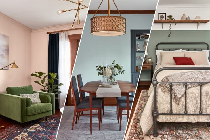
While most paint brands are expected to announce a single color of the year (or none, as one would have it), Valspar won’t settle for less than a dozen. That’s right, the company just debuted twelve hues for the coming year, in case you’d like one for each month of 2020.
We can’t say it’s a total shock; Valspar also announced a dozen colors for 2019. What is new is that each of 2020’s top shades was inspired by nature and photographed in real homes, showing that they can work in a variety of rooms, styles, and tastes.
Let’s meet the colors:
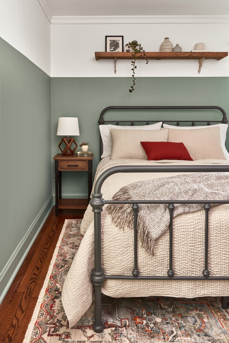
Tempered Sage
A “fresh take on lime green,” Tempered Sage “pairs with natural wood tones, creating an earthy wholesome space.”
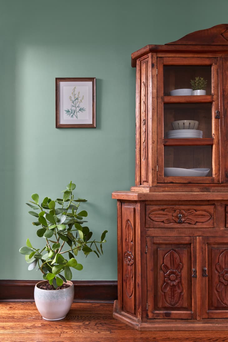
Secret Moss
Valspar describes this as “naturally therapeutic, this dusky moss green creates a calming escape in any room.” They suggest that “soft neutrals and minimalist decor allow this charming green to make a statement.”
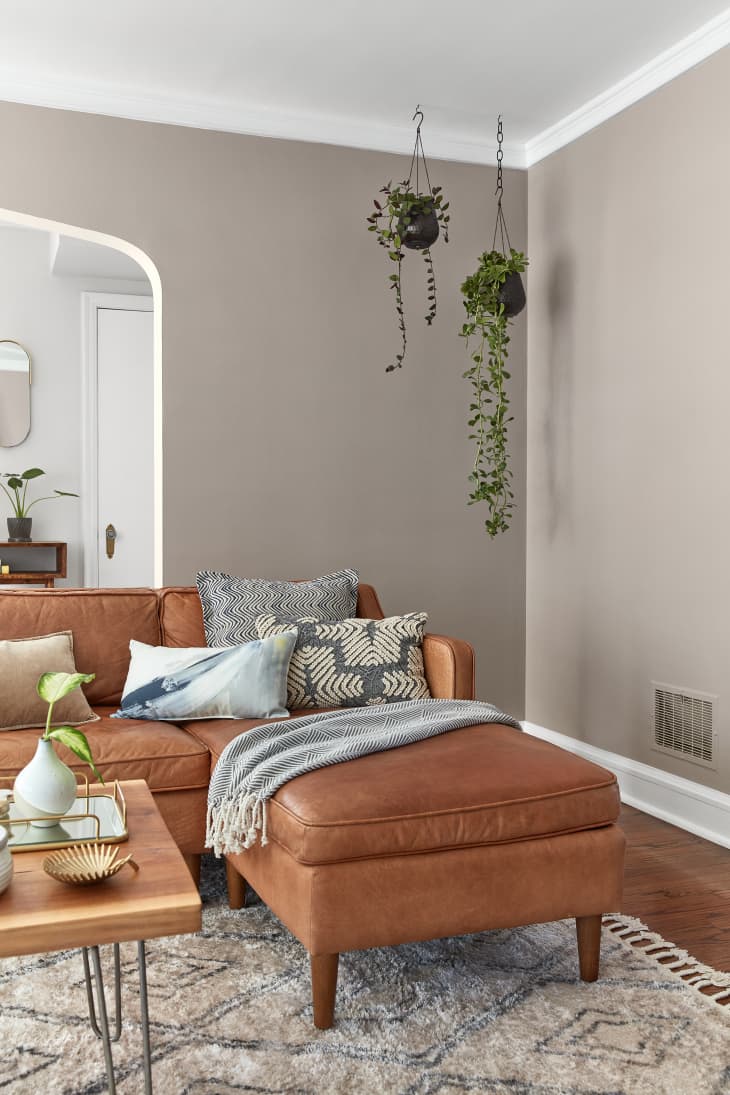
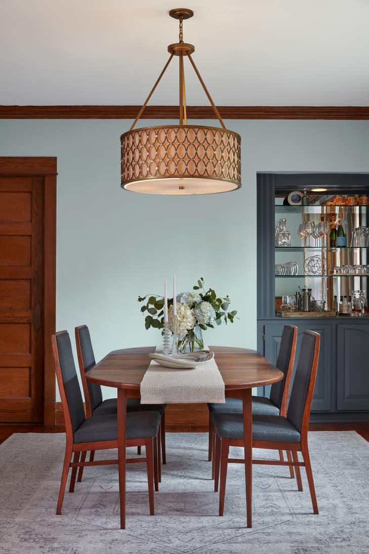
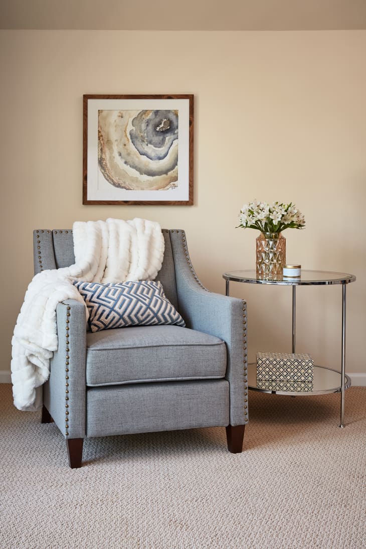
Winter Calm
This “calming greige” brings “a comforting sophistication to a space.”
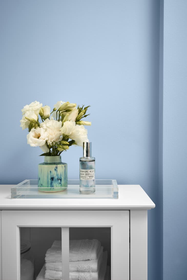
Utterly Blue
Utterly Blue brings the sea vibes, especially when paired with “crisp whites and pristine chrome…to create a spa-like retreat.”
Grey Brook
Evoking “a cozy warm blanket,” Grey Brook is a “charming bluish gray works in perfect harmony with classic wood tones, creating a timeless space.”
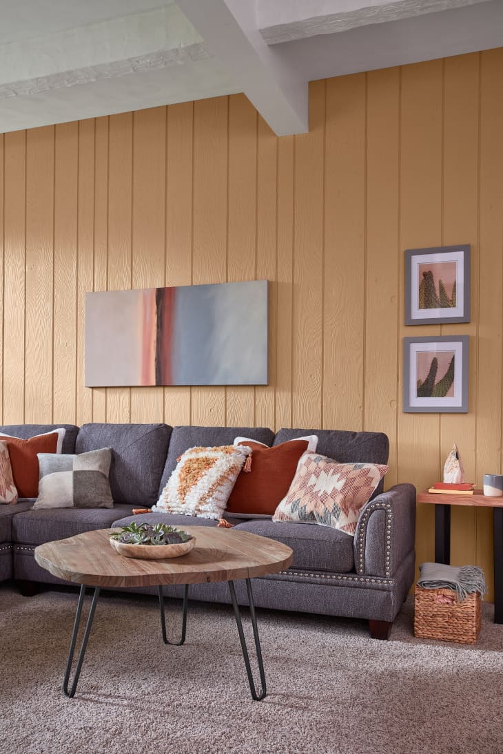
Pale Powder
A warm neutral, “woven baskets and wooden decor keep this nostalgic dusty apricot true to its retro roots.”
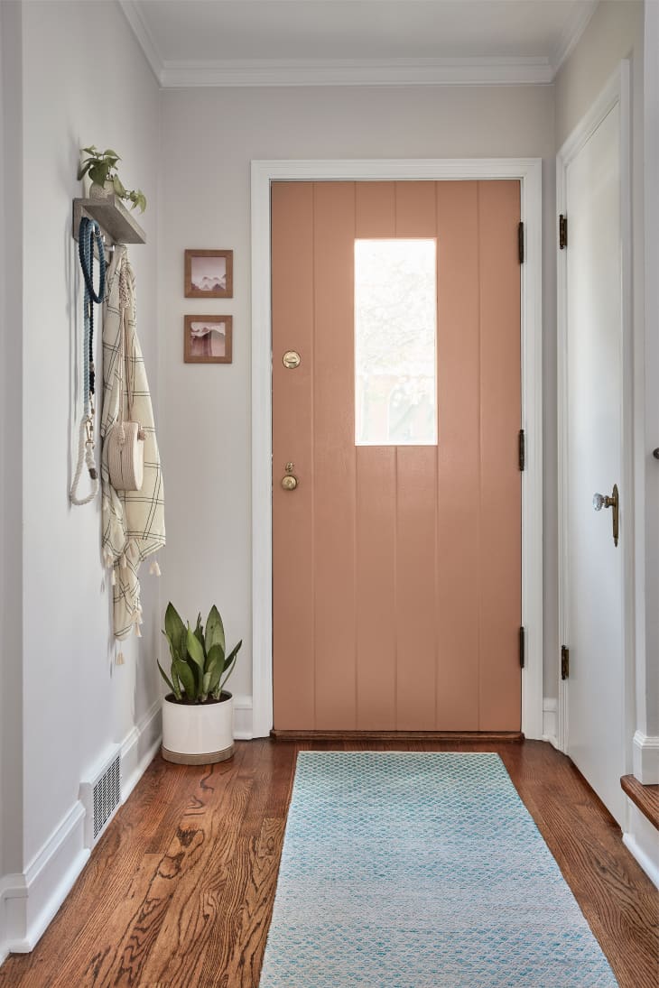
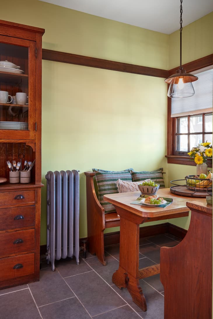
Canyon Earth
“Reminiscent of the desert,” Valspar recommends this hue on a door for “an infinitely more welcoming entrance.”
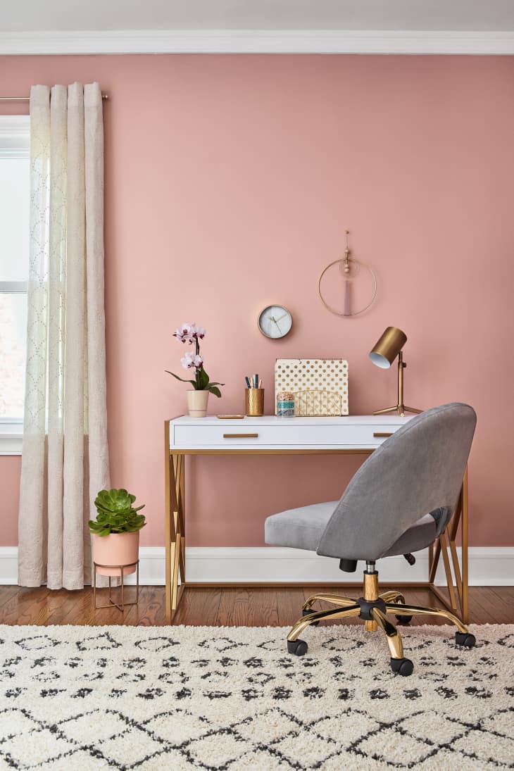
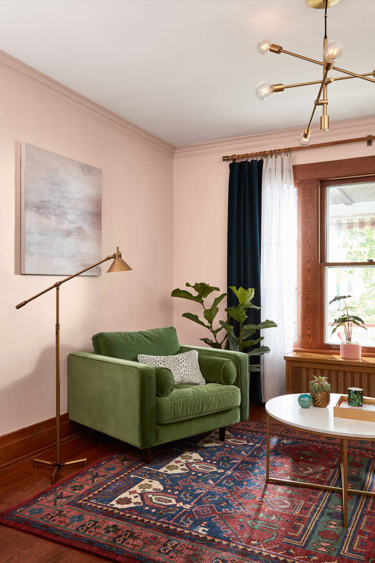
Bombay Pink
Described as “mature” and “confidently cheerful,” Bombay Pink is elevated with gold accents.
Desert Fortress
“Comforting” and a “blank canvas,” layer with plush blankets and pillows to create a relaxing space.”
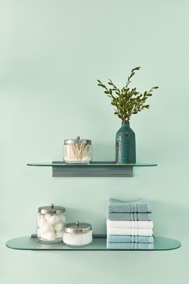
Mint Whisper
Valspar suggests pairing mint and white keeps “small spaces feeling light and airy” while “bringing a sense of peace.”
Secluded Garden
This “vibrant jewel tone creates a nostalgic sanctuary,” and “gets a touch of glamour” when paired with brass.
Crushed Out
When paired with bolder hues, the “hushed blush…recedes into a beautiful neutral backdrop.”