
This 1928 Bathroom Had Peeling Molding, Office Ceiling Tiles, and Pink Grout — Now It Looks Timeless
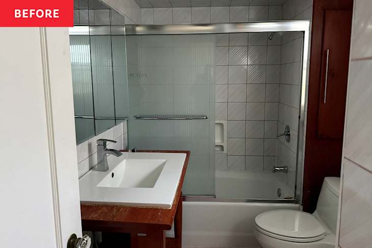
When we bought our 1928 home almost four years ago, neither bathroom was a selling point — but the main upstairs one was by far the worst. You could tell it had probably been renovated in the late ’90s or early ’00s, thanks to its frosted glass shower door, low-slung toilet, and faintly rainbow striped (yep, like a subtle candy cane!) wall tile.
The white tiled floors, laid with pink grout, truly weren’t any better. They showed every last bit of dust and hair. The drop ceiling was covered in the type of tiles you see at offices, the lighting was a harsh fluorescent, and the “crown” molding was clinging to the wall for its life with loose nails. The wood on the vanity top was peeling — as was the tub, which had been glazed at some point but looked fine at our home inspection — and the storage situation could have been better. Nothing in the bathroom was original or felt true to the home.

The Bathroom Was Stuck in the Early 2000s
So we did what anyone who just bought a house might do: We lived with it while we saved up for a renovation. We tried to keep track of what we didn’t like about the bath so we could change it thoughtfully. There was something sweet about the space, even in its dated state. But once a pipe behind the shower wall began acting up a few years after moving in, we were ready to invest in a whole new bathroom.
The goal? Create a classic bath in line with the age of our house and the color palette we were using elsewhere, which consisted of greens, teals, beiges, and hits of gold. We’d gut the room, replace the plumbing and run new electrical, and update all the fixtures and finishes. The floor plan wouldn’t really change, as the footprint is fairly small (with no nearby space to steal). And we didn’t want to significantly move the plumbing due to cost constraints. But we would add in a few modern amenities and make sure to prioritize storage.

Building the Right Team for the Job
Considering my background and love of home decor, I’d serve as the designer, and we enlisted the help of a wonderful contractor, Francisco Garcia, of European Renovations and Landscapes in New York City and New Jersey, to execute the vision. He came highly recommended by my designer friend Adnan Anwar, and really understood what we were trying to achieve.
After lots of time on Pinterest and Instagram, and even referencing some of my favorite Apartment Therapy House Tour bathrooms, I had some ideas. But the whole process of shopping different showrooms and home center stores to cobble together the design started to feel daunting. Enter: Wayfair, which reached out to partner on a makeover at the exact right moment somehow.

How Wayfair Made the Vision Come Together
The thing about Wayfair is it truly has everything — plumbing, faucets, shower hardware, tiles, toilets, the list goes on and on — and it’s literally what you find at many showrooms and stores but with the ease of one-cart checkout. So much of the company’s offerings ship quickly and for free, too, so it was a lot easier for a novice “designer” like me to pick products (because they have a lot of variety but not every hardware brand, for example) and to keep track of what I needed to order for the renovation and when to expect shipments.
The design plan sharpened while I shopped around Wayfair. We decided to create a fully tiled bath with a cool yet classic, two-toned wall treatment, with sage green tiles on the bottom 2/3 of the wall and vanilla on the top 1/3. These areas would be separated with a line of Bedrosians Clara black pencil trim, which is straight out of the ’20s, but I’ve been seeing so much more these days in high-end modern and traditional bathrooms. I couldn’t believe how much tile Wayfair stocked — and how beautiful the subway-meets-Zellige Bond Tiles I found were (they are made in Spain and absolutely lovely in person). I decided to carry the tiles onto the front of the tub, something I’d also been noticing in luxury baths with bespoke, built-in fixtures. We’d pair this tile combo with traditional hex mosaic underfoot; I went with WS Tiles mosaic flower tiled in black with white center to mix it up and avoid the white flooring issues I’d been having.

A Case for Ditching the Shower Door
The plan was to forgo a shower door and instead try the drapery-as-a-shower curtain idea, which I love. The hope was that it would soften up all the tile a bit and absorb any echoes. And almost immediately, I fell in love with the Birch Lane Garza 36″ Single Bathroom Vanity Set, which in addition to the fully tiled shower, would be the other focal point of the room. If you can believe it, this piece was actually smaller than my previous vanity, offered tons of closed storage (two large drawers, which we didn’t have before), and had a sink built into its gorgeous marble top. I love a one-and-done where possible, which simplifies the design process. When we unboxed this piece, though, it truly looked like a custom vanity that I’d never be able to afford, and I can’t recommend it enough.
To keep the focus on the vanity and the tile, I wanted a streamlined medicine cabinet. It took a while to find this design, because I wanted something minimal that could be fully recessed and also 36 inches wide, so it’d span the entire vanity. Ultimately, I went with the Latitude Run Ronelda 3 Door Medicine Cabinet. I think its matte black frame really complements the pencil trim. The contractor added wiring for a scone, and I chose the Joss & Main Jaina 2 Light Armed Wall Sconce in gold; I always like to go more mid-century with lighting when I can for a touch of something a little more contemporary. Francisco recommended an exhaust fan and overhead light combo, so I homed in on this plain circular LED style by Akion, also in matte black. People say this finish is out, but I didn’t want all brass everywhere. The black ties into the floor and grounds everything ever-so-slightly with a little bit of edge.

Choosing Fixtures That Felt Classic
Then it came time to choose the plumbing. I’m a big fan of Kohler, so I decided to stick with Kohler fixtures throughout the bath. That way, I knew the tub’s white finish would match the white toilet exactly — and that we wouldn’t have too many brass finishes clashing in the space, as I planned on going warm with my fixtures and hardware. Kohler’s Castia collection by Studio McGee had been a favorite of mine since it launched a few years ago. I selected the Castia Widespread Faucet and the Castia Rite Temp Bath and Shower Trim Kit (and later bought the Castia toilet paper holder and towel hook to coordinate), all in the vibrant “brushed moderne brass” finish.
The toilet was easy; I chose Kohler’s Memoirs because it had a traditional look and less exposure on its base, which meant fewer nooks and crannies to clean around. For a little bit of luxury, we splurged on the Purewarmth Toilet Seat.

The Tub Saga (and My Most Expensive Mistake)
The tub, though, gave us a run for our money. Initially, we thought we’d be able to remove the wood cabinet between the shower surround and exterior bathroom wall, stealing that foot of space for a larger, 6-foot soaker tub. Our plumbers, Amasi Plumbing & Heating, soon discovered, though, that the cabinet configuration concealed a vent pipe that couldn’t be moved. So we had to return the 6-foot tub for something smaller.
This is where I made a mistake that I want to help others avoid. Tired of making decisions, I naively asked chatGPT to decide between two different drop-in tubs for me: the Kohler Avec and the Kohler Archer. They seemed very similar to my eye, and in the 5-foot size (60″ by 30″ size), both theoretically should have fit. ChatGPT said the Avec was the designer favorite of the two, and so I just went with it. Turns out, though, the Avec is designed to be framed on both sides and not able to be installed flush against the wall, which is how our bathroom was set up. So yes, I had to order a third tub, the Archer, to fix that issue and still accommodate the vanity. That was a pricey mistake, but ultimately, it was worth it to avoid water damage and leaking in the future. This is why professional designers are truly so helpful, though: AI makes mistakes.

The Finishing Details That Made It Feel Personal
Finally, it was time to paint the ceiling and trim. I asked Adnan for a foolproof white paint recommendation that wouldn’t be too warm or too cool, and he suggested Benjamin Moore’s Simply White (OC-117), which we used in semi-gloss on the doors, window, and framing, and the ultra-flat finish on the ceiling. We chose the Advance Interior for the trim and the Waterborne Ceiling Paint, formulas designed to stand up to the heat and humidity in a bath.
Then I turned my attention to the finishing details. I had a vintage brass cup holder I found at the Paris flea installed above the vanity for soap, and an Anthropologie glass shelf I’d been holding onto for years installed over the toilet. I put my Pierce & Ward tissue box cover on the shelf alongside the cutest CB2 glass box for cotton swabs and some Paris flea art. I ordered Two Pages’ box pleated drapery meets shower curtain in the brand’s off-white Jawara fabric in a custom size, since we raised the adjustable fixed Kohler Elate Shower Rod up so the whole space would look a little loftier (demoing the drop ceiling really helped, too). The larger size curtain also conceals the niche that once held the wooden cabinet that was looking a little worse for the wear (Adnan and I decided this was the best solve for a seamless look in the space without having to spring for custom millwork). Aside from these small accessories and textiles, literally everything — even the in-wall plumbing my contractor helped me order for the shower, tub, and sink — came from Wayfair, which is pretty remarkable and oh-so convenient.
A Bathroom That Finally Fits the House
We’re pretty close to being fully done with the bath. I just purchased some vintage marble to replace the wooden door threshold (and make a few shelves in the niche for extra storage). These are projects that I feel will add a little extra character and charm to the space, as everything else is so new.
The project took about two months to complete (renovations always take longer than anyone thinks, and if you can be flexible about your timeline, sometimes the work will be a little bit more reasonable cost-wise). We couldn’t be happier with the results, though. From the heated toilet seat and the strong shower head to the gorgeous, floor-to-ceiling tile and beautiful vanity, I truly feel like I’m at a fancy hotel each time I use my bathroom.
Design Defined
Never miss the style inspo and recommendations you crave with Design Defined. Follow along each week as our Home Director Danielle shares the best style advice, latest trends, and popular decor finds you just can't miss.