Why This Room Works: 6 Expert Color Mixing Tips to Steal From Annie’s Bold Living Room

It’s one thing to add in a lot of color into a living room. It’s another thing to mix a lot of bold colors expertly in one compact space. How do you do it so it’s exciting and not a messy jumble of hues? A favorite house tour with a particularly colorful living room holds six secrets worth stealing for your own colorful home.
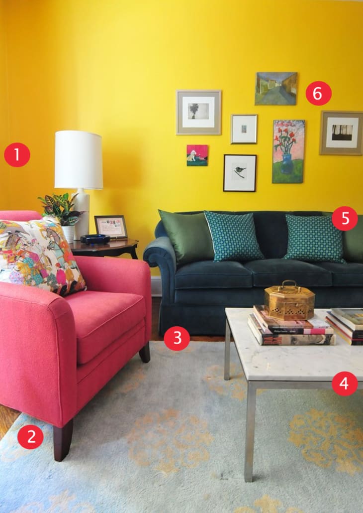
The living room in Annie’s Color-Splashed Home works because it’s a mix of really strong colors in expert balances that create a cohesive color palette, without any one thing sticking out too much or stealing the show. Here are six elements in particular we think are making this room work:
1. Go for a really bold wall paint color
If you want a really bold room, don’t skimp on boldness when it comes to picking a wall color, both in strength of hue and placement of color. In Annie’s living room, she chose a strong, golden yellow and then wrapped all the walls of the room in it.
2. Pick another strong color to complement
Another way to amp up the boldness of a room? Pick another bold, complementary color (in this case a strong pink). The trick? Use enough of the second color to balance with the wall color. In Annie’s living room, she uses the pink on multiple large upholstered furniture pieces. The yellow and pink work together in this way.
3. Use darker and lighter shades of colors as the neutrals
In this living room, the rug and the sofa are both technically colors. The rug sports a very pale, light blue and the sofa a deep, rich navy blue. But because both of those colors are on the more extreme ends of the shade spectrum, in this room they function as neutrals.
4. Have white surfaces to give the eye a rest
The coffee table, the lamp shade — even the radiator — all give the eye a place a rest by being white, not too much give a much needed lightness to a room full of color that could easily slide into heavy.
5. Partner secondary colors in small vignettes
The blue and green of the soda’s throw pillows, the blues of a side chair and accessories — there are plenty of smaller punches of additional colors that show up in this room. The reason why they work in this space is because Annie grouped secondary colors in vignettes so they felt like they connected with the space, and not stood out as single pops of unconnected color.
6. Use multi-colored art to tie the room together
It’s a simple tip, but an always effective one. When you’ve got a lot of color going on in a room, use art that also features many of those colors. It has a cohesive effect on an entire room.
What color mixing tips have you learned decorating your own rooms? Share in the comments below!
