
I Have 12 Different Colored Pens for Every Mood — Here’s Why Experts Say That’s Legit

For years, I’ve held onto this vague idea that writing things down has made them come true. It started with my “magic notebook,” which was an incredibly ordinary thin pink Moleskine I used to track all my tasks, notes, and hopes right after college. Somehow everything I wrote down — whether it was something I could control or not — actually happened. I noticed as this technique continued to produce results, over time, across notebooks. The practice felt like a healthy balance of organized and witchy behaviors, and I liked it.
Recently, though, I realized I wasn’t seeing the results I wanted to see. The fallout of the pandemic left me largely discouraged, and if I’m being honest, pretty depressed. I wasn’t getting things done, and things weren’t getting done. I couldn’t access my magic.
Then, I started listening to a podcast called “Your Magic,” courtesy of my Spotify algorithm. On each episode of the podcast, host Michelle Tea talks to a celebrity — people like Phoebe Bridgers, Busy Philipps, and Roxane Gay — about their magical practices and experiences, and through the conversation, reveals how simple and adaptable magical practices can be.
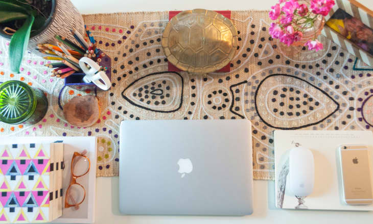
In March, it inspired me to create a practice of my own: Guided by color magic, which uses colors to guide spell-casting, I started using colored pens to help evoke results from my daily journaling and to-do lists. On days when I wasn’t sure what color to use, I’d ask the universe to supply me with what I needed and blindly pick one or two of my 12 MUJI pens. Even though my pen practice was entirely made up, it felt good to be doing something that might generate results. And then I started getting more productive.

Recently, I asked Tea, a modern tarot reader and author, if my practice felt like a valid form of magic. “The kind of magic that I really like and try to work with and that we like to put into the world via ‘Your Magic’ is this respect for traditions, but at the same time, understanding that those traditions just came about because regular people like you and me created them, and we can continue as human beings in 2021 to create new magical practices,” she says. She adds that my pen practice feels “intuitively true” based on its marriage of traditional color magic with modern intention.
And in fact, on a psychological level, using color to spark moods and outcomes is intuitively true. “There are many studies that show, both from a physiological and psychological standpoint, how color influence starts very, very early in our lives,” says Leatrice Eiseman, executive director of the Pantone Color Institute and author of “The Complete Color Harmony, Pantone Edition.” In daily life, your interpretation of colors helps you recognize signals, express creativity, and even convey emotions.
In using colored pens, I’m drawing from the emotional signals of the colors, affirms Karen Haller, an applied color and design psychology expert and author of “The Little Book of Colour: How to Use the Psychology of Colour to Transform Your Life.” You can try it, too, to “[use] color to support your intention,” she says. It might even make less exciting tasks more enticing. Writing a to-do list in a color associated with joy, like orange for many people, could make that to-do list seem more fun. “Cleaning the toilet, cleaning the bathroom, having to do your tax file — if that was written in your happy color, see if that would give you a different mindset,” Haller suggests. Looking back at your list, “you’ll connect to the color before you connect to the words,” she explains.
Despite using just a small amount of color for the colored ink concept compared to the grand scheme of your surroundings, this approach can still be impactful thanks to the amount of emphasis placed on each color. “If you’re journaling, you are really focused on what you’re doing,” Eiseman says. “Your surroundings become secondary and you’re focused on the page or on your computer. So, that focus means that that color takes on even more significance because you are zoomed in on it.”

A Quick Color Breakdown
Want to try a similar ink (or digital ink) practice yourself? Here are the most common emotions associated with each color, according to color psychology experts.
Keep in mind that specific color associations for an individual might veer off the collective path. “There are psychological traits that are positive and adverse for all colors, but we also pick colors because of a personal association we might have to it,” Haller says. Associations can also be culturally influenced (the breakdowns below skew Western), and a traumatic incident could bring about a negative connotation with a dominant color that was present at the time.
Red is physically stimulating and associated with energy and excitement. Of course, it’s the color of lust and passionate love, and it highlights urgency. “Color is actually wavelengths of light that comes into our eyes, and red is the wavelength that advances towards us the quickest, so therefore we see it the quickest,” Haller explains.
Pink is physically soothing. It signals compassion, nurture, care, and a more romantic or friendly love. It’s a good color for self-care.
Orange “is the color of fun, playfulness, and joy,” Haller says. It can also add a hint of mischief.
Yellow simulates sunshine. It represents cheer, happiness, optimism, and illumination. “It opens you up to new thoughts,” Eiseman says.

Green is the color of life, safety, growth, and health. Perceptions of green are tied to nature. (Magic takes the idea of green’s prosperity one step further — Tea calls it “abundance magic,” explaining that you can use it for an “abundance of cash or opportunity.”)
Blue is the color of the mind, Haller describes, ranging from soothing and calming light blues to focused and concentrated dark blues. We align blue with the ocean and the sky, always vast and waiting for us, ascribing a sense of loyalty and constancy, Eiseman says.
Purple “is about connection to your inner self and connection to your higher self, so it’s tapping into your own personal beliefs and connecting to who you are,” Haller says. (Personally, I often use a purple pen for new moon journaling or when I’m trying to access deeper thoughts.)
Black is tied to power, elegance, sophistication, and authority. It can also create barriers. “There’s no mucking around with black,” Haller says. But big caveat: When it comes to writing with black ink, achieving those emotions can be tricky, Eiseman warns. “Because we’re so accustomed to black or blue ink in pens, it’s really not as much of a presence as it is in other applications,” she says. So if you aren’t regularly using other colors, black’s perpetual sameness will dominate over any other potential emotional powers.
White is a sanitary and clean color, particularly after we’ve spent so much time thinking about germs and bacteria during the pandemic, Eiseman points out. It’s not the easiest color to write with (personally, I don’t), but when it comes to your workspace, “if you have too much white, it can cause eye strain,” she says, so it’s good to cut pure white surroundings with off-whites or pops of color.
Complex Colors Bring Complex Emotions
A complex color is one that is made up of two different colors. So secondary colors orange, green, and purple are all complex colors, and they spark some combination of the emotions of the primary colors (the “mother colors,” Eiseman calls them) that mix to make them.
For example, purple is made of red and blue, and because warm red and cool blue are opposites in color temperature, it can generate high activity on the one hand and tranquility on the other, potentially sparking the most complex emotions. “People that like purple are usually people that are a bit more creative and complex in their thinking,” Eiseman says. “They don’t like things that are too straightforward; they like things that are just a little bit running contrary to each other.”
Taking this idea of complex colors one step further, if a complex color scales closer to one mother color, it will take on more of the characteristics of that dominant mother color. Consider lime green: Green is made up of blue and yellow, of course, but Haller refers to lime green as “green’s alter ego,” because “if greens are normally very soothing and calming,” then “lime green is on steroids…because of all the yellow in it.” I use a yellow-green pen when I’m trying to tick through my to-do list, and I use a blue-green pen for more serene productivity.
Different Shades Spark Different Emotions
Adding white to any color is going to essentially turn down the volume on the associated emotions, making them gentler and less stimulating. (This is why people tend to decorate baby nurseries using colors low in chroma — to create a soothing environment.)
For example, look at the difference in emotions associated with red and pink. Pink, as we know, is red with white mixed in, so while red may create feelings of passion and arousal, pink tones it down to compassion or even friendship, depending on the shade.
“There are the softer, lighter pinks, but there’s also the hot pinks, and the hot pinks get closer to the mother color of red, so the hot pinks take on the same characteristics as the mother color red has,” Eiseman says.
Darkening a color by adding black, on the other hand, will “add depth,” Haller says. “The color will no longer be light or reflect, but heavier, making a space look darker, more somber, for people more serious.”
Ultimately, though, it’s up to you to recognize how colors make you feel and lean into those specialized interpretations. There’s no definitively right or wrong way to use color, but paying attention to the colors dominating your line of vision and how they impact you can help to guide emotional well-being and generate positive outcomes.