
Before and After: A Scary 120-Year-Old Bathroom Gets a Fresh Yet Timeless Transformation
This is the story of swapping a white-tiled shower for another white-tiled shower in a gut-job bathroom renovation. I’m only kidding, but that’s what my best friend — and partner in the adventure of rehabbing a 120-plus-year-old house — jokes. Mike and I bought the house, a Victorian in need of love, to restore to the kind of beauty she once had.
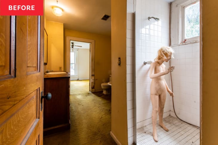
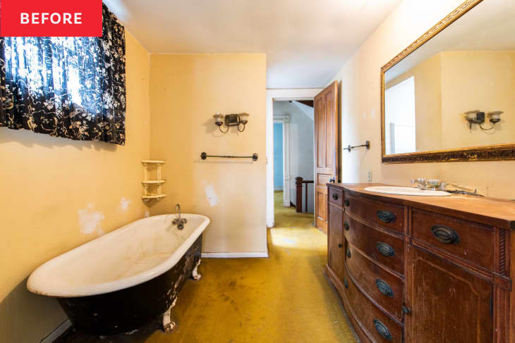
It was hard to see that beauty on day one, though, hiding under dingy brownish-yellow carpet (an unfortunate color and material in a bathroom!) topped with a rusted-out clawfoot tub and a cramped shower. Not to mention the jump scare of that surprise mannequin, which we did not put there. But the bathroom had potential, with natural light, plenty of space, and the chance to rehab and feature that rusted-out clawfoot tub.
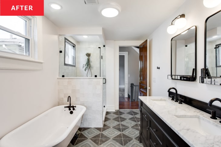
Mike and I had to take the bath down to the studs and joists as part of a two-year to-the-bones renovation of the house, but that gave us a fresh start for a classic, glam palette of black and white against pink. In place of the tiny and impractical old shower we added a larger custom one; there, we went for big impact with a few dark grey zellige tiles to trim out the niche and the window. The rest we covered with pearly white squares with a super on-trend textured style (and installed at an offset for a more contemporary feel than the old ones’ straight lay). A pinky-taupe penny round tile in the shower pan brought it all together, and inspired the room’s paint color — the ultra pale pink Vintage Taupe from Benjamin Moore.
Originally I wanted black walls but that may have been a touch risky for resale (ha!). Instead, we found a compromise in black floors in an over-sized simple geometric pattern that brought some vintage flair.
Because the bathroom’s starting layout was good, Mike and I decided to keep all the fixtures in their original places. But a glass half-wall on the new shower helps give the feeling of a bigger space — and helps show off the restored tub, too!
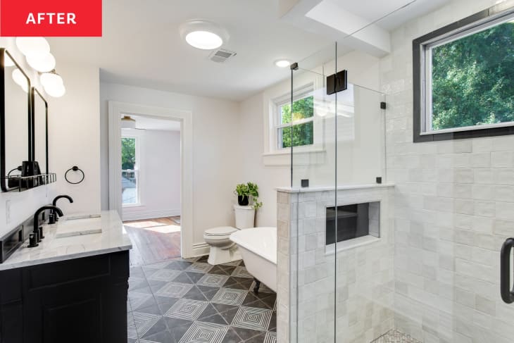
Confession: We weren’t able to salvage the original tub but luckily, a locally-owned tub refinisher had a different restored one in the right size ready for paint, and could take the old one away! We used the same color as the walls, in a more shimmery sheen, and chose glossy black feet to mirror the contrast in the shower.
One thing we knew for sure was that the new vanity needed to feel like a piece of furniture. The first one I fell in love with landed on our wish list, and although we tried to find something less expensive, nothing else was right. You can’t just say, “well, it’s worth the splurge,” on everything, but I couldn’t bring myself to settle for a just-OK vanity in the beautiful space. Also? The James Martin vanity in antique black looked like it could have been in the house forever. Once it was in, there were zero regrets.
The simple matte black mirrors we chose offered cute little shelving at the bottom that I could imagine the owners dressing up with pretty bottles and jars. And oh, those vanity lights! The living room chandelier (the show-stealing Alyssa by Mitzi) spun off into every light selection in the house, and their Paige vanity lights in matte black had just enough whimsy in the delicate design to remind us that a primary bath is a place to not take too seriously.
So yeah, I guess we did replace one white shower with another. But in the process, I’m so proud that we created a space that’s as beautiful as the house deserves, that’s inviting, and even brings a touch of luxe and glamor to a space that had none of that.
Inspired? Submit your own project here.