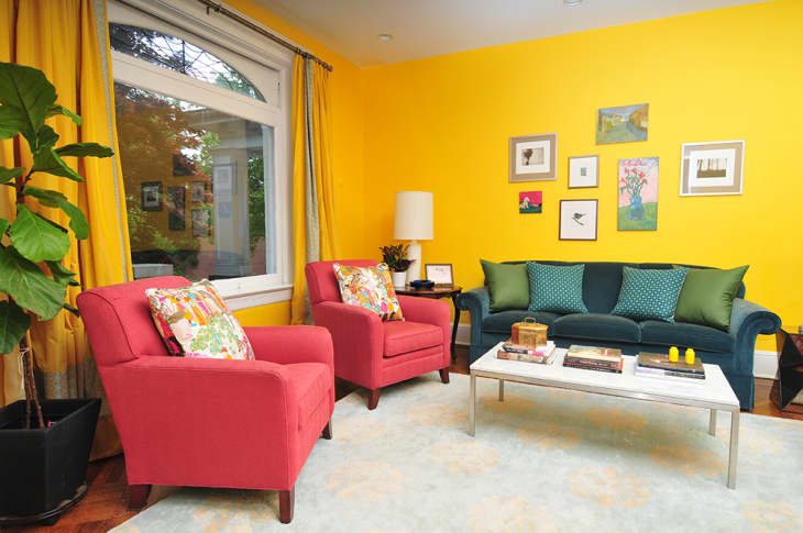
4 Rooms That Prove Primary Colors Are Cool

Forget about the town; it’s time to paint your room red. Or blue. Or yellow.
In a world where laidback neurals and millennial pink are all the rage, dousing your space in a bright, bold primary color can feel a little risky. These hues are a bonafide statement and there’s no going back once you apply that first coat of red paint or add a bright yellow couch to your e-cart.
But the truth is it pays off to be bold. If the most-anticipated trends are any indication, 2019 will be all about embracing new patterns and color. And what better way to kick off your bold streak than with the color wheel’s go-to hues?
The four examples below deftly use primary colors in a way that’s cool, contemporary, and oh-so covetable. If you want to add a punch of pigment to your space, take a page out of these stylish rooms’ rule books:
Opposites Attract
Psst… pairing complementary tones — like a warm yellow and cool blue — can make a statement without feeling like an eyesore. Let Annie Elliott, CEO of Bossy Color Interior Design, show you how it’s done.
Tonal Treatment
Pro tip: Choose one primary color and stick with it. This cool, Brooklyn abode sticks to a blue color scheme, but mixes things up with different textures and shades.
Art of The Matter
Warning: This Jamaica Plain, Massachusetts house tour is not for the color shy. By assigning one primary color to each surface, this room looks just like a cool, livable Mondrian painting.
A Pop of Color
Not ready to repaint your entire place? Add a few bright accessories to the mix. In this Spanish home, the yellow sign and chairs are a cheery contrast to the room’s earthy color palette.
