
A Dark and Dated Living Room Gets a Dramatic Designer Makeover
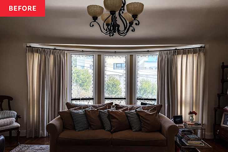
It seems like everyone wants a home with “good bones.” But what does that really mean? Sometimes you just know it when you see it. For Gina Gutierrez, principal designer and founder of Gina Rachelle Design, it was immediately clear that her clients’ 1927 San Francisco home was special. The architectural details were stunning, but still, the space just fell flat — especially when it came to the living room, where the family spent most of their time. “The room had beautiful bones, dramatic windows, and a curved ceiling, but it felt cool, empty, and visually disconnected,” Gutierrez says.
So the clients brought Gutierrez in to help make their already-beautiful home shine a bit brighter — and also to make it feel more like them. They were hoping to do all the work without any major structural changes to the space as well. “We wanted to preserve the footprint and architectural character [of the home] while making the living room feel lighter, warmer, and genuinely comfortable,” Gutierrez explains. “The must-haves were generous seating, better balance at the fireplace, and furnishings that complemented rather than competed with the windows and views.”


A Fresh, Neutral Color Palette Lightened Things Up
As it stood, the living room furnishings were distracting from the gorgeous view and great natural light provided by the huge bay window. “The dark fireplace surround and lack of appropriately scaled furnishings kept the natural light and architecture from feeling fully celebrated,” the designer says. She decided to start by setting the mood with a new color palette. Gutierrez’s clients wanted the space to feel bright and welcoming but still warm; they didn’t want to just whitewash the space to make it feel larger.
As it turns out, a new (and softer) neutral color palette made the room feel more alive than the old yellow walls ever did. “We built the room around a soft, tonal palette: a generous white sectional, pale patterned rug, sculptural marble table, large-scale art, and restrained olive and tobacco accents,” Gutierrez says. “Tailored floor-length drapery, warm metals, layered lighting, and a lighter treatment around the existing fireplace helped draw the eye upward and let the original windows and curved ceiling shine.” The neutral palette also helped to highlight the gorgeous view outside, bringing the same nature-inspired hues into the home.


Built-In Bookshelves Enhanced the Existing Architectural Charm
The only major change Gutierrez made to the structure of the room was swapping the dated wooden bookshelves for built-ins and open shelving flanking the fireplace. The old bookshelves distracted from the beauty of the original fireplace, and with the addition of the built-ins, the room’s architectural charm was finally on full display. The white lower cabinets also hide clutter and keep the open wooden shelving above feeling chic and intentional.
The dated sconces on the wall had to go, too, and were replaced with table lamps for a layered feel. She also swapped out the clunky old matching light for a sleek modern lantern-style fixture, which looks subtle but stunning in the finished space.


Larger Furniture and Decor Balanced the Room
The color palette and storage swap made a dramatic difference, but scale was still a problem. In the original space, the furnishings were simply too small. Instead of making the space feel open, this actually made it feel closed-off and cramped, Gutierrez says. “The biggest challenge was getting the scale right beneath the soaring curved ceiling while keeping the open room intimate,” she says. So she traded the leather recliner and roll-arm sofa for an oversized sectional in a gorgeous ivory fabric. She also added a round coffee table to make sure the flow of the space was uninterrupted; unlike the square glass coffee table there before, a round one is much easier to walk around. So even with a much larger sofa, the space feels chic and grand but also cozy and livable.
“Once the sectional, oversized art, rug, and lighting were properly proportioned, the rest of the styling came together more easily than expected,” Gutierrez says. Although the architectural details were always gorgeous, clever styling helped them shine and really brought forth the home’s character. Now the room feels both contemporary and still true to its 1920s roots. Her clients were thrilled with the result. “My favorite part is how the room now amplifies the home’s natural light and views while still feeling grounded and welcoming,” the designer says. “I love the balance of the substantial sectional and art with the airy palette, and I wouldn’t change that mix.”
Design Defined
Never miss the style inspo and recommendations you crave with Design Defined. Follow along each week as our Home Director Danielle shares the best style advice, latest trends, and popular decor finds you just can't miss.