
This Is the One Color Palette You Should Try for an Instantly Warm, Cozy Vibe
Cottagecore is more than just a design style; it’s an aesthetic that celebrates a simple, pastoral life. This whimsical trend influences many genres, from fashion and interior design to lifestyle and cooking. It’s seen a notable surge of popularity in home decor and landscaping, where romantic colors, natural materials, and vintage touches combine to create warm, inviting, and nostalgia-filled spaces.
The right color palette plays a significant role in cottagecore design. From earthy tones to airy pastels, cottagecore colors are all about creating serene spaces inspired by quaint country life. So what colors should you choose for your cottagecore design? Here’s everything you need to know about creating the perfect cottagecore color palette, with insights from design pros.
Cottagecore Color Palette Basics
At their core, cottagecore color palettes are nature-inspired. You won’t find high-contrast combinations or highly saturated hues in this design style. Instead, pastels, natural textures, and muted tones rule.
“[Cottagecore] blends the charm of an English countryside cottage with an effortlessly cozy, lived-in feel,” says Vyanca Soto, owner and principal designer at Market Studio Interiors. “Think vintage floral patterns, natural materials, antique-inspired furnishings, and an overall sense of warmth and whimsy.”
You’ll see plenty of earthy greens, calming blues, and soft, warm colors like yellow, blush, and dusty rose alongside warm neutrals and plenty of natural textures and materials.
What Colors Are Considered Cottagecore?
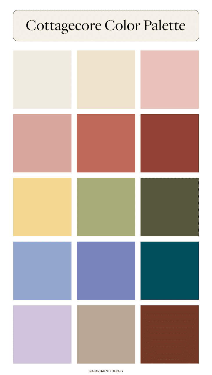
Quintessential cottagecore colors are soft, muted, and earthy. They evoke warmth and comfort, and can often be found in nature, whether in a blooming wildflower garden or tranquil river scene. Some examples of cottagecore colors include:
- Warm white and cream
- Blush
- Dusty rose
- Terracotta
- Burnt umber
- Butter yellow
- Sage green
- Olive green
- Powder blue
- Periwinkle
- Deep teal
- Lavender
- Taupe
- Brown
Neutral colors like off-whites, creams, taupes, and browns play a significant role in cottagecore spaces. They often act as the foundation for the design, creating a canvas for other hues to shine through decor and furnishings. However, this isn’t always the case. Color can also be used liberally throughout a cottagecore-inspired room to create a cozy, cocoon-like atmosphere.
“Layering various shades from the same color family is an excellent way to create a cozy, cottagecore home that feels harmonious and inviting, designer Sarah Barnard says. “For instance, pairing olive green walls with sage green curtains and a moss green bedspread, complemented by cream-colored cushions, can transform a primary bedroom into a soothing, nature-inspired cottagecore retreat.”
While soft pastel hues are prominent in the cottagecore aesthetic, darker shades are acceptable, too. Warm, deep colors like dark teal, burnt umber, and olive green can be used sparingly throughout cottagecore designs to create subtle contrast and visual interest.
Colors to Avoid in a Cottagecore Color Palette
Just as important as the colors to include in a cottagecore color palette are the ones to avoid. Barnard says colors like stark white, neons, highly saturated colors, and cool-toned grays can create an artificial feel that disrupts the rustic tranquility that cottagecore aims to create.
Soto also cautions against pairing high-contrast black and bright white together. While this is a popular combination in modern designs, it can feel too harsh for this storybook style. Instead, Soto recommends creating contrast in your cottagecore space by leaning into metals and woods with signs of natural aging and patina for added depth and character.
Examples of Cottagecore Color Palettes
If you need some examples to help you visualize cottagecore color palettes, I’ve got you covered. Here are a few examples of idyllic cottagecore interiors I pulled from Apartment Therapy house tours to help inspire your next home project.

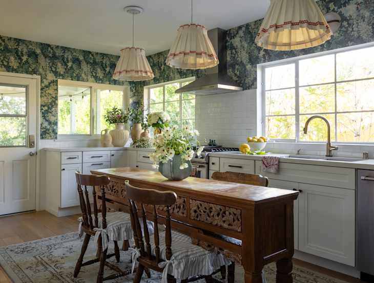
Complementary Colors
Looking to create some contrast in your space? Complementary colors are a great way to achieve this in cottagecore design. This cozy New York home features a charming dining area with warm and cool colors paired together. Note the muted red in the tablecloth and upholstery, plus vintage red-toned wood chairs paired with the soft blue trim and green wallpaper in the adjoining hallway.
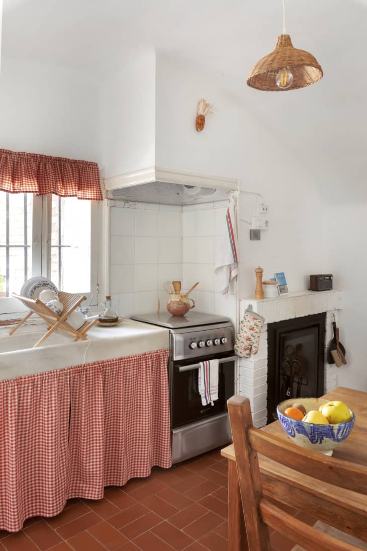
Rustic and Textural
This rustic cottage kitchen in Spain screams cute and functional. It features a predominantly warm palette with wood tones and a rattan lamp taking center stage, as well as terracotta tiles underfoot. Color is brought to the space with a red gingham sink skirt and matching ruffled window valence that play up the natural materials.

Warm and Cozy
This sweet bedroom also leans into the warm side of cottagecore color palettes. Earthy neutrals are accented by soft blushes, dusty roses, and plenty of woven textures for a totally quaint, adorable finished look.
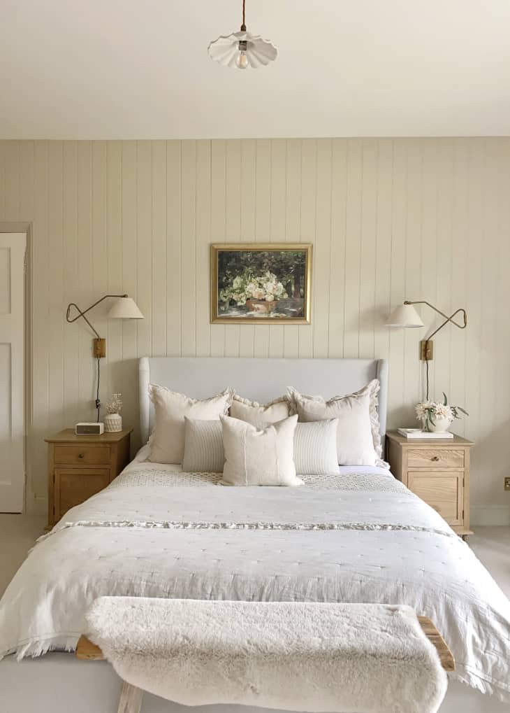
Soft and Neutral
This inviting cottagecore bedroom features soft, muted beige walls, light neutrals, brushed gold, bronze, and light wood furniture throughout. In the absence of color, ruffled elements and tactile faux fur lend textural components, while darker floral artwork also helps balance things out.