
The “8-Inch” Paint Rule Upgraded My Bedroom’s Look (and Helped Me Avoid a Pricey Mistake)
A fresh coat of paint is one of my favorite ways to give the rooms in my home an upgrade, and I’m guilty of switching up the paint in my home often. I’m also a true believer in the importance of swatching samples before choosing a new paint color, so to say I’ve swatched a lot of paint would be an understatement. But swatching hasn’t always saved me from choosing the wrong shade — more than once I’ve been left with painter’s remorse, regardless of how many days I prepped in advance.
Just a few months ago, I repainted my kitchen cabinets; while I thought I had chosen the perfect off-white shade for my upper cabinets, it turned out to be way more yellow-toned than I expected. Because I’ve officially sworn off repainting cabinets (so much work!) I am finding ways to make it work, but it was a bummer to realize the paint didn’t look like I thought it would — especially after I put so much time into it.
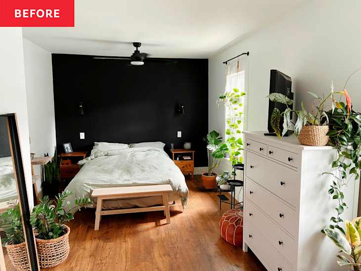
So when I came across this Apartment Therapy article that shares how designers approach paint swatching, I vowed to try it. I’m repainting my bedroom as part of a much-needed facelift (goodbye, black accent wall!), and I spent a week testing out the designer-approved “8-inch” paint rule. I can confidently say that it’s changed the way I think about painting forever.

What Is the “8-Inch” Paint Rule?
When it comes to swatching, I’d never given the size of the actual swatch too much thought. Instead, I focused on swatching multiple spots in each room to account for how the paint may look in natural versus artificial light.
As a result, my swatches usually ended up being a brushstroke or two: around 3 to 4 inches wide and tall. But the 8-inch paint rule, created by design pros who are looking to drench their clients’ rooms, indicates that’s not nearly big enough. Rather, interior designers say paint swatches should be about 8 inches wide and 8 inches tall to give you a good idea of how the color will look in your space.

Why I Loved This Paint Hack
After testing the 8-inch paint rule in my own bedroom, I can see why designers are such a fan of it. Such a simple change made a big difference in how I imagined the colors working in my space.
Because it was my first time trying it, I wanted to make sure I got my dimensions right, so I used a level and a ruler to mark out my 8×8-inch swatch boxes. Was this overkill? Probably. In the future, I’ll likely estimate my 8-inch swatches, but it was fun to try and it gave me very symmetrical and level paint swatches to admire for a few days.
When it came time to swatch the paints, I did two coats of each color for a nice, even finish. Yes, I’m a neutral-lover — can you tell? I also made sure to swatch at least two different walls in my space so I could get a good idea of what the paint will look like throughout the whole room.
One more tip I can’t stress enough: Keep the edges of your swatches thin. Feathering them out is a great option. This will make painting over the swatches later a breeze; no prep or sanding over rough edges required. Trust me — you’ll thank yourself (and me!) later.

After I finished swatching the paints, I sat on the decision for about 48 hours. At first I thought for sure I’d lean towards one of the lighter options, and I think if I had done smaller swatches I would have.
However, the larger swatches helped me visualize how the darker shades would look once they covered the whole wall. Especially against the stark white background, they would have felt even more intimidating (and high-contrast!) if the swatches were only a single paintbrush in width. I ended up choosing Behr’s Even Better Beige (DC-010), and I can’t wait to share how it all turns out. I think going with the darker shade is going to make the whole space look more expensive and elevated.
So call me a believer, because my methods have officially changed! Realistically, it only took me a few extra minutes to expand the size of my swatches, but I hope it’ll save me a lot of time and headaches down the line. This simple trick may be worth a try if, like me, you’re hit with painter’s remorse after finishing a project … no matter how many paints you swatched!
Design Defined
Never miss the style inspo and recommendations you crave with Design Defined. Follow along each week as our Home Director Danielle shares the best style advice, latest trends, and popular decor finds you just can't miss.