
4 All-White Bathrooms Got Bold Makeovers with 2 Easy Swaps
Blank canvases can sometimes be intimidating — especially when renovating a home. Kara Hobbs, an interior designer, had not one, but four “white boxed” bathrooms with “all neutral finishes and very basic, builder-grade fixtures throughout.”
Kara was given a tight deadline to add playfulness and originality to a local Austin, Texas, coworking and social club, Maeve House. The 1961 home had been flipped not long before it became a modern community clubhouse, so “it felt pretty sterile and ready for some life!” Kara explains.
The only request from the clients was that each bathroom be uniquely designed using wallpaper in a memorable way. For the vision, “fun, bold, playful, beautiful, colorful, dramatic, and magical were all words that came into the conversation,” Kara says.
So that’s exactly what she did, using two easy swaps in each bathroom.
Dramatic Wallpaper Made These Bathrooms More Than Just a Pit Stop
Each bathroom was styled around a different wallpaper that set the tone for the space — feeding into the vision that the client wanted.
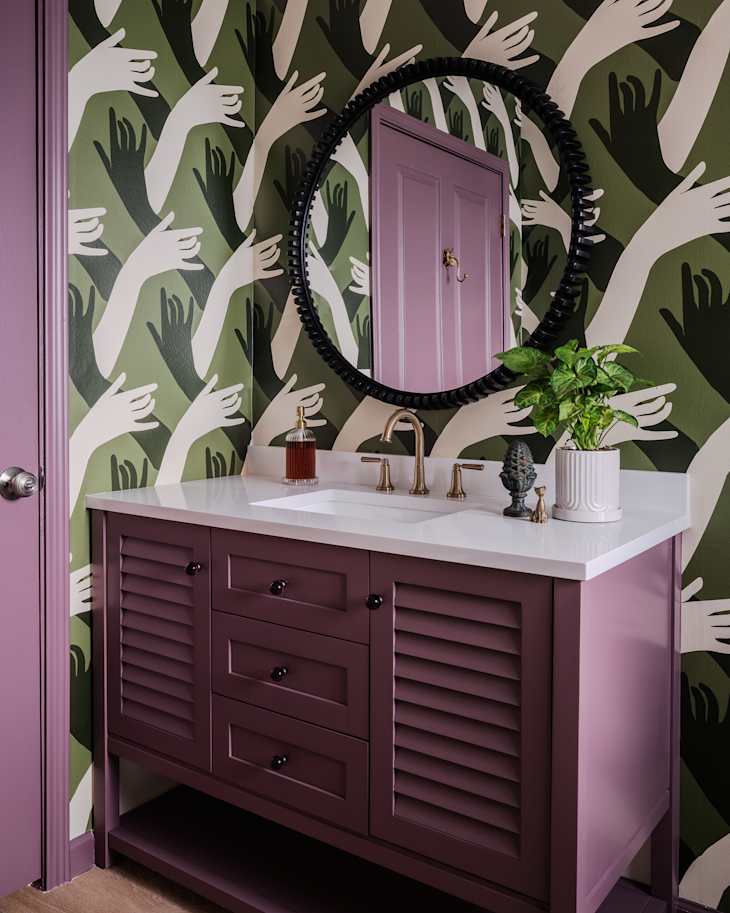
For one of the bathrooms, Kara chose Mitchell Black’s “Connect.” “It’s not only perfectly wild, but also, more importantly, aligned with the purpose of Maeve House,” she shares.
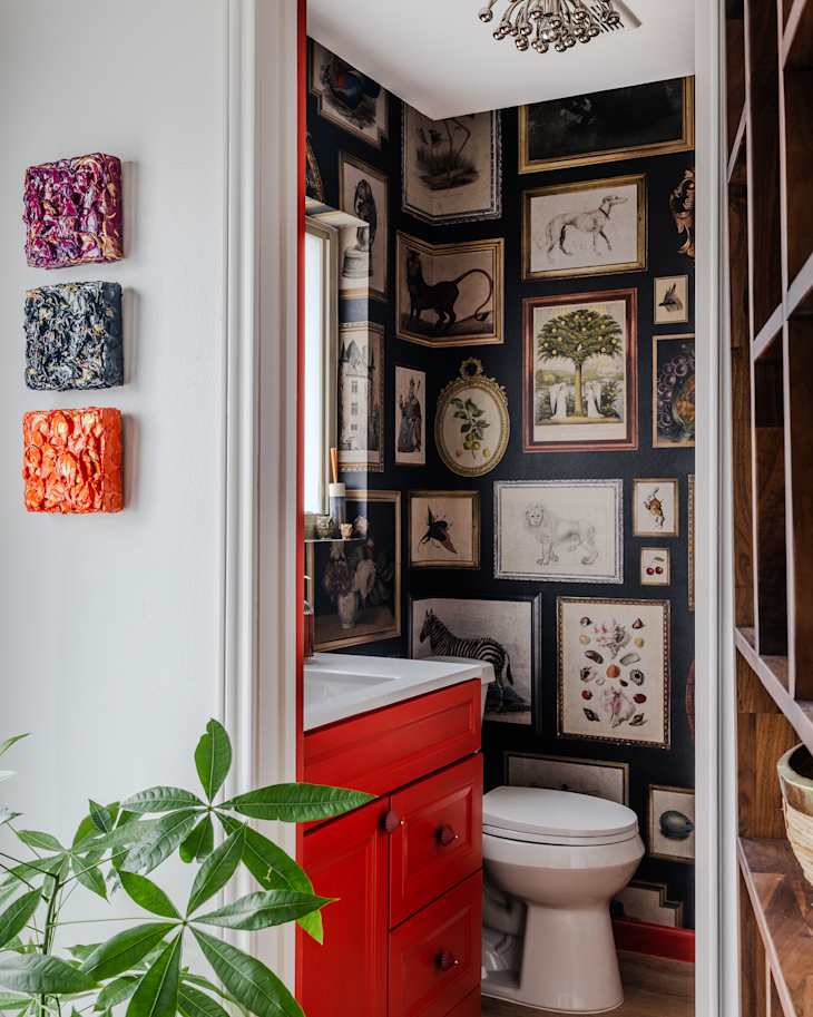
Then, “Vintage Frames” by Rebel Walls was used to bring depth to another bathroom and make the space “feel cozy, storied, and a little magical!” Kara explains.
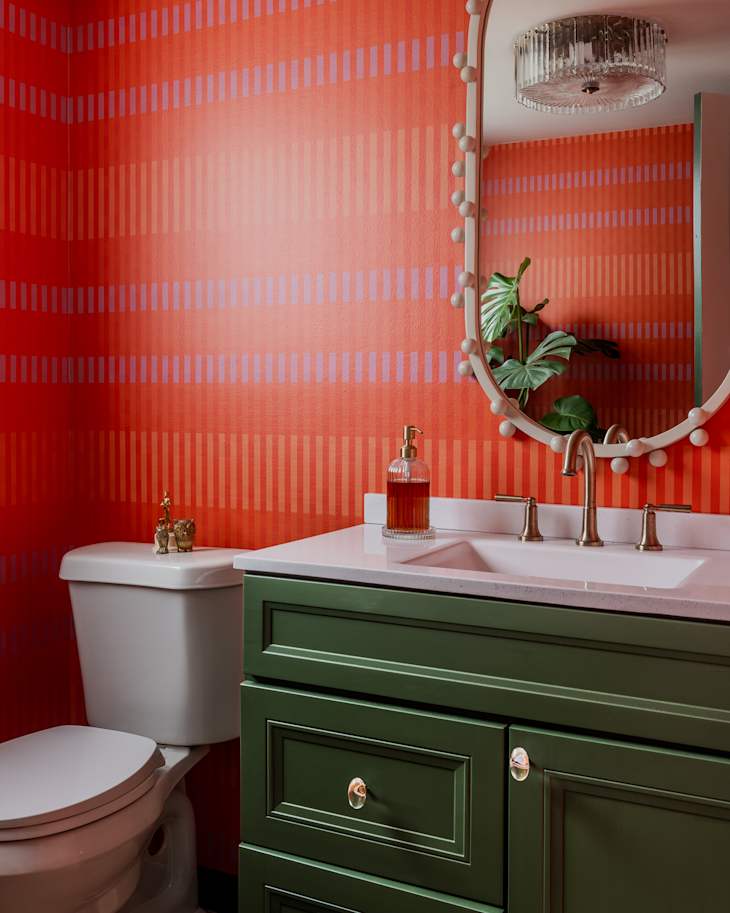
Maeve House has a vividness and unique structure for its members and visitors, and Kara wanted to honor that in the third bathroom. She chose Chasing Paper’s “Line Essence” for the space. “It adds color to their coworking and community experience (literally and figuratively!).”
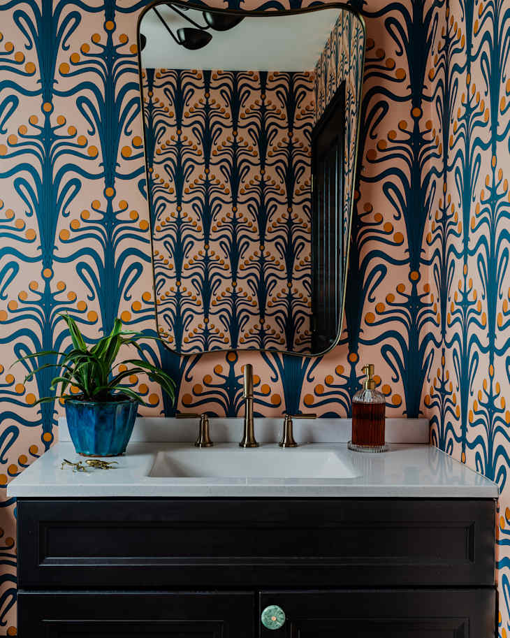
“Lucille” by Chasing Paper inspired the final art nouveau bathroom, and was chosen because the marigold accents were a subtle nod to Maeve House’s logo — plus “the pattern is simply beautiful and energizing,” Kara adds.
While each bathroom is very different in vibe and color scheme, each design plays a crucial role in connecting creativity with the community at Maeve House.
The Owner’s Artwork Inspired Bold Vanity Colors
“[The owner’s] original pieces are installed throughout the house as part of the decor, and her studio is in one room of the house, so connecting with her creative vibe was important,” Kara says.
The owner’s portfolio is bursting with saturated, rich colors and textures, and Kara wanted to continue that style throughout the four bathrooms. Not only did painting the existing vanity cabinets give them a more sophisticated look, but it was also “an opportunity to take the wallpaper [to the] next level by having them painted in colors that intentionally complement each wallpaper’s palette and pattern,” Kara shares.
The “Connect” wallpaper received Sherwin-Williams’ Patchwork Plum as an accent color. While the main focus in another bathroom was the “Vintage Frames” wallpaper, Sherwin-Williams’ Peppery was added as a unique highlight to the vanity and trim.
Sherwin-Williams’ Vogue Green complemented the “Line Essence” wallpaper, and the final vanity was painted Sherwin-Williams’ Black Magic, creating a dramatic moment with Chasing Paper’s “Lucille” wallpaper in the small space.
“The cherry on top,” as Kara calls it, was installing the funky knobs on each vanity, adding another layer of character and creating a unique, elevated look.
The Design Vision Added to the Client’s Brand Mission
The client’s favorite part is “the true uniqueness of each [bathroom] and how much Maeve House members and visitors enjoy the bold style,” Kara says.
Kara described the wallpaper “Connect” by Mitchell Black as aligning with Maeve House’s purpose, “to facilitate connection and build community.” Understanding the client’s brand and their intentions with others takes time, but it’s an important step in the design process.
“Let [it] inspire a design vision that is undeniably aligned with who they are,” Kara shares.
Inspired? Submit your own project here.