
Graham & Brown’s 2027 Color of the Year Is a Soft Hue with Major British Charm
As 2027 looms closer than ever, I’m already planning makeovers and moodboards for projects next year — and having lots of fun watching as brands and design pros make predictions for what’ll be hot in design this time next year. When it comes to buzzy colors, it seems that many are thinking neutrals are in — including the likes of Behr and Dunn-Edwards, who have predicted that moody, natural, deep-colored hues will be all the rage. But as a big fan of maximalist spaces, I’m not totally sure if I’m sold on neutrals being all the rage — and it seems I’m not alone.
One recent Color of the Year announcement has me thinking that richer hues may still have their time under the sun as super trendy in 2027. It comes from beloved British manufacturer Graham & Brown, who released their annual color trend forecast earlier this fall, and it’s a far cry from neutrals I’m seeing dominate other announcements. The brand, which creates stunning wallpapers and other coverings overseas, also indicated that more vivid, rich colors are sweeping its coinciding wallpaper trend forecast. But its also a delightfully moody color that achieves a similar effect as an earthy neutral. That hue? It’s pink!

Graham & Brown’s “Rose Earth” Is a Fresh Take on Neutrals
Graham & Brown’s color of the year is “Rose Earth,” which is “a warm, versatile earthy pink shade that’s both beautiful on its own and complementary in a wider palette,” according to the brand’s website. The color is inspired by “natural mineral pigments” from Italian clay deposits, highlighting the “timelessness of earth colors.” It’s no wonder the brand is promoting a classic, trendless shade, as the prediction also aligns with Graham & Brown’s 80th anniversary.
I love that this dusty rose has warm brown undertones that give it an earthy quality — but maintains the very rosy complexion of a pink that will blend into any space beautifully. “Rose Earth” offers a softer foundation to let details like bold prints, colorful artwork, and eclectic furniture shine. It melds perfectly with deep burgundy, olive green, and even chocolate brown, as a brighter hue that ties everything together (and this muted pink does exactly that!).

Graham & Brown’s “Roselle Grove” Is a Calming Floral Pattern
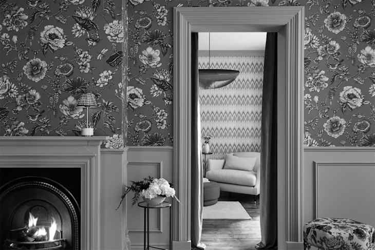
Graham & Brown calls “Roselle Grove” its pattern to watch in 2027, and I can totally see why; it takes the color story behind “Rose Earth” further with a classic British-esque motif. The winding floral pattern nods to chintz, a 16th-century pattern that the brand credits back to Indian design influence, all dressed in a touch of British sensibility. “It’s a piece steeped in history, heritage, and artisan detail,” the brand’s press release notes. It comes in five colorways to work in multiple spaces.
What makes Graham & Brown’s choices for their trend forecast so special is that they truly complement each other. If you’re brave enough to lean into a buzzy color story that breaks away from the pack, say hello to this dusty pink. It’s the new “it” neutral shade to weave into your home, and Graham & Brown created the perfect blueprint that will both calm and transfix guests in the most delightful way.