
We Asked 3 Designers How to Carry One Vibe Throughout Your Entire Home (They All Agreed!)
Don’t get me wrong: As someone who spends pretty much all day (and night) thinking about interior design, I firmly believe each room deserves to shine in its own special way. But while you might approach decorating your kitchen differently from how you’d spruce up your bedroom, every home really craves cohesion. You know, a through line — a calling card that connects one room to the next.
Like most things, there’s not one way to create cohesion in a home. Some people sprinkle identical window treatments and light fixtures throughout a space, while others commit to one type of wood grain. When I chatted with professional decorators, all three agreed that the magic of a cohesive home lies in your color choices. But they each have different interpretations of how best to bring about cohesion through color. Read on to find out which method might work for you.

Try Using One Color as a Through Line in Every Space
While we all probably know that creating a consistent color palette is key in design, this can be harder in practice than it sounds. Cohesion in design is a delicate dance between “expertly curated” and “overly contrived” — and it’s all in the details. “Overlooking even [one] small detail can throw the whole project off,” says Lisa Gilmore, an interior designer in St. Petersburg, Florida.
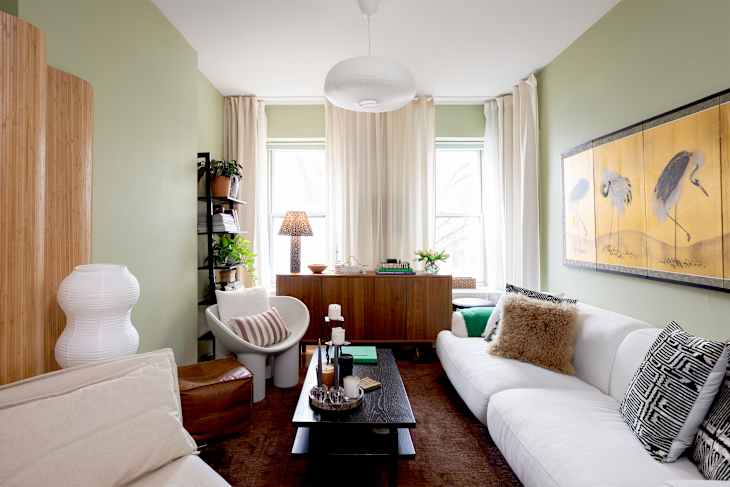
Gilmore lovingly calls her approach to color the “continuous thread theory:” When designing any space, she makes sure that one color makes at least one appearance in each and every room. “A wall color in the dining room might reappear as a sofa welt in the living room, and then surface again in a powder room wallpaper where that same tone is woven in more softly,” she explains.
Not only does this method act as connective tissue throughout the home — “without feeling repetitive or overly coordinated,” Gilmore adds — it also gives guests something fun to discover in each room. The interior design equivalent of an Easter egg, if you will.

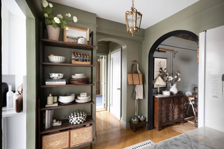
Create a “Color Story” for the Entire Home
While Gilmore likes to create a through line with just one single hue, designer Lisa Simopoulos has a less rigid take on continuity. She creates a “color story,” a palette containing six to 10 shades that become the “North Star” of the project. “Once it’s established, clarity comes quickly,” explains the Northern California designer. “Certain choices become immediate shoe-ins, while others are easy to rule out before they complicate the process.”
In other words, if you choose six shades, not every room has to include all six shades — in fact, they shouldn’t — but they should only contain one of the six. This maintains the perfect balance between “cohesive” and “overly curated.”
Simopoulos uses her color story method as a starting block to boost cohesion and flow. “It also gives us a clear framework when selecting finishes, from wood tones and tile to fabrics and window treatments,” she adds. “Cutting through the noise and helping the design come together in a way that feels intentional, layered, and effortless.”
If All Else Fails, Just Start with the Walls
If mixing and matching a bunch of colors still just feels overwhelming, Virginia designer Tracy Morris has an alternative: Pick one color, and stick with it — for your walls, at least. Painting all of your walls the same shade “allows the home to flow naturally from room to room,” she shares. “The paint does the quiet, grounding work, while the furnishings and details bring in character and interest.” Morris says.
Whether you opt for one cohesive color through line, or decide to experiment with an entire color story, the question remains: How does one come up with the perfect color palette? For Simopoulos, ideas are everywhere. Sometimes, the palette may be inspired by or derived from something tangible like artwork, a piece of furniture, or even a fabric sample. In other circumstances, her clients might share a favorite travel destination or connection to their local surroundings. “It doesn’t have to be a big or obvious statement,” she says. “It just needs to feel right and speak specifically to the client.”
Design Defined
Never miss the style inspo and recommendations you crave with Design Defined. Follow along each week as our Home Director Danielle shares the best style advice, latest trends, and popular decor finds you just can't miss.