
Most People Hide This Kitchen Eyesore — My Friend Did the Exact Opposite (See Why!)
As any renter moving into a new apartment could tell you, it can be very easy to focus on the eyesores that you might not be able to change: builder-grade finishes, awkward layouts, and a lack of storage. But for a dear friend of mine who recently landed in her dream Brooklyn neighborhood, an architectural feature that others would ignore ended up becoming a very key part of her space.
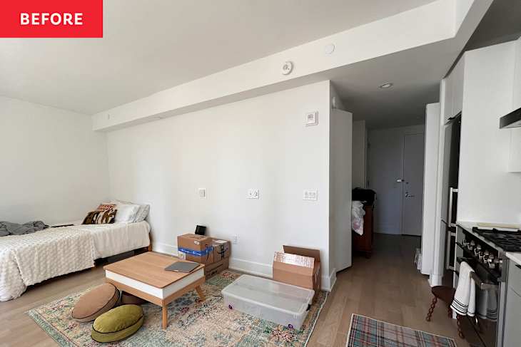
Erica Brown, 32, moved into a small 415-square-foot studio in Fort Greene, a newer build that felt exciting after four years in a fourth-floor walk-up in Manhattan’s Greenwich Village. While her building offered modern amenities (hello, elevator!), it lacked a bit of historical character that she previously enjoyed; it was a trade-off she chose to embrace as a design challenge when she moved in.


The Common Eyesore That Erica Chose to Embrace
“What attracted me to this apartment was that it felt like a blank canvas,” Erica says. “It was very cookie-cutter, and I saw that less as a downside and more of a challenge.” Before transitioning into a career in technology, Erica worked in residential interior design. Her background gave her plenty to work with in transforming a small studio apartment with a cookie-cutter layout into something that felt personal.
Sure, finding a way to bring warmth and personality into a neutral space is hard — but others would be more wary of the apartment’s most apparent feature: its kitchen bulkhead. It runs along the main living space, wrapping around the kitchen itself, and extending into the lower entryway ceiling. Erica came up with an ingenious solution that tackled both issues: color!

How Paint Enhances This Builder-Grade Feature
“I honestly never saw it as an eyesore,” she says. “From a design perspective, I actually liked having those lines to work with because I thought they could make the paint feel more interesting.”
Rather than painting the entire apartment, Erica intentionally left one wall white. Large windows and built-in blinds made the prospect of eventually repainting every surface feel too overwhelming, so she embraced the limitation. As she puts it, “I’m a big believer in constraints being what often drives the best and most creative ideas.” Once she made that decision, the concept came together naturally.


Choosing to Highlight a Bulkhead Rather Than Hide It
If she had consulted a design pro, Erica might not have so boldly painted the extensive bulkhead in a way that draws the eye. But she didn’t consult anyone or pull inspiration from other projects; she tells me she acted on a gut instinct. “Once I decided not to paint the entire apartment, the idea sort of just clicked.” Extending color onto the bulkhead would visually tie the living area, kitchen, and entryway together, all while creating dimension in the small space.
The final color choice came after an evening of looking at paint samples over pizza and wine. She and a group of friends initially thought a soft peach would win out, but as the light shifted throughout the day, one color stood above the rest: Benjamin Moore’s Cream Yellow. “By the time it got dark, we all agreed that the yellow made the apartment feel warmer and worked better in every kind of light,” Erica says.
The Final Result
The finished project included two walls, the bulkhead (including the portion above the kitchen), and the entryway ceiling. Extending the buttery yellow onto the underside of the bulkhead in the entry unexpectedly completed the space (which Erica originally thought might require bold wallpaper or additional paint to feel welcoming). “Since studios are essentially one large room, I was always thinking about how to carve out smaller spaces,” she shares. “Extending the paint onto the bulkhead and the ceiling helped accomplish that.”
The DIY project took about two weeks to complete, around work and travel commitments, and cost roughly around $250 in total, including two gallons of paint and some necessary tools that had unfortunately been lost in the move. The payoff, however, was immediate.
Why You Should Consider Highlighting a Bulkhead Feature, Too
“I absolutely love it,” she says. “Even before I had furniture or artwork, I finally felt like the space was becoming mine.”
Today, Erica’s guests frequently describe the studio as “homey” — exactly the feeling she was hoping to create. And the bulkhead that could have easily detracted from the space now acts as an intentional design component that adds visual interest and definition to the apartment. It’s a reminder that sometimes the best design move isn’t ignoring or concealing an architectural quirk — it’s giving it a little extra attention that it deserves.
Design Defined
Never miss the style inspo and recommendations you crave with Design Defined. Follow along each week as our Home Director Danielle shares the best style advice, latest trends, and popular decor finds you just can't miss.