
This Is the Absolute Best Color for Bedrooms, According to Sleep and Design Experts
Choosing a paint color for a room — whether it’s for a small bathroom or a living space — is about so much more than just aesthetics; it’s also important to consider how you want to feel in that space. Take your bedroom, for example. While this room is a great opportunity to showcase your specific personality, it’s just as important that your design choices are functional, too. That’s why you should consider the best bedroom paint colors according to designers and sleep experts. As it turns out, not all hues are created equally, and some shades, pros say, are better than others for creating a sanctuary for rest and relaxation.
Sue Peacock, a U.K.-based psychologist specializing in sleep, says how a room looks can directly impact how you feel. “Colors may affect you psychologically, including your ability to sleep,” she says. “Some colors may evoke relaxation, while others stimulate your mind and make you more awake.”
While specific colors may align with psychological principles for inducing rest, not everyone experiences colors the same way. For example, Tamra Fuscaldo, the former director of interior design at MA Design, says neurodiverse individuals may process harsher hues more intensely in a way that stimulates the autonomic nervous system.
Ultimately, your body and mind are unique, and the goal is to choose colors that feel soothing to you personally. Select a bedroom paint color that works for you. “It’s important to think of bedrooms as a ‘sanctuary space,’ where we feel safe and protected,” Fuscaldo says.
Get even more style inspiration from our Home Director in our exclusive (free!) newsletter, Design Defined. Sign up now!
So if you’re looking to figure out your best bedroom paint color match, you’ve come to a great starting place. Below you’ll find some tried-and-true hues for experimenting. Hopefully, you find your best fit in some of the soothing shades below — and have no problem drifting off to sleep each night.
What Colors to Paint Your Bedroom
- Experts agree that blue is the best color for a bedroom, especially since research shows it can have calming effects.
- Green is another relaxing runner-up for its connotations with nature.
- In terms of bedroom colors to avoid, overly bright or neon colors can have the opposite effect, making it difficult to fall asleep.
The Best Bedroom Color
While your personal preference certainly plays a role in what’ll help you relax before bed, there’s one color that stands out above the rest if your goal is a good night’s sleep: blue. “Not only is it more muted, but blue tones also tend to have more calming effects on the brain,” Peacock says.
Specifically, blue has been shown in research to reduce respiration and heart rate, which is great for drifting off to sleep. While all shades of blue can evoke a tranquil atmosphere, Peacock suggests sticking with lighter shades on your bedroom walls for the best sleep-inducing effect.
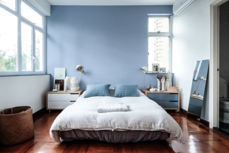
Sleep psychologist and sleep coach Katherine Hall, who works with Somnus Therapy, agrees. Light blue — like Benjamin Moore’s Summer Shower (2135-60) in the bedroom pictured above — is scientifically associated with creating feelings of calmness and serenity, she says, adding, “Studies have also shown that households with blue bedrooms sleep the best compared to any other color!”
3 Other Great Bedroom Colors
While blue is these particular experts’ number one choice for encouraging a good night’s sleep, don’t feel limited to just this one color when decorating your bedroom. Designers also recommend a few other hues for creating an equally soothing environment.
Greens
Because green can be reminiscent of nature, Peacock says it may put you in a relaxing mood. Opt for soft and natural sage green tones to lull you to sleep, like the California bedroom pictured above that’s coated in Sherwin-Williams’ Sagey (SW 6175). Or, choose a blue-green option to combine that ocean-like tranquility with those natural vibes.
Not all blues and greens will have the same psychological effect, though. So choosing paint colors that look and feel peaceful is important. Alice Chiu, a San Francisco-based interior designer and principal at Miss Alice Designs, calls out Sherwin-Williams’ Hazel (SW 6471), a beautiful shade of blue-green, as one that’s perfect for the bedroom. Not only will the color’s soft teal appearance help you unwind for bedtime, but it can also help your sleep space feel larger because it naturally brightens up the space with its airiness.
Amy Peltier, an interior designer and owner of Peltier Interiors, says her favorite soothing green is Benjamin Moore’s Hollingsworth Green (HC-141). “This color evokes images of gardens, grass, and nature,” she says.
Grays
According to designer Linda Hayslett of LH.Designs, greige — which combines gray and beige — can feel surprisingly calming, too. “This combo really makes a bedroom feel dreamy and almost like you’re in a Jane Austen novel,” she says. “The colors together create a natural feel in a bedroom, so you get that nature feeling of being in a garden or off in an old European town vibe.”
Or, designer and author Rebecca Atwood suggests offsetting gray’s moodier tones with a shade that leans slightly green, like Farrow & Ball’s Mizzle (No. 266), which she describes as having a nature-inspired “invisible feeling to it … like mist or fog.” “If you’re going to go more gray in the bedroom, I think it’s important for it to be chromatic so that it doesn’t feel sad,” Atwood explains.
If you want a little color underneath the gray, aim for a neutral with bluish tones. Chiu suggests Benjamin Moore’s Gray Owl (OC-52) as an example. This clean, refreshing gray can display a blue or green undertone depending on the natural light in your bedroom and the surrounding furniture and materials. “It’s the perfect gray that works with any style from traditional to modern, creating a relaxing and calm look and feel,” she says.
Pinks
Don’t underestimate pink — as Atwood notes, this color “doesn’t have to feel too sweet,” depending on how you style it. “Think golden hour glow,” she adds. Her former Brooklyn bedroom was coated in Farrow & Ball’s Calamine (No. 230), and she used the brand’s Setting Plaster (No. 231) paint in her daughter’s current bedroom for a more earthy, slightly brown-toned aesthetic.


The Best Bedroom Color Palettes
Now that you know which paint colors are best for bedrooms according to designers, it’s a good practice to see them used in real people’s homes. Choosing the right paint color is one important step, but then considering its surrounding cast of characters — the furnishings, materials, and finishes to pair it with it — is another matter. These examples will help you plan out a palette around the bedroom color that speaks to you.

Bold Blues and Vibrant Yellows
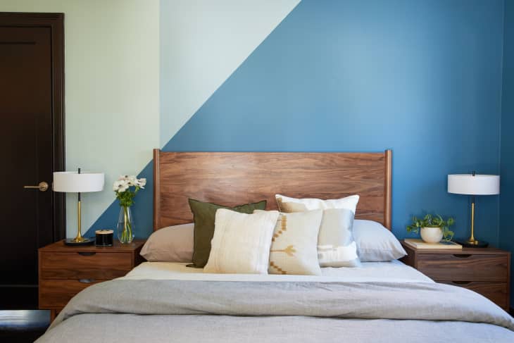
If you’re going for a bolder blue in your bedroom, consider amping it up with other vibrant shades, as seen in Simon and Emma’s primary bedroom in their colorful London home. The yellow pillows and bright artwork help to make the dramatic blue feel warmer and cozier.

Warm Wood Tones and Soft Blues
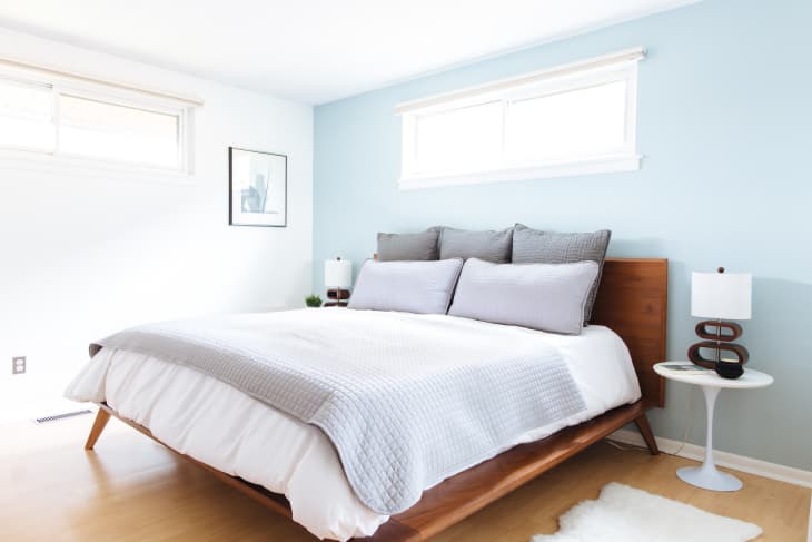
What makes the bedroom in Georgia Mooney’s 1930s Sydney home feel so calm and inviting is the warm wood tones paired with the light blue color (Porter’s Paints’ Provence Blue). Fun fact: Most of the furniture is secondhand (and some pieces were even found on the street!).
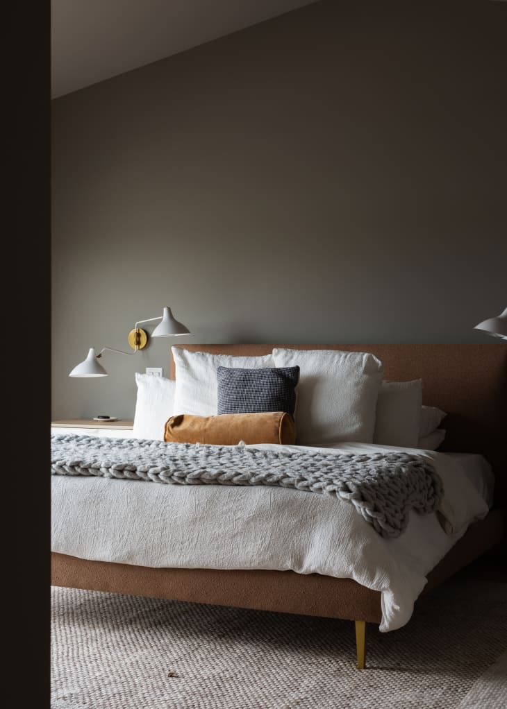
Dark Grays and Warm Whites
Even though the bedroom in Tracy Carmody’s Scandinavian-inspired house is painted in a darker gray, the brown bed from Room & Board, white sconces, and textured white duvet helps make the space feel lighter and brighter.
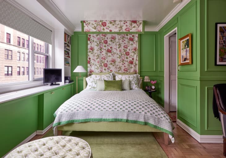
Color-Drench Green With Other Shades of Green
Barbara Campbell’s bedroom area in her 300-square-foot Manhattan studio apartment feels welcoming thanks to the vibrant green walls (Sherwin-Williams’ Organic Green (SW 6732)) paired with different shades of green featured in the tapestry, comforter, lampshades, and throw pillows. All the colors come together without clashing.

Pinks Pair Wonderfully With Greens and Warm Woods
Charlotte Violet’s bedroom in her 800-square-foot home in Brighton, U.K., feels like a space you couldn’t help but smile in. That’s all thanks to the happy pink paint color on the walls and the warmth incorporated through the greenery and wooden bed frame.
The Best Paint Color Ideas to Consider
Below, design and color experts weigh in on paint colors they typically caution against for bedrooms. Note, though, that there are no set “rules” when it comes to your own personal taste. Take these as general guidelines, and if there’s a certain shade or color you love for your bedroom, use it!
Red
As a rule of thumb, experts believe it’s best to avoid overly vibrant colors in bedrooms, including loud reds. (Mr. Big’s bedroom wall in the original Sex and the City? I’m looking at you.) Hall says the brain associates red tones with intensity, passion, war, and danger, which aren’t exactly conducive to sleep. “Research suggests that red can increase your fight-or-flight instinct, making you more alert and aware of your surroundings,” Peacock says.
Orange
“There is quite a bit of science behind how color affects the brain,” says Lisa Rickert, founder and creative director of Jolie Home. “If you’re choosing a paint color for a bedroom and actually want to sleep, I would stick with muted blues and greens. Colors to be sure to avoid are bright yellows, reds, and orange.
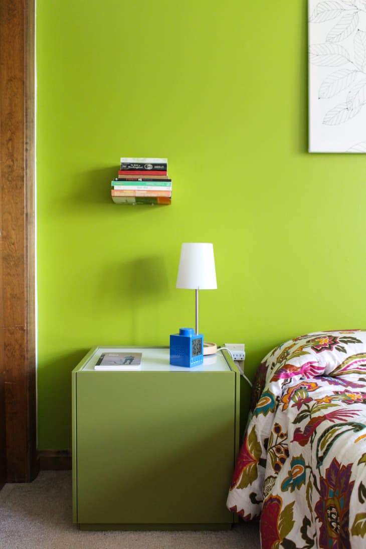
Bright Green
Hayslett says bright or neon colors may also be too stimulating when you’re winding down for sleep. She specifically cautions against shades like lime green or highlighter yellow, since these could “keep you up at night, even if the lights were turned out.”
Brown
While dark grays and browns might feel earthy at first, Peacock says they can evoke feelings of uncertainty that may make sleep difficult.
Anything Super Saturated
“It’s no wonder Smoke (2122-40), Collingwood (OC-28), and Wickham (Gray HC-171) are some of Benjamin Moore’s popular bedroom color choices,” says Hannah Yeo, a Benjamin Moore Color and Design Expert. “These light, muted hues promote relaxation and comfort, setting the mood for a good night’s sleep. Bright, saturated colors, on the other hand, can trigger a sense of alertness. Reserve the vivid hues for statement walls or for rooms that require high energy instead.”
Anything That Doesn’t Work for You
Ultimately, listen to your body’s cues. “I don’t think there are any hard or fast rules for choosing a bedroom color,” says Jamie Davis, cofounder and owner of Portola Paints & Glazes. “Everyone is different, and a color that might give you a headache could make someone else super happy.” Plus, at the end of the day, you can always paint over it if you don’t totally love the look and feel of your bedroom.