The Best Bold Wall Color Transformations We Saw This Year

When it comes to room makeovers, it’s hard to think of anything more satisfying than an after that features a big, bold paint color. Here’s the wonderful part: Painting your walls is a relatively affordable change, so if you absolutely hate the results, there’s always a can of white paint waiting for you tomorrow. But we’re going to go ahead and bet that you’ll love making a striking change. Just check out the 10 success stories below—and swipe left to see the stunning afters.
1. This powder room goes dramatic with inky blue paint
It’s a common misconception that you should avoid using dark paint colors in small spaces. When done right, they can offer a cozy, intimate feel. Exhibit A: this powder room that went from blah to high-impact in the span of one weekend.
2. A vibrant yellow makes this bedroom a standout
This hexagon-trimmed, mustard-colored accent wall turns Liz Elliot’s guest bedroom into a destination. Any color could have complemented the geometric pattern nicely, but Liz’s offbeat choice leans hard into mid-century vibes with totally cool results.
3. Going all-in on pink invigorates this home
Not every bold paint choice has to be dark. The bottom floor of this split-level has a unique twist, with light pink paint covering the walls and fireplace. The shade takes the space from retro ‘70s to modern and fresh.
4. Olive green gives this bedroom max coziness
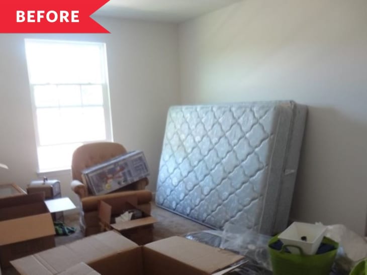
Light walls in this guest bedroom/office made the space actually feel smaller. Deep olive-y green (Benjamin Moore’s Vintage Vogue) takes it from cramped to cozy.
5. A powder room feels way more inviting in pink
Paint took this powder room from spooky to so sweet. The sophisticated shade of pink (Benjamin Moore’s Pink Beach) has a beige tilt, so it doesn’t feel too bubblegum-y. “The color is the perfect shade of pink that’s mature, calming, and looks great on everyone,” homeowner Laurel Oberst says. We’d love to see it in a living room or bedroom.
6. This bedroom’s winning combo: sage green with fresh white
Crisp white wainscoting paired with sage green (Sherwin-Williams’ Halcyon Green) is a little farmhouse, a little modern, and a lot chic. “Every time I venture into this room I get an overwhelming feeling of calmness that I just love,” homeowner Lindsey Boehmke says of her guest bedroom.
7. A zippy accent wall makes all the difference in this living room
Nope, this isn’t wallpaper—it’s a fab living room accent wall hand-painted by loft owner Adrianne. “I did the pattern free-hand, with only a vision in my head,” she says. “That’s a little scary but once I started, I saw that it was turning out pretty good so I just kept going.” She used Glidden’s Bay Coral and Bright Teal Surprise to get the look.
8. A moody blue paint job jazzes up all four walls (and the fifth, too)
Deep blue-gray paint (Farrow & Ball’s Inchyra Blue) goes the extra mile in this dining room redo when it goes on both the walls and ceiling. The result is a rich jewel box of a room.
9. This kids’ room is extra cheerful with bright coral paint
This horse-themed girls’ room is way more fun with a playful pop of coral. “We love the color choice and the life it brings to the room,” homeowner Suzanne says. “I wouldn’t do anything differently. In fact, I want to add some more color blocking and bright colors in other rooms in our house. This room is one of the happiest in our house now!”
10. Blue paneling makes this powder room pop
“I talked my mom into this blue paint color, and it’s the best part about the room!” Erin Zubot says of the paneled powder room in her parents’ house. (The winning shade? Sherwin-Williams’ Waterloo.) Installing lightly patterned wallpaper above keeps the space feeling bright and airy.
