There’s a Good Chance You’ve Been Sleeping on this Bright, Sunny Hue

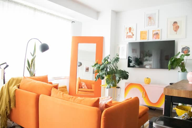
Certain shades make obvious choices as the focal point of beautiful homes. White is a contender, of course, as is the calming shade of blue. These days, green seems to pop up everywhere as a “new neutral” that carries the outside in. Orange, though? No one really seems to consider it — not the bright shade of it, anyway. That version is often relegated to Halloween decorations or playrooms, and almost never as the dominant color of a grown-up apartment. But this 400-square-foot Brooklyn studio makes that determination feel like a mistake.
Lauren has rented her home in this New York City neighborhood for less than two years and describes her style as a mix of “groovy retro” and “maximalism.” The footprint was shaped like a perfect square, which meant that she could see every corner from the minute she moved in.
“When I first saw the space, I instantly saw a 500-piece-puzzle that I was excited to put together,” she told AT. “Since I live in a studio, I felt I had to find a way to add invisible walls that made it feel like there was some separation in my space. The furniture placement and even the location of my mirror really aid in creating those boundaries.”
While some may have take this challenge as the opportunity to play it safe and decorate with those aforementioned standbys of white and blue, Lauren decided to go in the opposite direction. She wanted to pay homage to the far-out style of the 1970s, and that’s why she went with one of its most distinctive shades: orange.
“I found that mixing colorful vintage and modern pieces in my space really brought my idea to life,” she says. “Although my favorite color is yellow, I decided to go with orange as the foundational color for my apartment. I think it’s bold and attention grabbing, and also feels like I’m waking up to the sun everyday.”
The color sweeps across her living room in the form of an IKEA couch, floor mirror, and Studio Kibby side table. It also makes a supporting appearance in the wave mural on her Walmart locker and Society6 pillows. Lauren also incorporated the color into gallery walls, a shower curtain, and even a potted plant.
Lauren’s palette may not be for everyone, but she proves that taking a risk and choosing a shade outside the norm is refreshing. Furthermore, she pulls it off in a way that doesn’t feel like a Halloween novelty or even a kid’s room. That’s because Lauren’s studio has bright white walls that contrast well with the bright orange palette, and every piece is balanced by either clean lines or wavy shapes. Coupled with equally energetic colors, like a yellow table under a plant and yellow stripes in an area rug, everything seems to work.
If you want to go this bold, too, make sure the other shades in your space can keep up with your dominant one of choice. As Lauren so perfectly demonstrated, a white backdrop and black accents can help ground even the loudest pops of color.