
The Hidden Meaning in Pantone’s Color of the Year
In these unpredictable times, Pantone delivered at least one certainty we can hold onto for 2018: their much-anticipated Color of the Year. And like it or not, the pick is Ultra Violet—an intense, bold shade of purple. At face value, the choice might seem like merely a design one that will influence everything from throw pillows to bridesmaid dresses in the coming year. But over time, these selections have come to take on a bit of a deeper meaning. Turns out, this unsubtle hue could be carrying some subtler messages—and its own social commentary on our times.
“The Pantone Color of the Year has come to mean so much more than ‘what’s trending’ in the world of design; it’s truly a reflection of what’s needed in our world today,” Laurie Pressman, Vice President of the Pantone Color Institute, said in a statement.
For starters, “Ultra Violet” might be seen as a direct reaction to 2017’s pick: Greenery, a lighter, leafy shade.
“If you look back at the history of color [of the year] predictions, the pendulum seems to swing from one end of the spectrum to the other,” says Donald Kaufman, who develops, installs, and studies paint colors as part of his business, Donald Kaufman Color. “It has to do with [our] desire for variety.” So it makes sense that 2017’s lighter green would be countered with this year’s complimentary Ultra Violet.”
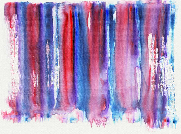
But let’s take it one step further than the visual alone. Last year, Pantone noted “Greenery” signified “renewal” (and there were certainly some new beginnings to be had socially and politically in 2017). Now, in 2018, Pantone executive director Leatrice Eiseman touted the “complex” Ultra Violet’s ability to take “two shades that are seemingly diametrically opposed—blue and red— and [bring] them together to create something new.”
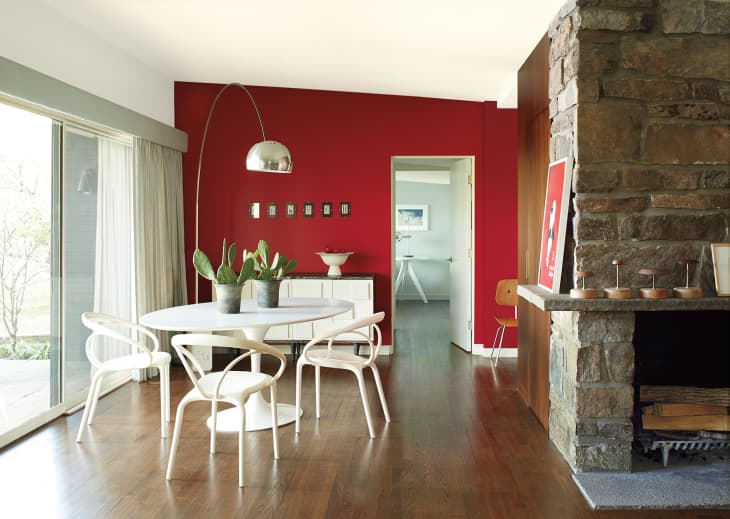
While she didn’t expand on the diametrically opposing blue and red views rippling across the country at this moment in time, they can be hard to ignore. Although interior designer and color coach Martin Kesselman, who works as a brand ambassador for several paint companies, tells us that he was drawn to Benjamin Moore’s 2018 Color of the Year “Caliente,” “because seeing red, fire, I think it’s how people are expressing themselves,” he is still intrigued by Ultra Violet.
“Maybe the blue cools things down a little bit,” he says. “The fire and the water—maybe we can come to a common ground. That there’s hope as opposed to the opposite clashing.”
Of course, even if Ultra Violet is technically a coming together, it’s no shrinking, well, violet. It is loud and individualistic. Pantone’s press release painted the choice as an ode to the unconventional creativity and artistry of David Bowie and Prince (both of whom passed last year) and Jimi Hendrix. It’s an ode to Neil deGrasse Tyson—ok, not by name, but Ultra Violet does represent “the cosmos” and “the greater galaxy.” It’s a symbol of meditation and spiritual reflection. Of Tinky Winky. Of women’s suffrage. (The latter two weren’t mention in the release, but we would be remiss to leave out purple’s meaning in both the gay and feminist movements.)
“I think that people are really wanting to express themselves, and they want to be heard,” says Kesselman. “And I do think it speaks to the state of the country and the world. People are voicing their opinions, and I think that design reflects that as well. They are making larger statements not only to the public and through social [media], but also in their design and in their home, which I find kind of fascinating.”
Are we reading a little bit too much into color? Maybe. After all, as Kaufman points out, color is all about context. Lighting. Physical construction. “Color is a sensation that changes based on where we see it, how we see it, what it represents culturally, what we are conditioned to see in our environment,” he says. But that’s not necessarily a bad thing: “It can literally and physically shed light on our current issues.”