
If You Love Mid-Century Modern Design, This Is the One Thing You Should Always Consider First
Even if you’re not someone who regularly keeps up with home trends, it’s absolutely impossible to miss the choke hold that mid-century modern design has had over the past decade. This earthy, retro style has become nearly ubiquitous in interior design, with many interpretations emerging, from the traditional vintage aesthetic to more contemporary takes.
One of the most defining characteristics of mid-century modern design is its color palette. Almost all mid-century modern-inspired color palettes follow a few basic principles. So what is the key to building a scheme that works for your own space? I interviewed two interior designers to get the scoop on everything you need to know about creating a mid-century modern color palette.
Mid-Century Modern Color Palette Basics
The beauty of mid-century modern design lies in its versatility. Whether you’re a maximalist who loves color or a minimalist who thrives in calm, neutral spaces, this style can work for you. However, it’s essential to understand that at its core, mid-century modern design is all about earthy tones and warm neutrals — like creamy whites, soft beiges, rich browns, and warm charcoal grays — paired with organic materials like wood and stone.
“Rich, warm woods such as walnut, oak, and teak are used extensively in mid-century modern furniture and architectural features such as wall paneling, shelving, and cabinetry,” says Sarah Barnard, founder and principal designer of Sarah Barnard Design. “Natural stone materials such as granite, terracotta, or slate also bring a warm, grounding element when incorporated into flooring, accent walls, or fireplaces.”
What Colors Are Considered Mid-Century Modern?
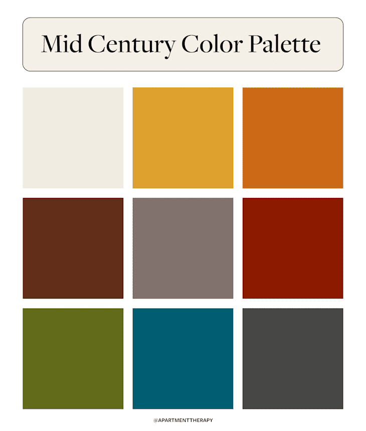
Warm and earthy describe the colors that make up mid-century modern color palettes. However, you won’t find soft shades like pastels in this retro style. Rather, mid-century modern design is filled with rich tones that pop against light neutrals. A few examples of mid-century modern colors include:
- Cream
- Mustard yellow
- Burnt orange
- Rich brown
- Warm gray
- Brick red
- Olive green
- Charcoal
- Rich teal
These examples can be used to create various pairings, depending on your preferences. Some mid-century modern interiors are heavily neutral, relying on textures and natural materials to provide contrast and visual interest. Others are more liberal with color, integrating bold pops of brick red or teal against neutral walls or furnishings. Whatever your preference, mid-century modern design can accommodate it.

Colors to Avoid for a Mid-Century Modern Design
Using the wrong colors can make a traditional mid-century modern space fall flat and may not achieve the look you’re going for. In general, designers recommend avoiding pastels, bright neon colors, and overly cool-toned neutrals like icy grays and stark whites.
“While mid-century modern design is known for its boldness, it’s important to distinguish it from the more kitschy Atomic Age subset, which leans heavily on brassy accents, chrome, and bright, loud colors like turquoise, pinks, oranges, yellows, and lime greens,” says Heather Cohen, cofounder and principal designer at DAMA Interiors.
For mid-century modern interiors that feel sophisticated and refined, neutral tones, natural materials, and rich accents are best. The beauty of this style is in its restraint.
Examples of Mid-Century Modern Color Palettes
As long as you follow the basic rules of mid-century modern design, the sky’s the limit regarding color palette combinations. If you need inspiration, here are a few examples pulled straight from real homes to help guide you.

Neutral and Natural
Color is used sparingly in this mid-century modern Amsterdam rental. The space is predominantly neutral, but touches of wood, brick, leather, and greenery add contrast. Mid-century modern-inspired furniture silhouettes and lighting also help play up this design aesthetic and provide visual interest.

Pops of Red
Are you interested in adding a touch of bolder color? This Toronto condo does it well, where the living room features a base of warm neutrals with pops of rich red integrated into the decor. It’s balanced out by light-toned woven furniture and a textured rug. Black accents also add a more modern feel.
Colorful and Vintage-Inspired
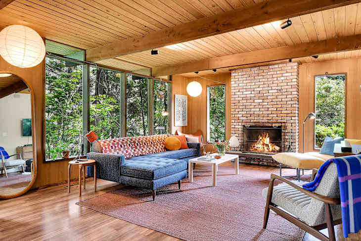
This historic Seattle home, built in 1973, maintains its mid-century modern roots in this beautifully wood-drenched living space. Complementary tones like blue and orange are paired throughout the room to provide visual focal points with a playful yet sophisticated touch. And even if you don’t have wood paneling and brick walls throughout your own home, take a cue from the side table, coffee table, and floor mirror, which all seem to have simple wood finishes.

White and Bright
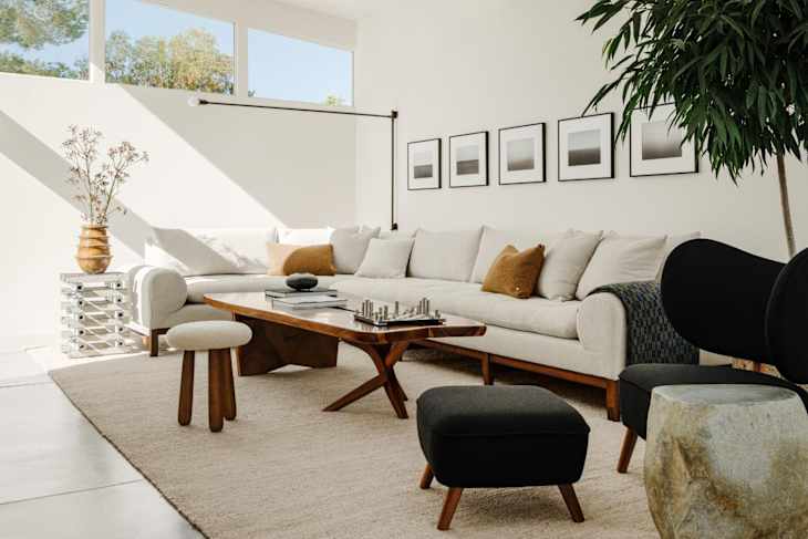
For anyone who’s color shy, let this Los Angeles apartment inspire you. Charcoal gray and black accents contrast with creamy white walls and furnishings. Mirrored surfaces add texture and interest, as well as uniquely shaped furniture and decor, which keep the space minimal and uncluttered without feeling sterile.
Design Defined
Never miss the style inspo and recommendations you crave with Design Defined. Follow along each week as our Home Director Danielle shares the best style advice, latest trends, and popular decor finds you just can't miss.