
What Are Muted Colors, and How Can They Work in Your Home?
Muted colors have a way of setting the mood in a space (think: cozy hues that exude a serene and calming ambiance). While a minimalist mentality naturally pairs well with a muted color palette, the shades are highly versatile and complement just about any design scheme.
Here, I’m breaking down all the different ways you can have fun and experiment with the less saturated tones in your home. From sage green paints to subtle grays with blue undertones, it’s easy to up the elegance of your walls by toning things down. I also consulted a handful of interior designers and color professionals — from paint companies like Backdrop, Benjamin Moore, and Little Greene — to help you choose the right muted color palette for your home.
Muted colors are everywhere in interior design. I’m not kidding — take a look at any design style and you’ll see at least one muted hue making an appearance (hello, sage green and butter yellow). These subdued shades offer a calming feel to interiors, which is why you’ll find a muted color palette used liberally in styles from cottagecore to Japandi.
In some interiors, you may notice that the entire color scheme consists of muted colors. Naturally, this is called a muted color palette, and curating an eye-catching muted color palette isn’t as simple as you may think — choosing the right colors is only half the battle. I interviewed two interior designers to gather their top tips for creating a muted color palette for interiors, and drew on Apartment Therapy’s earlier reporting to figure out how to create an ideal muted color palette. Here’s how to do it.
What are muted colors?
Muted colors are less bright and bold versions of common shades on the color wheel. “Muted hues are characterized by gray or black undertones,” Hannah Yeo, Benjamin Moore’s senior manager of color marketing, told Apartment Therapy writer Isis Briones in 2024. “They offer a soft and quiet presence that aligns closely with neutral colors. These tones, often earthy and timeless, bring sophistication to any space.”
Muted colors are achieved by adding gray, black, or a complementary color to a vibrant base hue, creating a tonal version of the original color. As such, muted hues can be light and dark colors — I’m not just talking about pastels here!
What Is a Muted Color Palette?
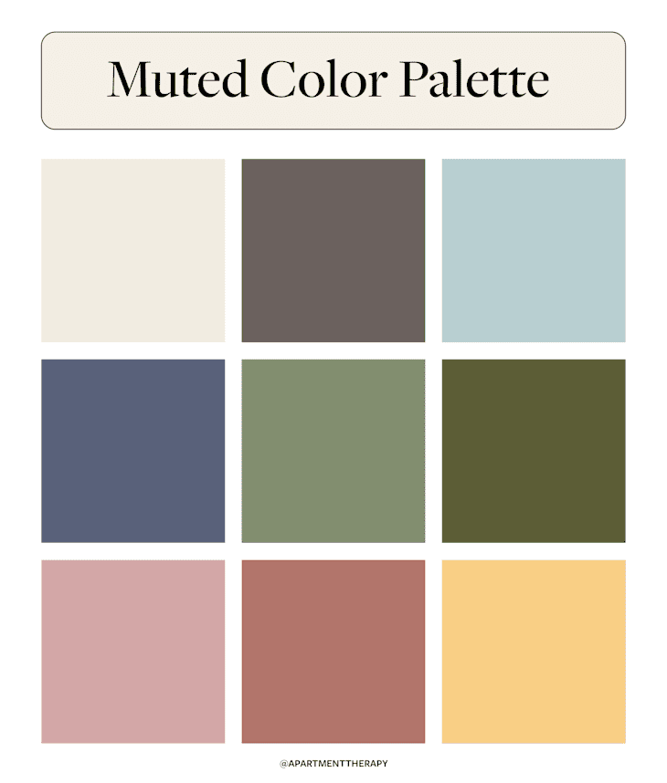
A muted color palette is made up only of soft, desaturated colors. Think: sage green paired with barely-blue blues and earthy beiges. “There are so many ways you can make a muted color palette. Muted neutrals and muted earth tones are classic and will always work,” says Kayleigh Eppinger, principal designer of Epp Interiors. Eppinger notes that muted jewel tones will have a bit more mood (think: deep burgundies and army greens, as examples).

What Colors Are Considered Muted?
Nearly any color can be muted, if it’s softened enough. However, designers say several muted colors are consistently popular in the interior design world. These include the following:
- Creamy whites
- Warm grays
- Light dusty blues
- Deep blue-grays
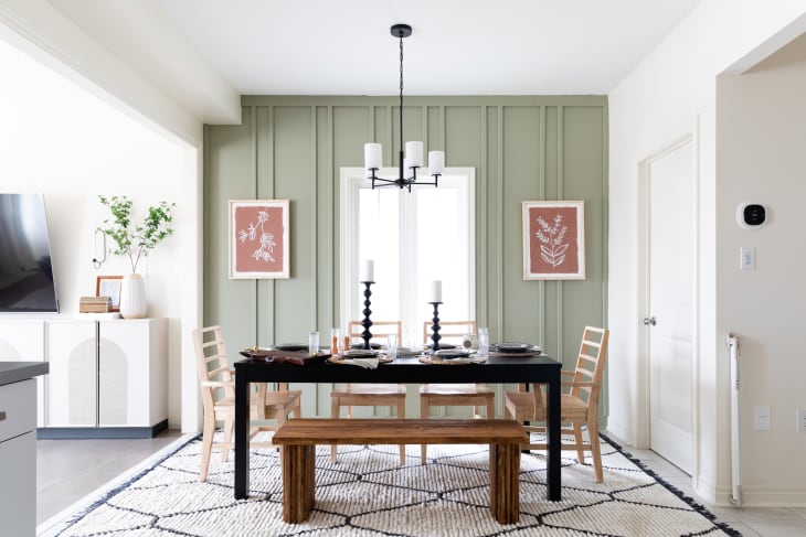
- Sage greens
- Olive greens
- Dusty pinks
- Terracottas
- Butter yellows
These colors can be combined in various ways to suit your style and preferences. In fact, a muted color palette’s versatility is its strong suit, but that can also make the process of putting one together a little overwhelming.
Start with your surroundings, suggests Kasandra Rafter, founder and principal designer at Canyon Creative Design. Draw inspiration from your home’s existing architecture and/or the surrounding environment, then build your palette from there. Curate the final collection of colors based on the aesthetic you’re looking to achieve.
Muted Colors Versus Neutral Colors
Muted colors and neutral colors are distinct from one another, but they do have their similarities. Neutral colors typically include shades of white, brown, and black, while muted colors can be found across the entire color wheel. Getting more technical, neutral colors do not contain a distinguishable ROYGBIV hue, while muted colors are easily recognizable as desaturated ROYGBIV tones, says Eppinger.
To complicate things, all neutral colors are also muted colors, but not all muted colors can be classified as neutral colors. Eppinger explains: “A soft pink could be included in a muted color palette, but wouldn’t go in a neutral palette, for instance. Likewise, a neutral palette could also include a very deep, rich brown, which I wouldn’t consider muted,” she says.

Colors to Avoid in a Muted Palette
So, what colors should you avoid when building a muted color palette? The answer depends on the type of muted color palette you’re curating. However, the designers I spoke to agree that a few colors should always be avoided in muted palettes, no matter your style. These include rich, bright, and highly saturated colors; bold primary hues; neons; and the starkest whites and blacks.
Eppinger also offers a general word of advice: When building out a muted color palette, avoid pairing very similar muted hues within the same palette. When colors are vibrant, slight variations are easier to notice and appreciate, but with muted colors the differences can be nearly indistinguishable or appear to clash rather than harmonize.
Examples of Muted Color Palettes
Looking for some visual inspiration? Here are a few examples of stylish muted color palettes from real homes in the Apartment Therapy Home Tours archive.

Earthy and Muddled
This New York City apartment features a variety of earthy, muted colors to create a calm and inviting space — perfect for a bedroom. Washed-out olive green walls, creamy beiges and whites, and muddied browns make up the majority of the palette. Natural materials like wood and linen finish off the look.
Traditional and Sophisticated
If you needed proof that muted tones can look stunning in traditional designs, here it is. This sophisticated kitchen renovation in Bellport, New York, utilized medium blue-grays accented by pops of contrasting burgundy in the marble countertops and backsplash. Natural materials and brushed bronze hardware finish off the look. I’m totally obsessed!

Moody Monochromatic
This Philadelphia apartment is a masterclass in creating moody, monochromatic spaces. The bedroom features a muted dusty terracotta color on the walls, trim, and ceiling for a warm, enveloping feel. Here, the dominant color is accentuated by a plethora of natural materials, including wood, rattan, dried florals, and greenery, as well as other muted hues such as ochre and sage green.

Cozy and Collected
This cozy townhouse in Brighton, U.K., features muted colors in every room. My favorite, however, is the kitchen, which features soft sage green cabinetry, brushed gold fixtures, and a collected feel. The color palette is simple — it contains muted greens, browns, and creamy whites. The result, however, is anything but basic.
Design Defined
Never miss the style inspo and recommendations you crave with Design Defined. Follow along each week as our Home Director Danielle shares the best style advice, latest trends, and popular decor finds you just can't miss.