
12 Gorgeous Front Door Colors That Real Homeowners Use to Boost Curb Appeal
Your front door may be the very first thing that a guest notices about your home — and yet, so many homeowners overlook the staying power of a beautiful entryway. With a simple swipe of paint, an otherwise forgettable entry can become the detail that defines a home’s curb appeal. Before anyone notices furniture or art, they’re forming an impression from the exterior; your front door acts like a preview of what’s inside, especially in neighborhoods where the architecture feels homogeneous.
Beyond aesthetics, a front door serves a practical design role. The right color visually connects exterior materials — perhaps brick, siding, or stone — and bridges them to the style found inside. On a simple facade, a saturated hue creates a focal point; on a more ornate exterior, a quieter shade can ground decorative elements. The best door colors don’t just get your neighbors talking; they make other elements look more intentional.

Before you make a selection, think about how sunlight falls across your front door throughout the day; could it change a hue in the afternoon? Professional designers say it’s also important to consider the paint finish, as semi-gloss paints offer greater durability and resistance to dirt and moisture.
If you’re looking for a bit of inspiration to get you started, interior designers helped us highlight surprisingly effective front door colors — including picks featured in Apartment Therapy’s house tour archive. Read on for 12 designer-approved front door colors (and save the cheat sheet above on your phone for shopping) — just in time for a spring refresh.

Muted Green
Historic homes benefit from colors that nod to that era, and an earthy green does that effortlessly. This tone behaves almost like a neutral, grounding the facade while still giving the entry presence. It pairs especially well with traditional materials, like stone, brick, and wood.
For this project, Pamela Forman, principal of PBF Homes, researched period-appropriate palettes before landing on the final shade. “We did deep research into color options for doors circa 1810 when the carriage house was built for the large parcel of land next door. This color spoke both to the design of the exterior and in keeping with what would have been expected back then,” she says.
Get the look: Farrow & Ball’s Mouse Back No. 40

Cherry Red
Red front doors bring more than curb appeal — they also come with lore. Depending on who you ask, a red door can symbolize good fortune, protection, financial freedom, or positive energy. Whether or not you subscribe to the red door superstition, there’s no denying the visual impact. A saturated cherry red feels confident and welcoming, and instantly energizes any home’s facade.
Interior designer Lauren Saab leaned into that boldness when updating her own 1950s home. What began as gray brick with a muted green door became a far more dynamic entry once she embraced a vibrant red.
Get the look: Benjamin Moore’s China Red

Soft Black
A black front door doesn’t always have to create sharp contrast. In the right setting, it can actually be calming. Here, a soft black blends seamlessly with dark timber cladding, allowing craftsmanship — not color contrast — to do the visual heavy lifting. The result reads architectural and restrained rather than dramatic.
Designer Helena Clunies-Ross intentionally chose a nuanced shade of black. “We used Benjamin Moore’s Black HC-190 on the front door to ensure it blended seamlessly with the home’s black timber cladding,” she says. “Black HC-190 has a softness to it that prevents the finish from feeling too harsh or flat. Instead, it subtly responds to the surrounding landscape and changing light, allowing the door to sit harmoniously within its natural setting while still feeling refined and intentional.”
Get the look: Benjamin Moore’s Black HC-190

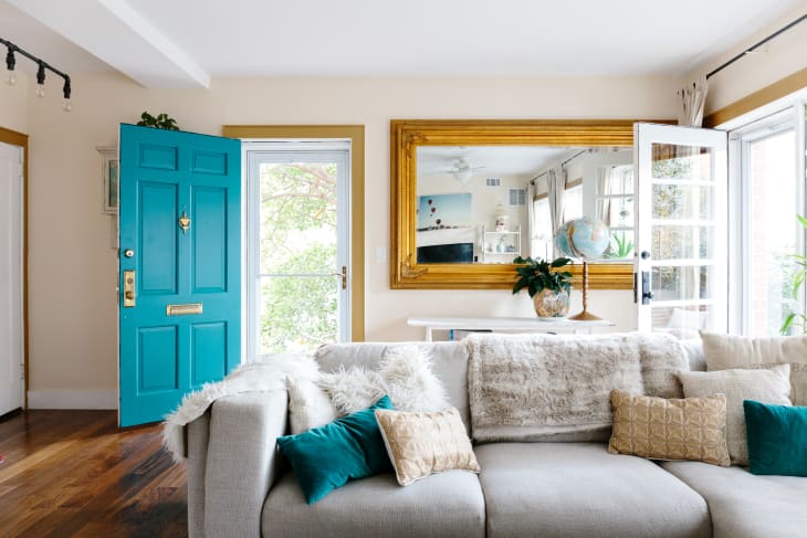
Ultramarine Blue
Some blues are soft and serene. Then there’s ultramarine, which is deeply pigmented and delightfully dramatic. This saturated shade commands attention, which makes it especially compelling on a front door.
In this 1900-built Victorian home in Virginia, deep tones and historic detailing define the aesthetic. The ultramarine door blends heritage with a modern edge, starkly contrasting with white siding. The bold hue nods to classic Victorian drama without veering into whimsy, transforming the entry into a deliberate architectural accent rather than an afterthought.
Get the look: Benjamin Moore’s Evening Blue

Salmon Pink
A bright Barbie pink could be risky, but a dusty salmon tone reads more sophisticated than saccharine. This shade shifts throughout the day, sometimes appearing near-neutral and sometimes rosy, making it surprisingly versatile against dark exteriors and lush greenery.
Designer Andee Ferrer recommends Farrow & Ball’s Dead Salmon No. 28. “It’s a complex, aged salmon pink that reads as a warm and earthy mushroom or buff neutral,” she says. “It shifts with light from a sophisticated grown-up pink to a rich neutral taupe that enhances and pairs perfectly with rich browns and varied greens in the landscaping. It makes a perfect pop of color and fun twist on a moody and sophisticated exterior. It’s also always a happy color to come home to!”
Get the look: Farrow & Ball’s Dead Salmon No. 28
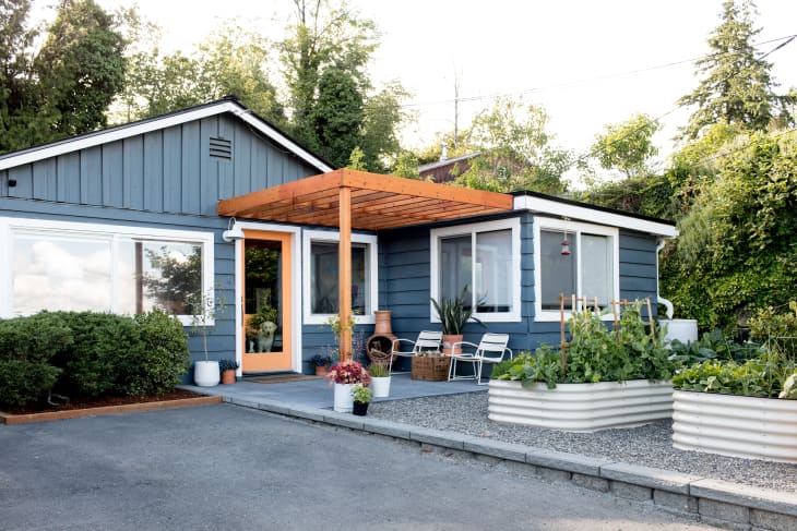
Peach
A warm peachy-orange front door can feel unexpected — and unexpectedly versatile. It’s bright enough to make an entrance pop, but soft enough to complement a variety of common exterior hues, including blues, greens, and neutrals. It checks all the boxes: warm, approachable, and a conversation starter.
In this Seattle mid-century house, a peachy entry plays beautifully with the home’s light-filled facade and backyard garden. Because most of the door is made of glass, the painted border acts like a frame, bringing a pop of color that’s not too overpowering.
Get the look: Benjamin Moore’s Peach Party

Daisy Yellow
A bright yellow door isn’t for the faint of heart, as it could quickly go wrong. It’s an optimistic hue — even before the door opens. On neutral facades, it creates a focal point that makes for a showstopping entry, not an overlooked one. Because the front door is a relatively small surface area, it’s a safe place to experiment with saturated color.
Interior designer and television host Sabrina Soto painted her own door Behr’s English Daisy. “My bright yellow front door is proof that small surface areas can handle big color and completely change your home’s personality,” she says.
Get the look: Behr’s English Daisy
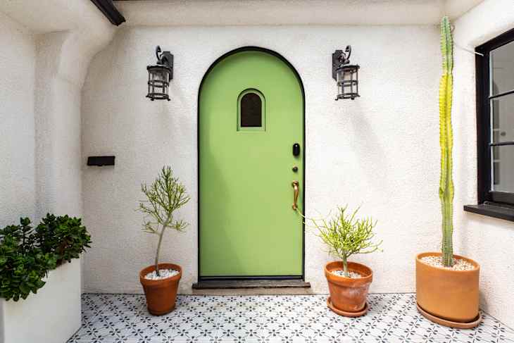
Lime Green
A lime green front door isn’t subtle. That’s the point. A bright, citrusy green instantly energizes a facade, bringing a playful edge. It works especially well with older homes — like this 1929-built Spanish-style home in Los Angeles — where classic architectural details ensure the tone doesn’t veer too starkly modern.
The lively hue nods to Mediterranean influences while reflecting the home’s eclectic spirit. Rather than competing with the lush surroundings, the lime green feels in sync with year-round greenery, highlighting the arched doorway and tiled patio. The result is a confident color choice that enhances the home’s character instead of overpowering it.
Get the look: Benjamin Moore’s Lime Green

Dusty Blue
Blue remains one of the most reliable front door colors because it naturally bridges a variety of exterior and interior styles. A slightly gray-tinged blue, like Benjamin Moore’s French Toile, looks equally relaxed and polished. It also pairs beautifully with warm materials like cedar and stone.
Diana Pauro, founder of Massachusetts-based Rebel Builders, used the hue to create a welcoming entry for this home. “The vision for this home was a beach house in the woods. We know how important it is for the front door color to give a clue to what awaits inside. With the warm cedar shingles of the main porch and the neutral light mist board and batten siding, this timeless blue brings a pop of color that completes the composition.”
Get the look: Benjamin Moore’s French Toile
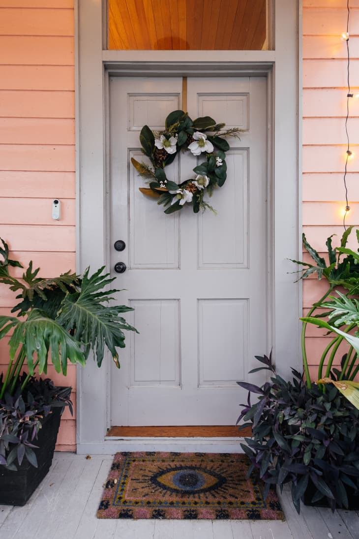
Putty Gray
Not all gray tones are created equal. Some are cool and flat, like the ones often seen in builder-grade homes. Then there are deep, warm grays that subtly shift as the light changes throughout the day. With soft clay undertones, this shade feels grounded and organic, not industrial.
For homes already awash in bright tones, a warm gray door creates a sense of grounding. Take this New Orleans shotgun house, for example: The cheerful pink exterior is balanced with a putty gray door and trim, ensuring the pink tones shine, all while keeping the overall look sophisticated.
Get the Look: Sherwin-Williams’s Functional Gray

Raspberry
Courageous? Check. Refined? Also check. A raspberry-toned front door strikes the perfect balance between playful and polished. It makes a statement without shouting, and surely will be the only berry-toned door on your block.
This hue works especially well on historic homes, cottages, or any understated exterior that could benefit from a focal point. In fluctuating sunlight, the tone subtly shifts from deep and moody to bright and sweet, giving the door visual complexity. If you’re on the fence about embracing such a striking color, remember that it pairs perfectly with classic trim colors, like cream and charcoal.
Get the look: Sherwin-William’s Framboise

Natural Wood
Paint isn’t the only way to make a front door stand out. A natural wood finish highlights craftsmanship and texture in a way that color can sometimes cover up, allowing the material itself to become the focal point. Rich wood tones are warm and welcoming, and they work especially well on traditional homes, cottages, and craftsman-style exteriors where architectural details matter.
For their own entry, HGTV’s Home Town hosts Erin and Ben Napier chose a door made from Spanish cedar. “It feels substantial when you open it, but it isn’t too heavy of a wood and will resist rot and bugs in our South Mississippi climate. My favorite color for a front door is the natural wood, but that is a lot of maintenance to keep up,” Ben tells us.
Erin designed the carved medallions, turning the door into a decorative feature rather than just a passage. The layered rails and raised panels also add durability, helping prevent sagging over time — proof that a beautiful entry can be as functional as it is striking.

How to Make Any Front Door Look Luxe
The paint color you choose matters, and so do the details around the door — they’re what make an entryway feel elevated instead of simply painted. Whether you go bold or subtle, small upgrades can dramatically increase curb appeal.
Consider these upgrades to make your front door feel high-end:
- Upgrade the hardware. Flimsy, builder-grade hardware can make even a beautiful front door feel forgotten. Opt for an oversized handle set or aged brass hardware instead.
- Replace the house numbers. Choose numbers that are properly scaled to the door and aligned with your home’s architectural style.
- Choose the right finish. A semi-gloss finish reflects light and shows off the color’s depth while also withstanding weather, fingerprints, and everyday use.
- Add lighting. Outdoor sconces aren’t just practical; they also add much-needed visual interest.
- Paint the trim a contrasting color. Crisp white trim around a dark door (or dark trim around a light door) makes your door pop all the more.
- Add greenery. A pair of planters on either side of the door anchors the entry with a sense of symmetry.
- Paint the interior side of the door. Carrying the color inside makes the choice feel deliberate rather than decorative.
Design Defined
Never miss the style inspo and recommendations you crave with Design Defined. Follow along each week as our Home Director Danielle shares the best style advice, latest trends, and popular decor finds you just can't miss.