
25 Gorgeous Colors That Pair Beautifully with Green, per Designers
Of all the colors in the rainbow, green is always my first suggestion to anyone who wants to bring bold color into their home — but doesn’t know where to start. Why? It’s a cozy shade that’s easy to warm up to, thanks to its ties to nature; it tends to bring feel-good energy into any space. What makes it even better, though, is its versatility once you start pairing it with other shades — from cool, calming palettes to bold, blue-green mixes, it’s a color that just works.
Designer Jonathan Adler puts it best: “Green is the color of life. Bright chartreuse green is the color of spring leaves; forest green is the color of autumn,” he tells Apartment Therapy. “Green has many playmates on the color spectrum … Brown and green, the color of trees and nature, is the most familiar color combo on earth.”
I think it really comes down to shade: Rust, coral, and terracotta feel earthy and elevated, while a moodier shade like burgundy can add richness without tipping into seasonal tropes. That’s the flexibility that makes green such an approachable entryway option — it works whether you want to play it safe or take a more experimental approach.

Designer Elizabeth Sims of CALAFIA Home Designs agrees, sharing, “The most common color palette request I get is for a blend of neutrals, plus green. Neutrals are classic but have been trending for so long now that people want to add a little color, and green feels like it’s part of the neutral family because it’s so common in nature.”
So whether you’re ready to experiment with a blue-green paint or stick with a classic green, this shade is endlessly versatile. Ahead, you’ll find 25 real-life color combinations (spotlighted from our House Tours and real interior designer projects!) to inspire you to bring green home in a way that feels just right for you.
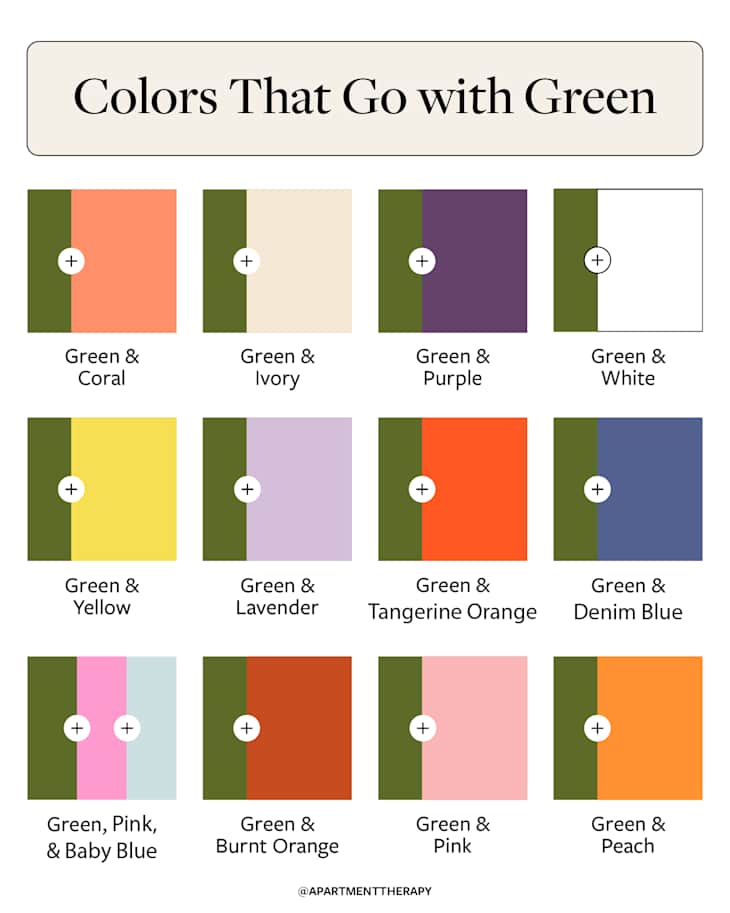
3 Pro Tips in Choosing Complementary Colors for Green
- Determine the mood you want to evoke in your space. Then, select a green that will help you achieve that feeling. For example, if you want something moody or romantic, consider using a dark green paint.
- Treat green like a neutral. Depending on the shade, especially in sage or olive green, it can be just as flexible as beige or gray. Layer it with other muted shades or textured materials (wood, linen, brass) to create depth without overwhelming the space.
- Or go bold with opposites. If you want your space to stand out, contrast is your best friend when it comes to decorating. Just make sure you balance one bold tone with softer accents; for example, Adler highlights green and red. Since red is the complementary color of green, the pairing is inherently bold, but it doesn’t have to read as a holiday.

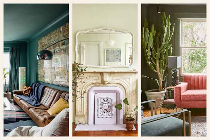
1. Green and Coral
Kicking off with a bold color combination, this Long Island home showcases the power of a brighter pop of color, highlighted by a coral sofa and dark green walls. When color pros say that opposites attract, this is what they mean.

2. Green and Ivory
In this living room designed by Jennifer Jones of San Francisco-based Niche Interiors, the green furniture practically glows against the creamy ivory backdrop, and it’s totally working.
“Green brings instant life and energy to a room and provides a focal point to design around,” Jones says. “In this formal living room, we paired an emerald green sofa with warm neutrals such as ivory, flax, and taupe for a clean, contemporary look.”

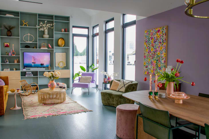
3. Green and Purple
It feels fitting that this New Orleans home is proudly rocking cheerful shades of green, purple, and magenta in the living room. The purple hues are featured in both the rug and throw pillows, which keep things interesting as your eyes wander from one object to another.

4. Green and White
Sometimes, the best approach when using a bold emerald green, as seen in this bathroom designed by Pamela Hope, is to let it shine by pairing it with white accents.
“While the green palette is intense, we kept it disciplined by using paint, paper, and tile in the same color way. White floors and ceiling serve as a counterpoint to lighten the space,” she says.

5. Green and Tangerine Orange
This South Manchester kitchen pairs green cabinets with a cheerful tangerine-colored backsplash, and the whole room feels cheerful and warm because of it. The variation of wood tones and finishes also helps it feel balanced.
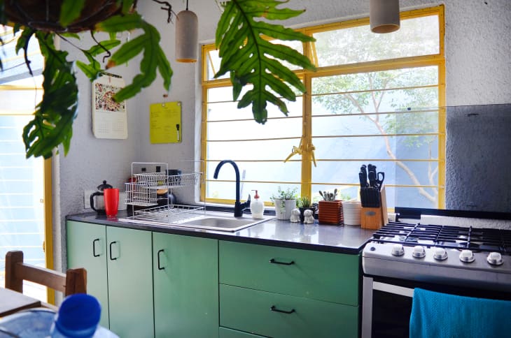
6. Green and Yellow
There’s something about the subtlety of the steel yellow accents and green cabinet color in this colorful home in Mexico that brings me so much joy. This kitchen is proof that neutral walls can serve as the perfect backdrop for bringing in color.

7. Green and Off-White
Paint is the easiest way to transform a space, and this London living room shows just how magical four painted walls can feel. The off-white accents, like the curtain panels and chairs, don’t compete with the green, but rather complement it.

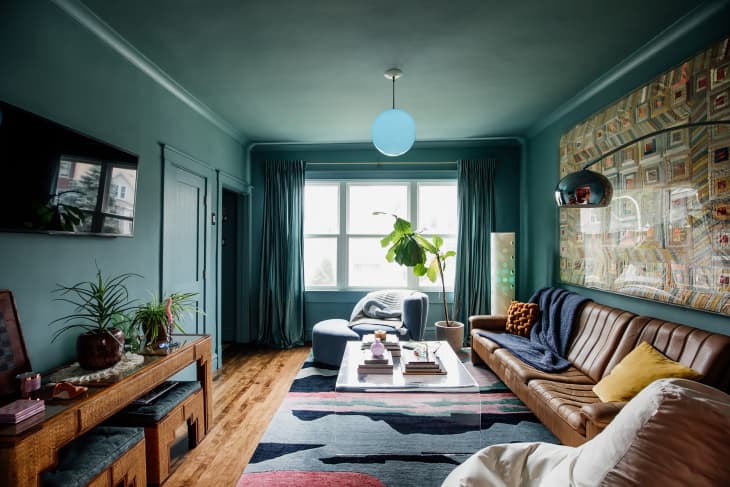
8. Aqua Green and Navy Blue
Aqua green walls make a statement all on their own, but paired with hits of navy blue, the palette feels sharper and more defined. Leave it to Jonathan Adler to turn a bold mash-up into an ode to vibrant living.
9. Seafoam Green and Lilac
Craving a spring-inspired green? This Amsterdam houseboat is a masterclass in cheerful color combinations, and the seafoam and lilac-painted walls look darling without leaning pastel-y.

10. Mint Green and Blue
This combo may feel like too bold a pairing for some, but in this playful kid’s room, it feels just right. The homeowners did a great job by repeating the colors through the wallpaper, which makes it feel blended rather than overwhelming.

11. Kelly Green and Pink
This Washington, D.C., studio nailed their Kelly green and pink color combo. The pink bookcase is clearly the star of the room, but alongside the green wallpaper and sofa, it makes the whole room feel even more inviting.
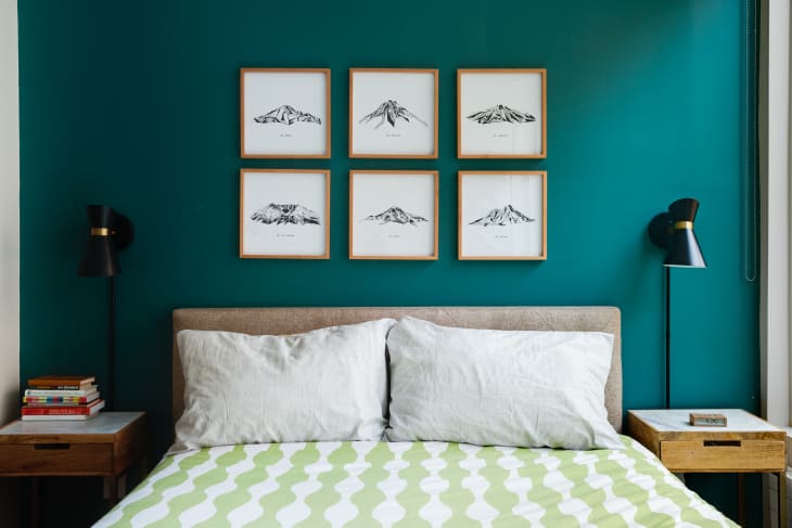
12. Teal Green and Brown
When a living room looks as good as it does in this Chicago house, how can you resist the temptation of a teal green color-drench moment? The enveloping feel of the walls in this room creates the perfect canvas for the brown furniture throughout.

13. Sage Green and Black
Sage has been a go-to green for years, and this London home shows why. The walls are soft and calming enough to pass as a neutral look, but they still breathe life into the room. Paired with crisp black accents, the look leans elevated and quietly sophisticated.
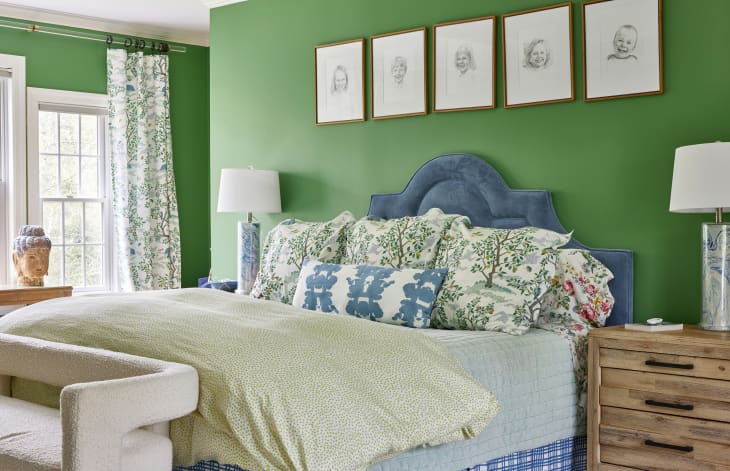
14. Green and Denim Blue
In this bedroom, green walls do the heavy lifting while denim blue accents keep the palette grounded. The mix of materials, from the velvet headboard to the crisp bedding, makes the space feel bold but balanced (chef’s kiss!).
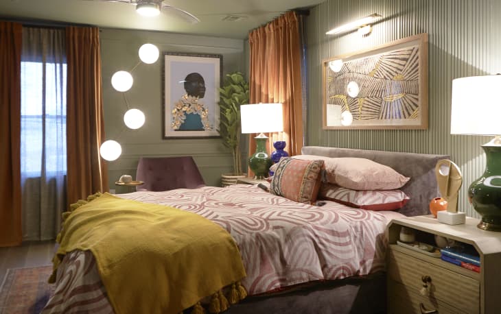
15. Muted Sage Green and Burnt Orange
If you’re looking for a recipe for a grounded space, muted sage and burnt orange are a perfect match. In this bedroom, soft green walls create a calm backdrop while rust accents layer in warmth and depth.

16. Dusty Green and Green
What makes this dusty green even more delicious? Adding texture through limewash, as seen in this bedroom designed by Erica Davis of Eralyn Interiors.
“In our Safari House project, we used a moody limewash green called Seine by Color Atelier in the primary suite. Instead of treating it as an accent, we let the green act as a neutral foundation,” she shares. “It allowed us to layer in warm natural woods, creamy textures, and brass accents without the room ever feeling heavy.”
17. Mint Green and Teal
Bedding is one of the easiest ways to test-drive color, but this room proves it doesn’t have to stop there. A teal wall sets a bold backdrop while mint green patterned sheets add a fresher note. It’s proof that you can work with both paint and textiles (a win-win!).

18. Chartreuse and Blush
There are bold interiors, and then there are bold interiors — this room in Los Angeles definitely qualifies. Chartreuse walls and furniture bring the drama, but paired with soft blush accents, the palette feels intentional and surprisingly harmonious.

19. Light Sage Green and White
You don’t always need to go bold to make a statement. In this bedroom designed by Sarah Bronstein of Sukkha Interior Design, muted shades of sage green and white take center stage.
“I love using greens in my projects and feel it can be a timeless color, especially when in a muted, earthy tone,” Bronstein says. “I think it’s trending because it’s a color that adds a lot of character with the capabilities to stay aligned with the trending neutral palettes.”
Want to bring the look home? Bronstein used Benjamin Moore’s October Mist to create this zen feel.
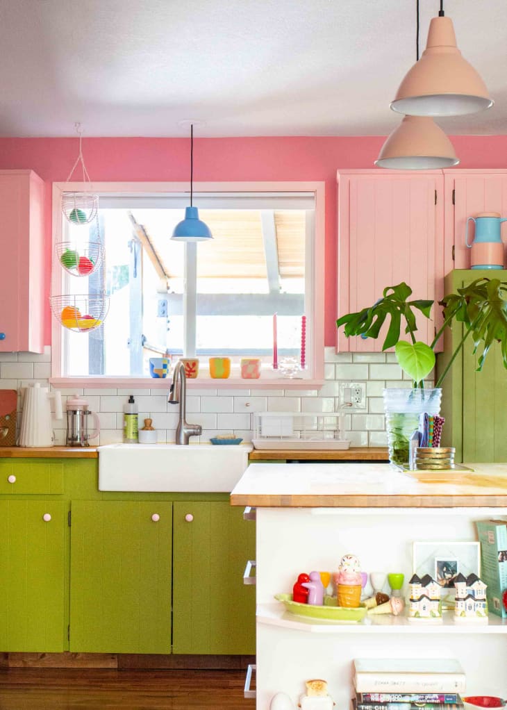
20. Lime Green and Peach
Nothing says joyful kitchen like lime green cabinets and peach accents. And while painting your cupboards might not be the most renter-friendly move, you can still bring this punchy duo home through accessories, textiles, or even a peel-and-stick backsplash — no deposit risk required.

21. Celadon and Lavender
This Brooklyn apartment shows that even a soft shade like celadon can hold its own. The walls feel airy, but it’s the unexpected accents (a lavender-painted fireplace and pipe!) that quietly steal the show. Subtle, yes, but powerful in the way they make the whole space feel more intentional.

22. Sage Mist and Blue
Sage green may be a popular choice (as seen in this kitchen by Sims), but she notes that clients are increasingly open to pairing it with other shades, like the subtle blue-and-white tile here. “In any hue, green adds a brightness to interiors while remaining down-to-earth,” she adds.
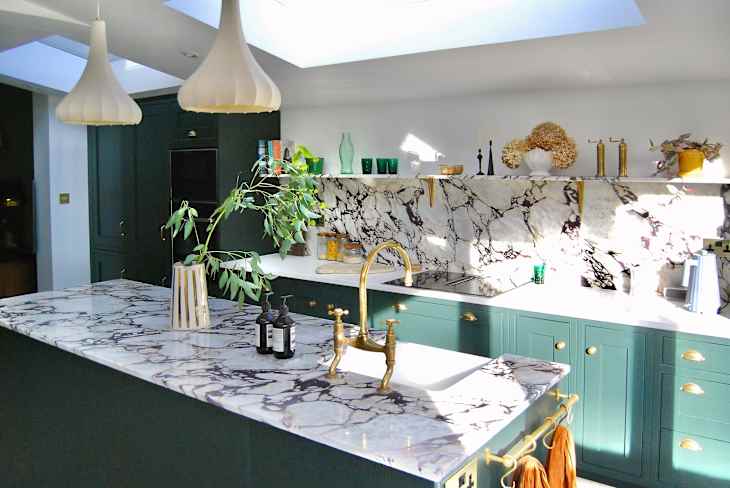
23. Peacock Green + White
Peacock green cabinets are made to turn heads (in a good way!), and in this London kitchen, they do just that. The dramatic veining of the countertops only ups the ante, while fresh white accents keep everything feeling sharp and pulled together.

24. Moss Green and Olive Oil Yellow
Don’t underestimate the power of a green and yellow color combo. In this Brooklyn apartment, mossy green and olive oil yellow play off each other to create a kitchen that feels vibrant and fun to be in.
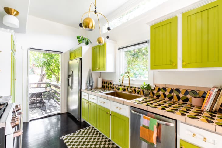
25. Apple Green, Bubblegum Pink, and Baby Blue
Name a more cheerful combo than apple green and bubblegum pink — I’ll wait! This Portland kitchen proves that even high-contrast colors can look sophisticated, especially with light blue sneaking in through the fixture, hardware, and decor for an extra playful touch.
Design Defined
Never miss the style inspo and recommendations you crave with Design Defined. Follow along each week as our Home Director Danielle shares the best style advice, latest trends, and popular decor finds you just can't miss.