
8 Super Chic Homes That Prove Pink Isn’t Just for Kids’ Rooms
Can't-Miss House Tours Straight to Your Inbox
Keep up with our latest house tours each weekday with our House Tour of the Day newsletter
Besides a longstanding association with ruffles and romance, the color pink has historically been overlooked in home decor as a “girly” hue and frequently relegated to kids’ spaces. In recent years, however, the rosy-tinged pigment has been steadily gaining traction as a more sophisticated option in the design world. Take, for instance, the Millennial pink movement, an entire generation’s obsession with blush-toned everything.
One could also take a cue from the cinematic world, like the eponymous setting of Wes Anderson’s “Grand Budapest Hotel.” Restaurateurs have also jumped on the pink train, with establishments like Sketch, a trendy tea room in London swathed in luxurious pink velvet, and Pietro Nolita, an Italian eatery in New York City featuring a vibrant all-pink aesthetic.
It’s only logical, then, that pink would eventually find its place outside of the playroom and into the main spaces of the home. Here are eight ways to use pink in home decor that are both stylish and decidedly grown-up.
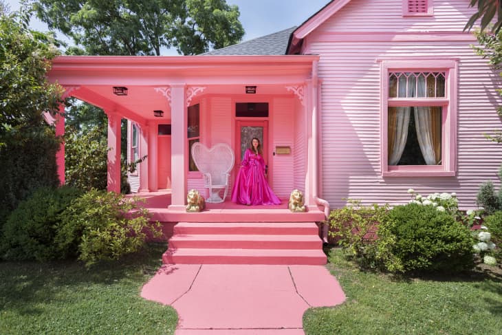
Front Doors Are Prettier in Pink
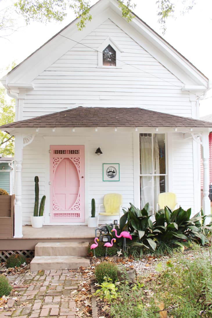
First impressions are everything, according to Atlanta-based siblings Sophie Loghman and Saba Loghman, who opted to paint the front door of their shotgun-style house a soft shade of pink to welcome guests. Not only does it lend a playful note to the home’s Victorian accents, it also coordinates perfectly with the three pink flamingos in the lawn. And it offers a hint of what’s to come inside: lots of bright colors!
Ditch the Rug in Favor of Painted Floors
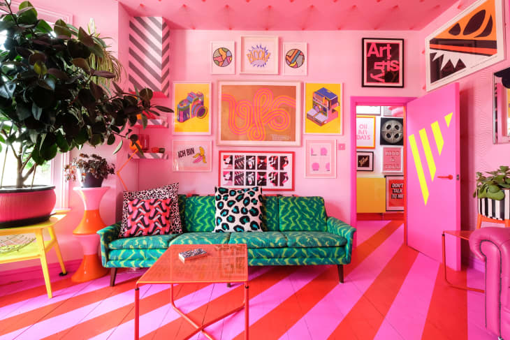
Color permeates every nook and cranny of this London home, but it’s the pink and red stripes painted on the living room floor that really stand out. It’s easy to see why it’s the proudest DIY of the homeowners, Ms. Pink and Mr. Black, a creative duo who shares the three-story flat with their three sons and two cats. The diagonal striped lines make a bold graphic statement, drawing your eye into the rest of the living space, which also features a light pink fireplace and berry-hued Chesterfield couch.
Be the Brightest House on the Block
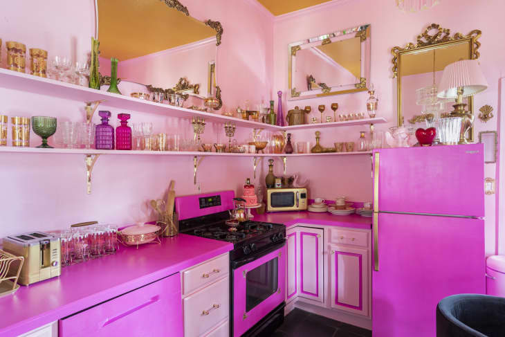
Thanks to its all-pink color palette on the exterior, including the siding, porch, and trim, this Nashville home owned by Adora sure stands out in the neighborhood. Inspired by Jayne Mansfield’s former Pink Palace and the Madonna Inn, the home’s interiors are just as vivid as the outside, including a pink kitchen with matching appliances and a pink-tiled bathroom. With its vintage furnishings and opulent style, the house is also frequently rented out for video shoots on Peerspace.
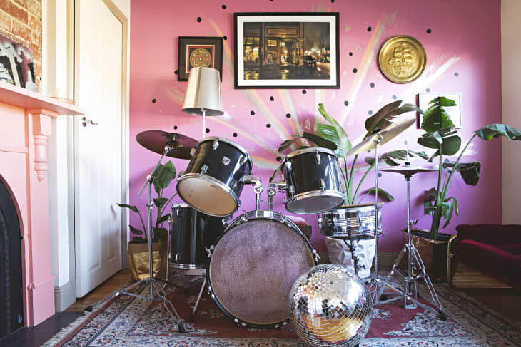
March to the Beat of Your Own Drum
The front bedroom of this house in Australia was converted into a music room with a drum set center stage in front of a watermelon pink wall. A hand-painted mural and disco ball further enhance the space’s quirkiness. The homeowners, Kate Forsyth and Dave Bunting, along with their son Remy, had one mission after they moved in: to rid the house of its “three shades of beige.” With its pink mantels and colorful furnishings, including a custom-built rainbow headboard, they accomplished exactly that.
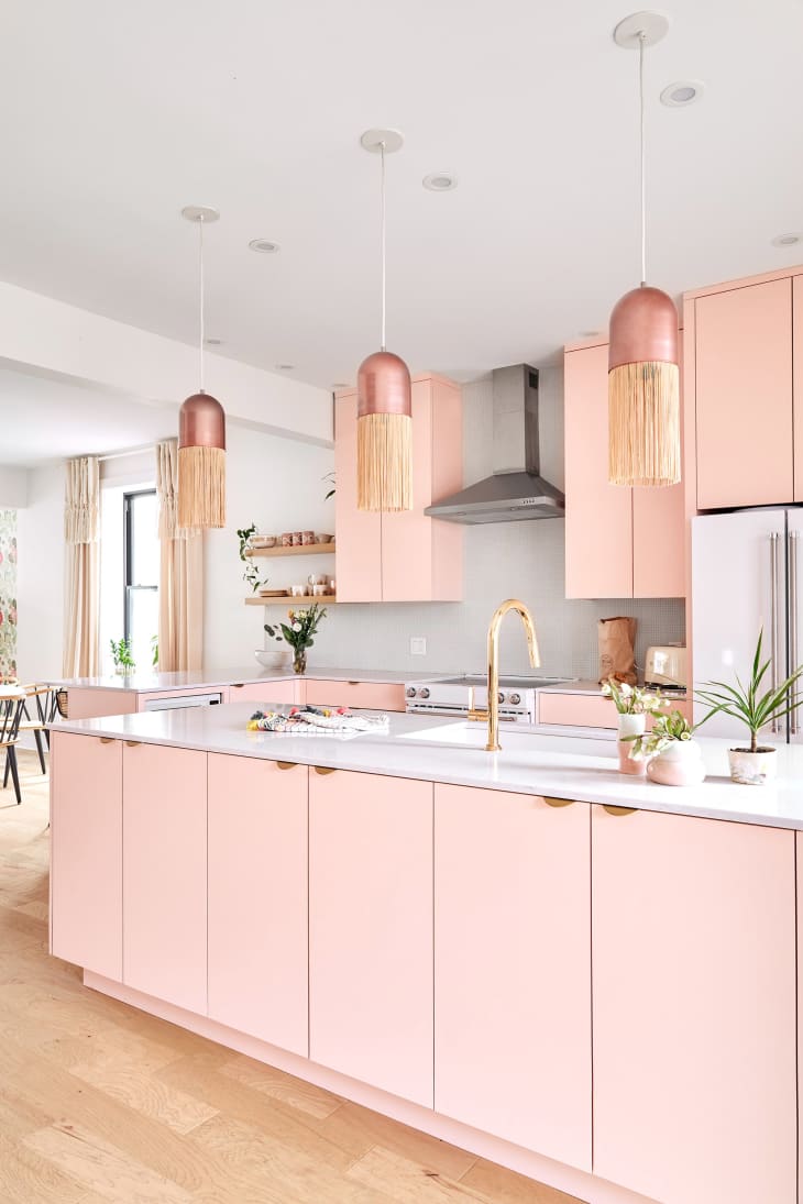
Spice (or Sweeten) Up Your Kitchen Cabinets
The peachy pink cabinetry in this stunning Montreal home is a testament to how form meets function. After all, the homeowner, Isa Lora Messier, is a chef who owns a restaurant a few blocks away. Though others were initially unsure about her kitchen’s unconventional color choice, she’s glad she followed her instincts and claims it to be her favorite place in the house. The pièce de résistance is the trio of rose gold pendants that hang above the kitchen island, which lend a modern luxe vibe to the space.
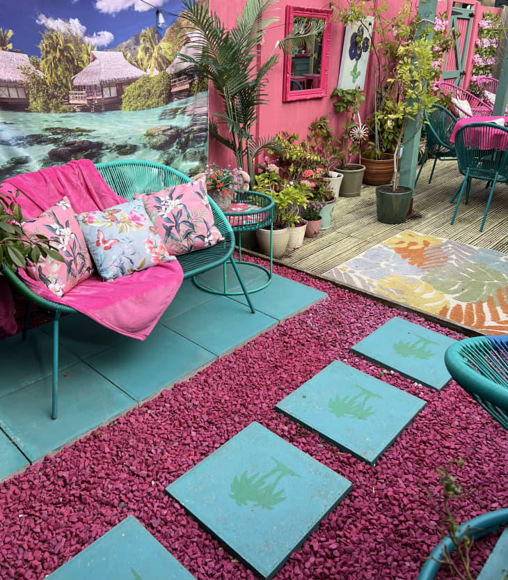
Pink Gravel Is What Your Patio Is Missing
Though the interiors of this U.K. home are chock full of pink touches and leopard print, it’s the hot pink gravel on the patio that really grabs your eye. Paired with teal pavers featuring a palm tree print and coordinating teal furniture, it creates a colorful oasis for relaxing outdoors. The homeowner, Nikki Shore, who considers her style to be eclectic and maximalist, says it’s lovely to create a home where you can “smile and be happy.”
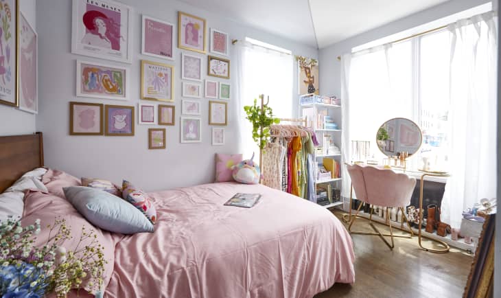
Match Your Sheets to Your Gallery Wall
The blush-toned linens in the bedroom of this Brooklyn rental adds softness to the space while also complementing the various shades of pink in the artwork — much of which Briana Guin, who shares the apartment with two roommates, printed herself to save money. Her motto is to seek out items that bring you joy, even if it’s something as mundane as a toaster or frying pan. For her, that means all things pink.
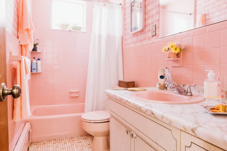
Go Bold in the Bathroom
Everything’s coming up roses in the bathroom of this South Philly home. The homeowner, Sue Liedke, had a vision of a “bright ‘50s ladies room” in mind when she approached the remodel. Rather than replacing the existing peach and pink tiled floor, she had the tub, wall tile, and sink reglazed in a rosy hue that matched, and then found a matching vintage toilet. Wallpaper and a few key accessories really polish off the look and seal in the nostalgic vibe.
Design Defined
Never miss the style inspo and recommendations you crave with Design Defined. Follow along each week as our Home Director Danielle shares the best style advice, latest trends, and popular decor finds you just can't miss.